Correlation Matrix
A feature of Microsoft Excel that examines the association or link between multiple variables.


What is a Correlation Matrix?
A correlation matrix examines the association or link between multiple variables. A correlation refers to a connection between two things, so the addition of a matrix involves using several variables in conjunction with one another.

A couple of notes to keep in mind when measuring the correlation between variables:
- A value of a positive or negative 1 implies a positive or negative association.
- A value of 0 indicated there is no association.
More commonly seen in data sets, regressions, and analyses, a correlation matrix can be used similarly throughout all. Therefore, reading a correlation matrix should not be difficult, and it should summarize any given data set.
Remember, any value of 1 or close to 1 is considered a correlation. While a value of 0 or -1 equals negative or no correlation.
Whether you are looking at a firm’s quarterly transactions or a regression line model, creating a matrix can help outline the overall numerical set and determine variable correlations within a regression.
Key Takeaways
- A correlation matrix is a table that displays the correlation coefficients between multiple variables in a dataset.
- It helps identify relationships and patterns between variables, showing how they move in relation to each other.
- The correlation coefficient ranges from -1 to +1, where +1 indicates a perfect positive correlation (as one variable increases, the other variable also increases). -1 indicates a perfect negative correlation (as one variable increases, the other variable decreases).
- The closer the correlation coefficient is to +1 or -1, the stronger the correlation between the variables.
Correlation Matrix Example
Let's discuss the requirements and variables needed to complete the correlation matrix to elevate your understanding and practice of it.

Within a newly created Excel sheet, simply input your data and the necessary number of variables used within the data set. The number of variables can range depending on the data set you are working with.
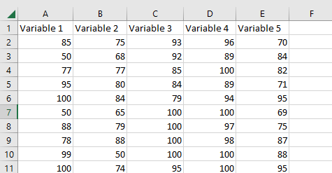
For simplicity, the example depicted throughout the data set compares student test scores, out of one hundred, to other classes.
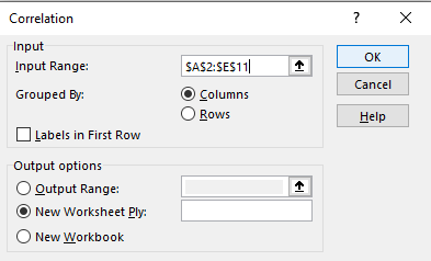
Next, you will locate the Data tab at the top of the Excel page and navigate to the Data Analysis. Once you have opened the Data Analysis, select the “Correlation” tool to move forward in the matrix process.
Once selected, highlight the data set. As pictured in the example, it is organized in columns, so select the “columns” option within the Input Section as necessary.
Additionally, ensure the Output Section has selected “new worksheet ply” before continuing.
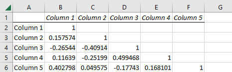
Now, you should see the data set rearranged to form a matrix of all variables and their correlating link. As photographed, your new data set should look similar to the one below.
As you may notice, the student test scores are now organized in a correlated matrix. In addition, the graph titles may be reworded for clearer understanding based on your specific data set.
If you want to learn more about the different mechanisms in building a matrix and organizing the data sets in color, practice with the Top Tip Bio’s YouTube tutorial.
Additionally, our Excel courses offer the resources to help improve your skills in formatting and utilizing various data functions.

Free Resources
To continue learning and advancing your career, check out these additional helpful WSO resources:

or Want to Sign up with your social account?