Help Me Choose a Book Cover for My Corporate Thriller
As mentioned in my last few posts, I'm very close to publishing a fiction corporate thriller on banking. I'm probably a week or two away from the final product, but for now monkeys, I need your help choosing a front cover.
Let me know which ones you like best and if you don't like any of them, that's a useful comment as well. Also, feel free to click follow on my profile for updates on the final publication date. I will also likely post an excerpt on WSO soon.
Cover 1 - Light Blue: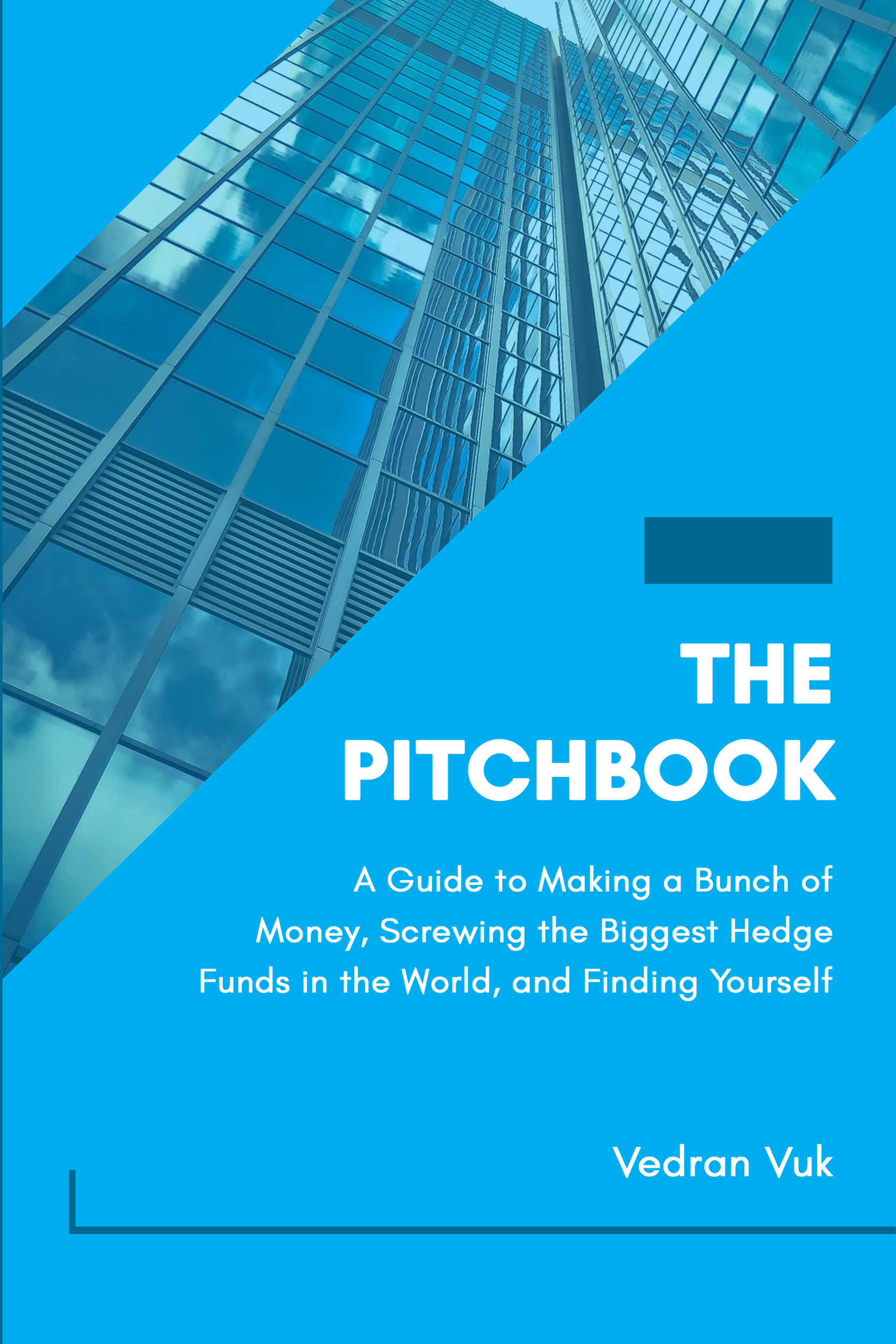 Cover 2 - Dark Blue:
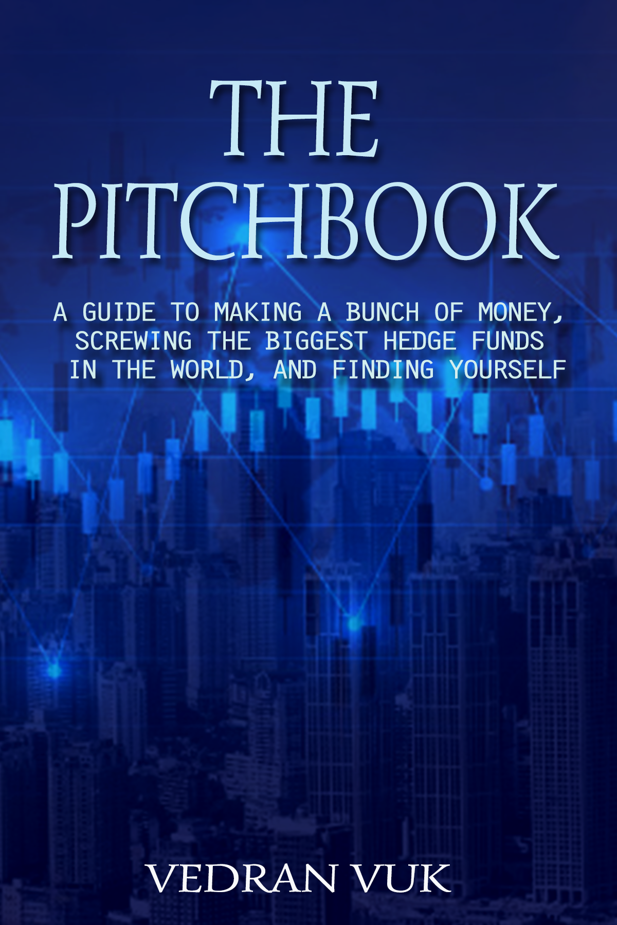 Cover 3 - Grey with Charts:
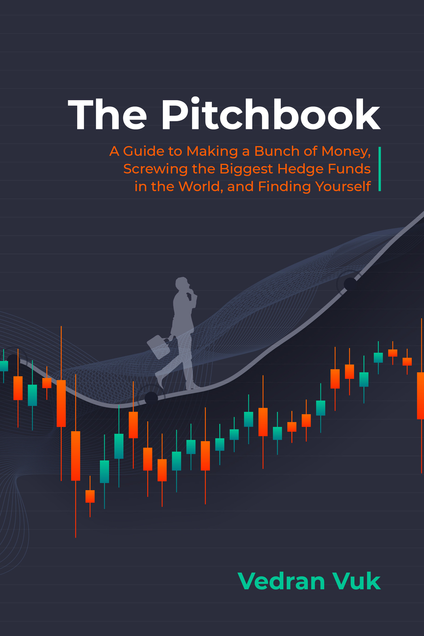 UPDATE: Based on the responses on here and those in real life, I'm leaning toward option number 3. I got the color theme changed to make it even less textbook-like. What do you think of this version below in comparison to the grey background frozen assets Gibbon@ petight TMD777 rezjopls or anyone else that would like to comment?
Also, thanks to the commenters with the ominous sky cover idea. I will likely do a second cover for the ebook and may explore something like that. Looking forward to sharing the final product with the WSO community.
Cover 4: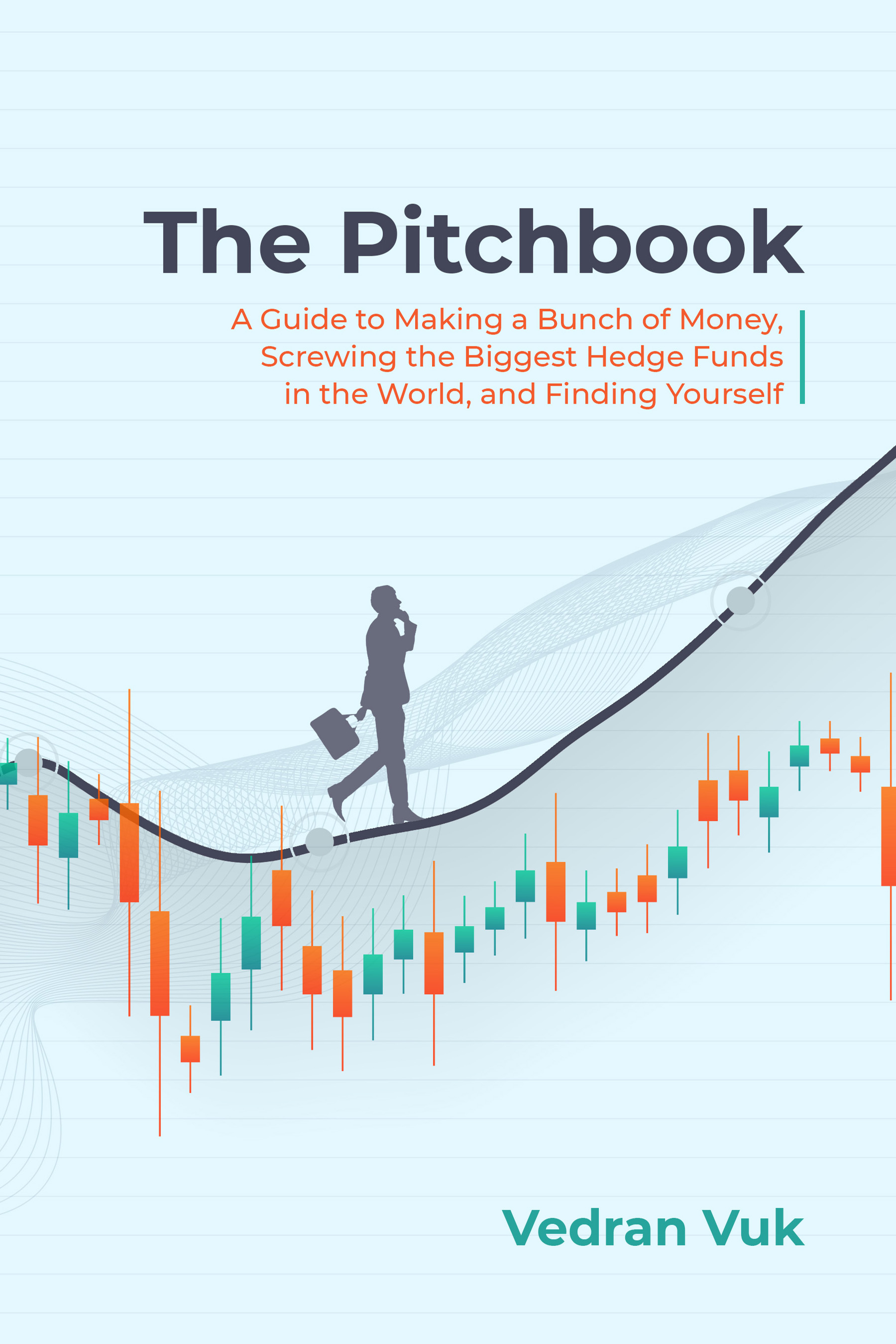


Looping in a few people that have already read the first chapter. Thanks again for the read! [BigKahunaBanker] SaA12 AKvB happygolucky Pussy galore Army Monkey falconeagle
Number 2 looks attractive enough, I´d shorten the subtitle a bit, to something like "A Hero´s Journey in a Mundane Hellworld" or "A Guide to Yuppie Greatness". Otherwise it clashes with the main title and, let´s be honest, decriptive mega-long titles are so 17th century. Please notify us when the book is being published, I´d like to be your first reader.
I'm trying to give the Spider Network a run for its money on the title length: https://www.amazon.com/Spider-Network-Backstabbing-Greatest-Financial/d…
all of yours look like text book covers for a 1st year university course.
i love this poster Margin Call movie has. Has such an ominous look. If you can get something similar (minus the people) that would be great imo
Yeah, that's one of my concerns as well. Went to three different designers and all came back with textbook-like covers. Second option is probably the least textbook. Like the Margin Call poster - actually probably more intense than the movie itself but it does draw you in.
Discussion Materials: Tales of a Rookie Wall Street Investment Banker also has a very unique book cover. i like it.
God, that was such a good fucking movie
I think number two has potential. Big thing I'd say is change the subtitle. If you hadn't mentioned it was a fictional corporate thriller I would have guessed it was some guide book to break in to/succeed on Wall Street. I wouldn't include things like "A guide..." and "finding yourself"
Yeah, I've been going back and forth on this myself. My goal was to make the title sound so ridiculous that you click on it regardless and then the book description fills you in on what it's about.
Do you think the problem could be solved by just changing it to "A Story of Making a Bunch of Money, Screwing the Biggest Hedge Funds in the World, and Find Yourself"?
Looks like a finance 101 textbook cover!
Give me a smashed keyboard, a boss eating an intern’s pet goldfish, something!! You can do better with photoshop or even making it on a Microsoft word doc tbh.
1st looks like a textbook. 2nd looks like an outdated book, but at least it's a novel. Third looks like a podcast.
Thanks for the input!
Number 1. It gives the book a nerdy look but in the end they are going for a ride. Btw can I read it?
I'll probably have it out in a week or so if you can wait for a proper kindle or paperback edition. Thanks for the interest! Will let you know when it's out.
!remind me
Number 1. Reminds me of WSO a little bit
AndyLouis WallStreetOasis.com Andy and Patrick, I know you guys have to make these sorts of design decisions all the time. Any thoughts?
3rd looks the best imo, but they all look like textbook covers. Get an artist to draw something up!
Try again! I'm sure you can find something better!
1 looks like a WSO course, 3 looks like Econ 101, 2 looks like a udemy cover on a course on trading where they gave up on the font.
Maybe try to make it more reflective of the content of the book in a less generic "financey" way.
The font from the big short (movie) is more bank-like and also the movie cover at least gives you this impression 'look at these 4 guys that came together" in a way.
The subtitle is kinda long and feels like the way sb that is lazy to talk about it would explain it. If you were trying to make it more provocative maybe shorten it a bit
I would say the last one but you should give this work to an artist.
Last one looks the most crisp. First looks like a textbook, second looks super basic but could just be the font.
Creative suggestion, Google "bad banks intro" and you get some eerie skyscraper vibes, similar to the Margin Call suggestions.
Thanks! It sounds like the ominous skies theme would be popular. Very helpful.
I liked the first and the third one.
Thanks! Made an update to version 3 in an update above. What do you think, grey version 3 or light blue version 4?
I think the third one is my favourite
It still looks like a textbook. Tbh you could have a solid color as the cover and it would do better.
Your subtitle makes it even more textbooky.
Something even very simple like “a fictional tale of a kid looking to make millions” works
I think using terms like hedge funds gives it a technical-y vibe which would be a turnoff for the broader audience
I'd go 2, 3, 4, 1, in terms of rankings, with a large chasm between 3 and 4. Agree that the subtitle is a bit long but I'm more of a consumer than creator of art/literature so unfortunately I don't really have suggestions other than maybe dropping the hedge fund part.
Don't spend all night on this but have it to me by 9AM tomorrow, thx.
Really excited to read the final product.
Quis dignissimos voluptatem deserunt magnam dolor ad aut est. Tenetur omnis sint vel maxime placeat. Dolore quis dolores laborum perspiciatis repudiandae perferendis. Nihil ut eligendi adipisci aut. Voluptas ea fugit fugiat cupiditate sit unde quidem.
Alias sed libero veritatis. Dicta dignissimos ex est qui sint est. Non aut facilis nisi excepturi soluta. Rerum quibusdam ab eos repellat magnam et. Sed aliquid ex non repellat enim qui odit enim.
Sit voluptate quod qui sed. Quia dolorem sit saepe totam facere autem sed.
See All Comments - 100% Free
WSO depends on everyone being able to pitch in when they know something. Unlock with your email and get bonus: 6 financial modeling lessons free ($199 value)
or Unlock with your social account...
Ut et inventore dolore rerum sunt quis recusandae ea. Suscipit consectetur cupiditate quo et possimus expedita est eligendi. Porro reprehenderit sed animi molestiae.
Cupiditate labore consequatur iusto dolorem blanditiis magnam. Aliquid omnis rerum aut est nobis tempore. Facere ratione voluptates consequatur sunt ducimus libero. Omnis unde eos consectetur.
Commodi velit qui qui amet. Libero vitae soluta a temporibus. Asperiores mollitia officiis ut rerum quia. Adipisci minus quia possimus in adipisci tempora.
Error dolor dolore consequuntur. Occaecati fuga esse sint nihil quidem nostrum. Est in quia optio qui rerum.