Technical Indicator
Mathematical tools used for technical analysis


A technical indicator is a tool that uses mathematical analysis of a security's past prices and behavior to predict future prices for sound investment decisions in financial markets trading and investing. A technical indicator is used explicitly for technical analysis.

Technical analysis is an umbrella term that specifies the approach investors use to evaluate investment opportunities aside from fundamental and sentimental analysis. Instead, evaluations involve researching the stock's historical information, such as past prices, volume, etc.
Technical analysis takes an entirely different approach to fundamental analysis when evaluating stocks. Technical analysts are fond of paying much attention to charts rather than the underlying intrinsic factors driving the price.
In a nutshell, using technical indicators is looking at historical data (often prices) with or without an automated tool, analyzing past price behavior, and making predictions about the possible future behaviors of price. Hence, a prediction is arrived at by looking at past behavior.
Technical analysis is broad and involves a lot of tools and features. This article will help put forth the basics of indicators in technical analysis and the different types of technical indicators available in the market.
Most used technical indicators
Recently, technical indicators have been the talk of the town. Finally, somebody develops a technical indicator to be used in the financial markets. These indicators serve different purposes: some show momentum, others volatility, and some volume.

Indicators may also be grouped into two, i.e., leading and lagging indicators. Leading indicators provide a signal before a move starts while lagging indicators confirm and give a signal after a motion has begun.
The choice between leading and lagging indicators depends on the traders' personality and risk appetite. Some traders prefer not to lose out on a trade; hence they aim to capture the move from the beginning.
On the other hand, traders seek to confirm a direction before entering the market. The downside of lagging indicators is that traders may miss out on a great move as, most of the time, the beginning of the move experiences higher volatility.
Moving averages
The moving average calculates a security's average opening or closing price over time. For example, a company's 10-day moving average price will show the average closing or opening price of the last 10 days.
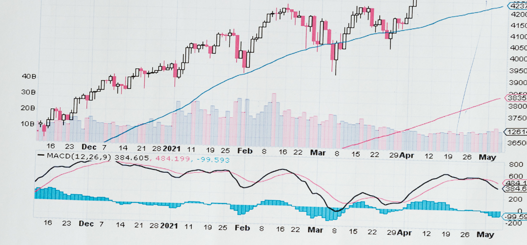
Different moving averages undergo other computations and behavior in the markets. The major types include the simple moving average and the exponential moving average. These differ in terms of their speed of reaction to price changes.
These two moving averages are different as the simple moving average computes the average price in a given period by giving the same weight to all the incorporated prices.
On the other hand, the exponential moving average gives more weight to the last price so that it takes more consideration of the current price behavior to form a more current prediction of the price behavior.
The formula for calculating the average is as follows;

(Where Pi is the price and N is the number of prices incorporated)]
Moving averages may also differ in terms of the type of price used. Some investors prefer the closing price (which is preferred by many), while others prefer the opening price. However, the method of calculation always remains the same in both scenarios.
Besides adjusting the noise in financial markets, traders can also use moving averages to indicate bull or bear signals. The behaviors of these averages can signal investors and traders when to bull sell or hold.

The simplest strategy that investors use is moving average crossovers. In this strategy, traders plot a long-period and short-period moving average on the charts. Because of the difference in the length of the period, the moving averages react with different magnitudes to price.
-
Calculate a long simple moving average (commonly 20 days)
-
Calculate a short, simple moving average (commonly 5 days)
-
When the short moving average crosses above the long moving average, it is a bullish sign. This is considered the formation of a golden cross, and investors should go long or close existing short positions.
-
When the short moving average crosses below the long moving average, it is a bearish sign. This is considered the formation of a death cross, and investors should go short or close open long positions.
The major downside of this moving average crossover strategy is that it proves lagging signals, providing a signal after the move has already started. This is a disadvantage because traders cannot enter at the beginning of the action.
Some people also compare the short SMA to an instrument's trading price. If the daily price crosses above the short SMA, investors would consider that as a buy signal, and vice versa.
Support and resistance levels
Support and resistance levels are lines drawn on the charts to mark equal levels of historical and current prices to predict key levels to future prices. With statistical significance, price tends to react to a past level where it had significant reactions.

For example, if the price previously failed to break a price X. In that case, it is more likely that in the future, some reactions will happen when the price reaches X again, i.e., it might either find it as resistance or act as a support when the price approaches its upside.
Support and resistance lines may be formed in several ways. First, they may be drawn in triangles, wedges, or straight lines, as most commonly done. However, the underlying analysis factors of these different formations are the same.

Some support and resistance lines are dynamic, commonly known as moving averages. Unlike the traditional support and resistance lines formed in a straight line, these dynamic lines follow prices and tend to help traders have an urge in trending markets.
Once a support level or line is broken, the price usually treats that previous support as resistance when the price is pulling back from the downside. Traders take advantage of this knowledge to have the urge to trade pullbacks.
A similar thing happens when resistance lines are broken. They tend to act as support when the price is pulling back from the upside. Likewise, traders pay attention to these levels to identify possible areas for placing their trades.
Bollinger bands
Bollinger bands are bands that John Bollinger developed in the 1980s, which help to measure market volatility and present a possible range where the price of securities is likely to be trading. These bands are plotted at a standard deviation from the median moving average.

In these bands, the price tends to move from the upper bands and bounces back once it touches the lower band. The middle-moving average in the bands also experiences price reactions but is broken for the price to head for the other bands.
Widen Bollinger bands signal high market volatility, while tightening bands signal low market volatility. This is an important signal to traders as volatility is crucial in market analysis, determining how fast the price will move at a given period.
The following calculations are done to plot Bollinger bands,
-
Calculate a moving average in any period u like using the formula:

-
Calculate the standard deviation from the same period using the formula:

-
Add the standard deviation to the moving average for the upper band.
-
Subtract the standard deviation from the moving average for the lower band.
Fibonacci retracement levels
Fibonacci retracement levels are areas where the price of securities is likely to form resistance and support. These levels are indicated by Fibonacci retracement lines, plotted horizontally on the charts of securities.

The Fibonacci sequence was developed by a famous mathematician known as Leonardo Bonacci. The sequence is derived by adding the previous two numbers in the roll starting from 0 and 1 (0, 1, 0+1, 1, 1+1, 2, 1+3…. Which makes 0, 1, 1, 2, 3, 5, 8, 13, etc.)
It has been noted that the Fibonacci sequence is present in most natural phenomena. Likewise, science has proven that most natural occurrences and objects follow this sequence in their development and growth. This is noted in seashells, tornados, trees, galaxies, human body parts, storms, etc.
From this premise, Leonardo Bonacci believed that the sequence and its numbers could also be relevant in technical analysis as its participants are natural beings; hence they might use their natural abilities and leave those patterns in the charts.
The Fibonacci levels are marked by percentages with different significance and probabilities as to the likelihood of turning. The levels in the Fibonacci retracements include the 23.6%, 38.2%, 50%, 61,8%, and 78.6%.

This indicator is one of the best leading indicators available in the market as it pinpoints the possible turning points in the price of securities even before the securities reach those points. It allows traders to enter a position at the beginning of a movement.
When the Fibonacci indicator is plotted on the charts, traders keenly look for reactions of prices around those levels to identify responses that indicate that price is likely to turn. Once they determine that level, traders confidently place their trades.
To increase the odds of success when using this indicator, traders like to include other indicators to have a solid base on their price prediction. Therefore, traders want to use this indicator in line with other indicators like the support and resistance lines and candlestick patterns.
Candlestick patterns
Candlesticks are price charts that display four key levels in price per time in single anatomy. These charts show the Open, High, Low, and Closing in any chosen time interval. Candlesticks have a body and wicks on the upper ends of the body.

Candlesticks date back to the 18th century, developed by one of the ancient Japanese technical analysts named Munehisa Homma. This man was a famous rice trader using candlesticks to trade rice and predict future rice prices.
In 1991, a man named Steve Nison introduced the use of candlesticks in financial markets, first published in his book, "Japanese candlestick charting techniques." Now, candlesticks have been digitized and are being used across the world.
Candles have two distinct features, namely the body and wicks. The body shows the opening and closing of the price, while the wicks show the high and low of the time interval in question. The body and size of wicks can be of any size, depending on market volatility.

Traders interpret the candlestick pattern formation based on its psychological implications. For example, some patterns signal indecision in the market, others signal momentum, and others signal volatility. Below is an example of the different candlestick patterns:
-
Doji: This shows indecision and the likelihood that a trend ends.
-
Hammer: This shows rejection from areas where the price is avoided, signaling the potential for a reversal. That is mostly the case when it forms near key levels.
-
Morning star: This showed the beginning of an uptrend when the market was a downtrend.
-
Engulfing bar: This momentum indicator shows that heavy market participants are in the market and are violently forcing prices into a particular direction.
-
Marubozo: This is also a momentum indicator showing that the price is forcing its way in one direction without clues that it might go in the opposite direction.


or Want to Sign up with your social account?