The Sage Group Overview
The Overall Ranking is a score from 1 star (very bad) to 5 stars (excellent) generated based on the Company Reviews of current and former employees at this company, taking everything into account.
The number you see in the middle of the donut pie chart is the simple average of these scores. If you hover over the various sections of the donut, you will see the % breakdown of each score given.
The percentile score in the title is calculated across the entire Company Database and uses an adjusted score based on Bayesian Estimates (to account for companies that have few reviews). Simply put, as a company gets more reviews, the confidence of a "true score" increases so it is pulled closer to its simple average and away from the average of the entire dataset.
- 5 Stars
- 4 Stars
- 3 Stars
- 2 Stars
- 1 Star
The Sage Group Job Openings
No jobs found.
The Sage Group Stats
The average hours worked chart shows the distribution of average hours worked per week generated based on the Compensation data at this company.
The number you see in the middle of the doughnut pie chart is the adjusted average of these scores. If you hover over the various sections of the donut, you will see the % breakdown of each workload given.
The percentile score in the title is calculated across the entire Company Database and uses an adjusted score based on Bayesian Estimates (to account for companies that have few interview insights). Simply put, as a company gets more data points, the confidence of a "true measure" increases so it is pulled closer to its simple average and away from the average of the entire dataset.
The Interview Experience is a score from 1 star (very negative) to 5 stars (very positive) generated based on the Interview Insights at this company.
The number you see in the middle of the doughnut pie chart is the simple average of these scores. If you hover over the various sections of the donut, you will see the % breakdown of each score given.
The percentile score in the title is calculated across the entire Company Database and uses an adjusted score based on Bayesian Estimates (to account for companies that have few interview insights). Simply put, as a company gets more reviews, the confidence of a "true score" increases so it is pulled closer to its simple average and away from the average of the entire dataset.
- Very Negative
- Negative
- Neutral
- Positive
- Very Positive
The Relative Compensation is a score from 1 star (very bad) to 5 stars (excellent) generated based on the Company Reviews of current and former employees at this company based on relative pay.
The number you see in the middle of the donut pie chart is the simple average of these scores. If you hover over the various sections of the donut, you will see the % breakdown of each score given.
The percentile score in the title is calculated across the entire Company Database and uses an adjusted score based on Bayesian Estimates (to account for companies that have few reviews). Simply put, as a company gets more reviews, the confidence of a "true score" increases so it is pulled closer to its simple average and away from the average of the entire dataset.
- 1 Star
- 2 Stars
- 3 Stars
- 4 Stars
- 5 Stars
Male/Female Interview % is simply the gender breakdown of the interview insights from this company. If you hover over the pie chart, you will see the % breakdown by gender.
The percentile score in the title is calculated across the entire Company Database and uses an adjusted score based on Bayesian Estimates (to account for companies that have less data).
Simply put, as a company gets more interviews, the confidence of a "true score" increases so it is pulled closer to the simple company average and away from the average of the entire data set.
The higher the percentile, the more likely this company is to interview a female based on our data.
- Male
- Female
The % of Interns Getting a Full Time Offer chart is meant to provide a realistic estimate of the hiring practices of the company based on the reviews at this company.
The number you see in the middle of the doughnut pie chart is the simple average of these scores. If you hover over the various sections of the doughnut, you will see the % breakdown of each score given.
The percentile score in the title is calculated across the entire Company Database and uses an adjusted score based on Bayesian Estimates (to account for companies that have few reviews). Simply put, as a company gets more reviews, the confidence of a "true score" increases so it is pulled closer to the simple company average and away from the average of the entire data set.
- 0%
- 10%
- 20%
- 30%
- 40%
- 50%
- 60%
- 70%
- 80%
- 90%
- 100%
The Interview Difficulty is a score ranging from very difficult (red) to very easy (green) generated based on the Interview Insights at this company.
The number you see in the middle of the doughnut pie chart is the simple average of these scores. The higher the number, the more difficult the interviews on average. If you hover over the various sections of the doughnut, you will see the % breakdown of each score given.
The percentile score in the title is calculated across the entire Company Database and uses an adjusted score based on Bayesian Estimates (to account for companies that have few interview insights). Simply put, as a company gets more insights, the confidence of a "true score" increases so it is pulled closer to its simple average and away from the average of the entire data set.
- Very Easy
- Easy
- Average
- Difficult
- Very Difficult
The Military Friendly chart shows the % of interviewed candidates that were in a military program or involved in the military at some point. If you hover over the the pie chart, you will see the % breakdown of military and non-military candidates.
The percentile score in the title is calculated across the entire Company Database and uses an adjusted score based on Bayesian Estimates (to account for companies that have less data).
Simply put, as a company gets more interviews, the confidence of a "true score" increases so it is pulled closer to the simple company average and away from the average of the entire data set.
The higher the percentile, the more likely this company is to grant an interview to someone with a military background.
- Yes
- No
The Interview Diversity chart is a way to estimate the opportunities being provided across races based on the Interview Insights at this company. If you hover over the various sections of the chart, you will see the % breakdown of each race based on our data.
- African American
- Alaska Native
- American Indian
- Asian
- Hispanic/Latino
- Native Hawaiian
- White
- Other
The Sports Matters? chart shows the % of interviewed candidates that played a varsity sport in their undergraduate university. If you hover over the the pie chart, you will see the % breakdown by Varsity Athletes and Non-varsity athletes. The percentile score in the title is calculated across the entire Company Database and uses an adjusted score based on Bayesian Estimates (to account for companies that have less data).
Simply put, as a company gets more interviews, the confidence of a "true score" increases so it is pulled closer to the simple company average and away from the average of the entire data set.
The higher the percentile, the more likely this company is to grant an interview to a varsity athlete based on our data.
- Yes
- No
Top Undergrad Schools represents the schools that are most targeted by the Company based on our data. The %s shown next to the school name are ONLY relative to the other top schools listed. These %s are provided solely to give you an idea of relative preference of each top school, not all schools.
- University of Chicago100%
Top Undergrad Majors represents the majors that are most targeted by the Company based on our data. The %s shown next to the major labels are ONLY relative to the other top majors listed. These %s are provided solely to give you an idea of relative preference of each top major, not all majors.
- Economics100%
Top Undergrad Degrees represents the degrees that are most targeted by the Company based on our data. The %s shown next to the degree labels are ONLY relative the other top degrees listed. These %s are provided solely to give you an idea of relative preference of each top degree, not all degrees.
- AB or BA100%
Company Details
The Sage Group is an independent investment banking boutique that advises its clients on a wide range of mergers and acquisitions (M&A) and other corporate finance transactions.
The firm was founded in Los Angeles in 2000 on the premise that it would provide world-class financial advisory services to companies with enterprise values generally between $50 million and several billion dollars. The firm represents private companies, public companies and private equity funds – nationally and internationally – who are seeking to sell all, or part, of their businesses, as well as large corporations, private equity funds and other financial institutions, as to their strategic acquisitions and divestitures. While our experience includes completed transactions across a wide range of industries, we focus, in particular, on providing financial advice to branded consumer and retail companies. In the branded consumer sector, the firm has distinguished itself by closing some of the highest profile transactions of recent times.
At Sage, our clients always come first. We consider our clients’ financial and strategic goals as if they were our own, and we pursue them with creativity, commitment and intellectual rigor. We provide consistent and active senior-banker attention and offer a broad, extensive network of relationships. In the process, we become our clients’ most Trusted Advisor.
The firm’s powerful combination of institutional experience and industry knowledge, coupled with its unparalleled successes in creating value on behalf of its clients, has brought Sage a national and international reputation for delivering exceptional results.
Locations
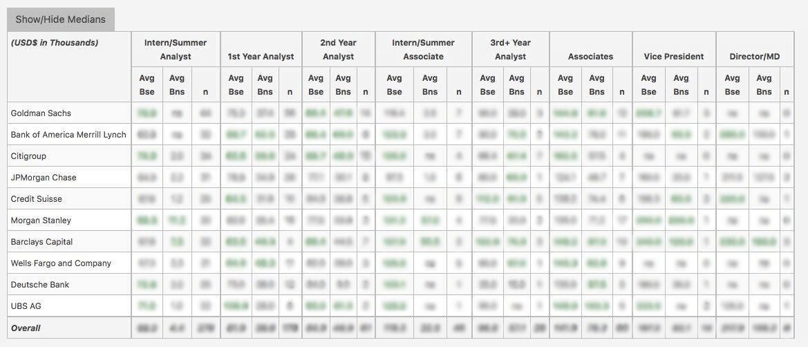
WSO Company Database Comparison Table
The Sage Group Interview Questions
or Want to Sign up with your social account?