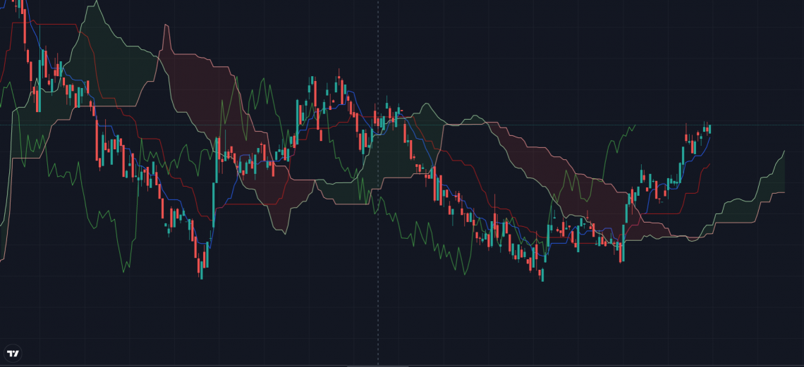
Ichimoku Cloud
A group of technical indicators that displays support and resistance levels, as well as momentum and trend direction


What Is The Ichimoku Cloud?
The Ichimoku Cloud is a group of technical indicators that displays support and resistance levels, as well as momentum and trend direction. It accomplishes this by plotting numerous averages on a graph.
Additionally, it makes use of this information to construct a "cloud" that aims to forecast where future price support or resistance will come from.
Goichi Hosoda, a Japanese journalist, created the Ichimoku Cloud, which was first published in the late 1960s.
It has a larger number of data points than a traditional candlestick chart. While it may appear sophisticated at first glance, individuals who are accustomed to chart reading will find it simple to comprehend due to the well-defined trading indications.
The indication is made up of five plots. The following are their names and calculations:
- Tenkan-Sen (Conversion Line): (High + Low) / 2 default period = 9
- Kijun-Sen (Base Line): (High + Low) / 2 default period = 26
- Chiku Span (Lagging Span): Price Close shifted back 26 bars
- Senkou A (Leading Span A): (TenkanSen + KijunSen) / 2 (Senkou A is shifted forward 26 bars)
- Senkou B (Leading Span B): (High + Low) / 2 using period = 52 (Senkou B is shifted forward 26 bars)
- The Ichimoku Cloud is a technical analysis tool that presents support, resistance, momentum, and trend direction by plotting several averages on a chart. It was developed by Goichi Hosoda in the late 1960s and offers a comprehensive view of market dynamics.
- The Ichimoku Cloud comprises five main components: Tenkan-Sen (Conversion Line), Kijun-Sen (Base Line), Senkou Span A, Senkou Span B, and Chikou Span (Lagging Span). Each component provides unique insights into market behavior, such as trend direction, support/resistance levels, and potential price movements.
- The Chikou Span provides buy and sell signals when it crosses the price from below or above, respectively. These signals can help traders identify potential entry and exit points in the market.
Components Of The Ichimoku Cloud
At first glance, its multiple lines and shades might seem overwhelming, but each component of the Ichimoku Cloud offers distinct insights into market dynamics.
1. Tenkan-Sen
The Tenkan-Sen, generally shown by a red line on the chart, is the first component of the indicator. It's a moving average that's generated by averaging the highs and lows over the previous nine periods.
If the Tenkan-Sen moves up or down, the market is said to be trending. If the line goes horizontally, however, the market is ranging.
2. Kijun-Sen
The Kijun-Sen is a support/resistance line that serves as a predictor of future price fluctuations.
A blue line is commonly used to depict it. The Kijun-Sen is comparable to the Tenkan-Sen, but it considers a larger time range, generally 26 periods as opposed to nine.
It is calculated by averaging the highs and lows over the previous 26 periods. The Kijun-sen often lags behind the Tenkan-sen when plotted on a chart because the former has longer periods than the latter.
3. Senkou Span A
The average of the highs and lows of the Tenkan-Sen and Kijun-Sen is shown 26 periods to the right as Senkou Span. The Senkou Span A is represented as an orange line on a chart.
The top and bottom lines become the first and second support levels, respectively, if the security price is above the Senkou Span A (orange line).
When the price falls below the Senkou Span A, the bottom and top lines, respectively, become first and second resistance levels.
4. Senkou Span B
It's determined by plotting the average of the previous 52 periods' high and low values 26 points to the right.
5. Chikou Span
A green line represents the Chikou Span, also known as the trailing span. It's made by taking the closing prices up to 26 periods to the left.
A purchase signal is displayed when the Chikou Span crosses the price from the bottom up. It is a sell indication if the line crosses the price from the top down.
Ichimoku Cloud History
It was created in the late 1930s by Goichi Hosoda, a Japanese journalist who used to go by the moniker Ichimoku Sanjin. Before exposing his results to the wider public in the late 1960s, he spent 30 years developing the approach.
Ichimoku Kinko Hyo translates to "one glance equilibrium chart" or "quick look at the balance chart" and is also known as "one glance cloud chart" because of the distinctive "clouds" that appear in the charting.
Ichimoku is a moving-average-based trend detection technique that gives a sharper picture of possible price action than regular candlestick charts since it comprises more data points.
The primary distinction between Ichimoku and other approaches is that Ichimoku's lines are drawn using the 50% point of the highs and lows rather than the candle's closing price.
Ichimoku, like William Delbert Gann's trading concepts, considers the component of time as an extra variable in addition to price movement.
Because the writers did not translate the original manual into English, German, or Spanish, it is only recognized in the Western world for its "graphic environment." Three more ideas, however, are merged to augment and enhance the indicator:
Ichimoku Cloud Calculation
In the case of the conversion line, the highs and lows are the highest and lowest prices seen over the period—for example, the highest and lowest prices seen during the past nine days.
The calculations will be done for you if you add the Ichimoku Cloud indication to your chart, but if you want to do it manually, follow these steps:
-
Determine the Base Line and the Conversion Line.
-
Using the previous formulas, calculate Leading Span A. This data point is generated and projected 26 cycles into the future.
-
Determine the Leading Span B. Plot this data point over the next 26 periods.
-
On the chart, plot the closing price 26 times in the past for the Lagging Span.
-
To make the cloud, the difference between Leading Span A and Leading Span B is colored in.
-
Color the cloud green when Leading Span A is greater than Leading Span B. Color the cloud red when Leading Span A is less than Leading Span B.
-
One data point will be created as a result of the preceding procedures. To make the lines, go through the procedures again when each period ends to produce fresh data points for that time. To produce the lines and cloud effect, connect the data points.
Ichimoku Cloud Signals
Using averages, the technical indicator displays essential information at a glance.
When the price is above the cloud, the overall trend is up; when the price is below the cloud, the overall trend is down. Lastly, when the price is in the cloud, the overall trend is trendless or transitional.
The gap between the lines is often colored green when Leading Span A is increasing and above Leading Span B, which helps to confirm the uptrend.
When Leading Span A falls below Leading Span B, it aids in the confirmation of the downtrend. In this situation, the gap between the lines is usually colored red.
Traders frequently utilize the indicator as a support and resistance region, depending on the price's relative placement.
Support/resistance levels in the cloud can be projected into the future. The indicator is distinguished from many other technical indicators by the fact that it provides support and resistance levels for the current date and time.
To enhance risk-adjusted returns, traders should combine this indicator with additional technical indicators. The relative strength index (RSI), which may be used to validate momentum in a certain direction, is usually employed in conjunction with the indication.
During a severe downturn, for example, the price may momentarily push into or slightly above the cloud before dropping again.
If you only pay attention to the indication, you'll miss the wider picture, which is that the price is under significant longer-term selling pressure.
Another method to use the indication is through crossovers. This might be a strong purchase indication. Holding the transaction until the conversion line dips below the baseline is one possibility. Any of the remaining lines might also be used as exit locations.
Interpreting the Ichimoku Cloud
The Leading Span A and Leading Span B lines form a cloud that may be used to determine the trend.
Short-term trading signals are identified by looking at the correlations between the price, the Conversion Line, and the Base Line.
1. Identifying the Trend
The cloud (Kumo) is the most visible aspect of the plots, and it is frequently used to determine the general trend. The cloud is formed by Leading Span A (green) and Leading Span B (red).
The average of the Conversion Line and the Base Line is the Leading Span A.
The green cloud boundary moves quicker than the red cloud border, which is the average of the 52-day high and low since the Conversion Line and Base Line are computed with 9 and 26 periods, respectively.
Moving averages work on the same premise. Moving averages with shorter periods are more sensitive and quick than those with longer periods.
Using the cloud, there are two methods for determining the general trend. First, when prices are above the cloud, the trend is up; when prices are below the cloud, the trend is down; and when prices are in the cloud, the trend is flat.
Second, when the Leading Span A (green cloud line) is rising and above the Leading Span B, the uptrend is reinforced (red cloud line).
A green cloud forms as a result of this circumstance. When the Leading Span A (green cloud line) is dropping and below the Leading Span B, a downtrend is confirmed (red cloud line).
A crimson cloud appears as a result of this circumstance. Because the cloud has been pushed forward for 26 days, it may also be used to predict future support or resistance.
2. Identifying Trading Signals
To recognize quicker and more frequent signals, price, the Conversion Line, and the BaseLine are employed. It's vital to note that when prices are above the cloud and the cloud is green, positive signals are reinforced. When prices are below the cloud and the cloud is red, bearish signs are reinforced.
To put it another way, bullish signals are favored when the larger trend is up (prices above the green cloud), whereas bearish signals are preferred when the larger trend is down (prices below the green cloud). This is what trading in the direction of the larger trend is all about.
3. Conversion-Base Line Signals
When the Conversion Line crosses over the Base Line during an uptrend, a positive signal is generated. Similarly, during a downturn, the Conversion Line crossing below the Base Line is a negative indication.
4. Price-Base Line Signals
When the price crosses above the Base Line during an uptrend, a bullish signal is generated. In a downtrend, a price crossing below the Base Line is a negative indication.
5. Bullish Signals
- Price climbs above the cloud
- The cloud changes color from red to green (ebb-flow within trend)
- Price has risen over the Base Line (momentum)
- The Conversion Line has risen over the Base Line (momentum)
6. Bearish Signals
- Price moves below the cloud
- The cloud changes color from green to crimson (ebb-flow within trend)
- Price drops below the Base Line (momentum)
- The Conversion Line has dropped below the Base Line (momentum)
Ichimoku Cloud FAQs

"Ichimoku" means "one look" in Japanese, alluding to the notion that support and resistance levels may be determined with a single glance.
The Tenkan-Sen and Kijun-Sen are the Japanese terms for the moving average lines employed in the indicator.
- The Tenkan Sen is the average of the previous nine periods' highest high and lowest low prices.
- Over the last 26 periods, the Kijun Sen is the average of the highest high and lowest low.
The Ichimoku Cloud employs averages, although they are not the same as a moving average. Simple moving averages combine closing prices and divide the sum by the number of closing prices.
The closing prices for the previous ten periods are summed, then divided by 10 to generate the average in a 10-period moving average.
Take note of how the Ichimoku Cloud estimations differ. They are calculated by dividing a period's highs and lows by two. As a result, even if the same number of periods are employed, Ichimoku averages will differ from regular moving averages.
There is no such thing as a better indication; they just give information in various ways.
With all the lines, the indicator may make a chart seem cluttered. To address this, most charting software allows you to hide particular lines.
For example, all of the lines except Leading Span A and Leading Span B, which form the cloud, can be concealed. If all of the lines are distracting, each trader should focus on which lines give the greatest information and consider concealing the others.
The Ichimoku Cloud also has the drawback of being based on past data. Despite the fact that two of these data points are projected in the future, the algorithm is not intrinsically predictive. Averages are only projected into the future.
The cloud might also become unimportant over time if the price remains far above or below it. The conversion line, the baseline, and their crossovers become more relevant at times like these since they are typically closer to the price.

Free Resources
To continue learning and advancing your career, check out these additional helpful WSO resources:


or Want to Sign up with your social account?