We took the suggestion and contructive criticism seriously a few short months ago in this thread: http://www.wallstreetoasis.com/blog/wso-site-suggestionslet-me-hear-it
...and we have a LOT more work to do, but redesigning the comments and forums was not an easy undertaking and something that I really think helps the UI.
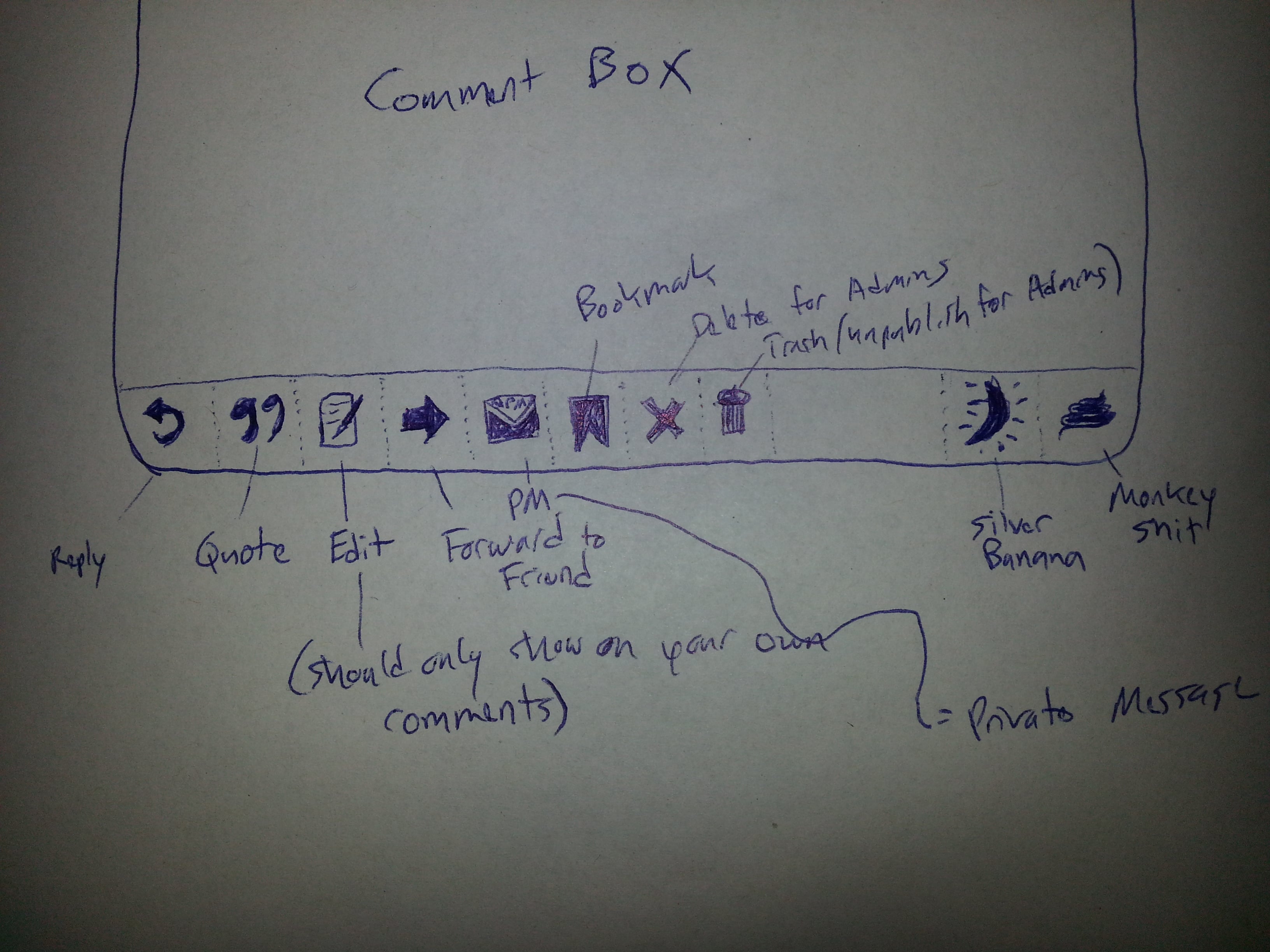
The white user navigation bar along the top will also get some refreshed icons next and we still have some stuff we can do to integrate better UI with jquery / dynamic features...so we're on it. Just wanted to give an update...also attached some of the iterations so you can see some of the work behind the design.
Thanks,
Patrick
| Attachment | Size |
|---|---|
| original-post icons.jpg 22.54 KB | 22.54 KB |
| new-wso-icons-mockup.jpg 2.08 MB | 2.08 MB |


I dont like not being having trouble being able to see how much MS has been thrown at something.
good point, what if I were to make it so the Content Score was not opaque? so that is already "faded in"?
good point, what if I were to make it so the Content Score was not opaque? so that is already "faded in"?
Agree w STA. And as an aside, hoooooooooooly shit, I just re-read my comment from earlier, and it has more double entendres than a high school pep rally.
Labore pariatur non repellat possimus voluptatem iste. At pariatur pariatur quisquam ut atque tempora. Nemo rerum voluptas ut ut sit. Ex aliquam soluta nulla assumenda optio officia quos. Eius nostrum sit sed est.
Necessitatibus id facilis est et quia tempora animi debitis. Magnam et velit possimus. Dolores et iusto eos dolor quam.
Beatae a et et ducimus est rerum totam. Laudantium quis et quo pariatur odio accusamus at laudantium. Facilis voluptates nemo quas accusamus eaque repellendus qui.
See All Comments - 100% Free
WSO depends on everyone being able to pitch in when they know something. Unlock with your email and get bonus: 6 financial modeling lessons free ($199 value)
or Unlock with your social account...