Error Bars in Excel
An Excel feature represents the data variability and uncertainty graphically in data points, visually representing the potential error or any deviation related to data points.

What are Error Bars in Excel?
Error bars in Excel represent the data variability and uncertainty graphically in data points, visually representing the potential error or any deviation related to data points.
Excel can be used to analyze and interpret data numerically and graphically. Graphs and charts make it easy to analyze and quickly absorb large amounts of data.
Error bars are a line across a point in a graph, parallel to either of the axes, that portrays the uncertainty of a variable.
Error bars provide an idea of the standard deviations or margins of error in a particular piece of data in the graph. They are important when you have variable data, i.e., data with deviations like budget estimates.
Graphs are much easier to interpret and can be interpreted much faster than numerical data. This is why it is important to know how to display data graphically.
Below you will find information on how to create a graph and various ways to use Error bars in Excel to make your data look professional and unique.
- Error bars are graphical representations used in Excel charts to indicate the variability or uncertainty in data points. They visually represent the potential error or deviation associated with each data point.
- Error bars provide additional information about the reliability and variability of data points in a chart, helping viewers understand the precision of measurements or the spread of data.
- Error bars are commonly used in scientific research, statistical analysis, and data visualization to convey uncertainty or variability in data.
- The best practices under error bars in Excel include using appropriate error bar types, labeling error bars, and validating error bar settings, and the bar types should be selected according to the needs to be catered.
How to Create a Graph in Excel
Large numerical data, although organized in tabular form, are time-consuming to analyze, and you may end up overlooking finer details in the data. Graphs or Charts come in handy in this scenario.
Before adding Error bars, first, we must know how to add a graph in Excel. To add a graph using a dataset is simple. Below you will see steps to add a graph or chart in Excel.
Step 1:
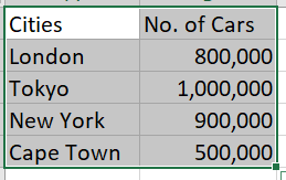
First, we must select the data we want to display in a graph.
Step 2:
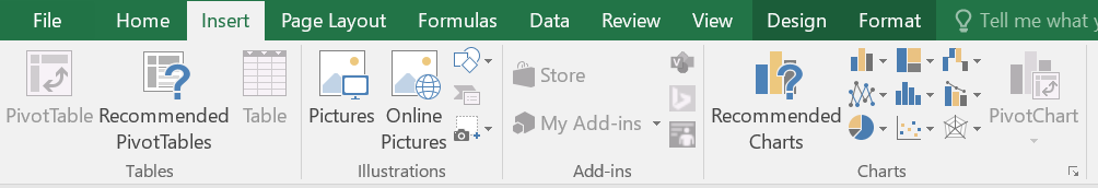
Select the Insert Tab, and in the Charts section, Click on the Recommended Charts.
Step 3:
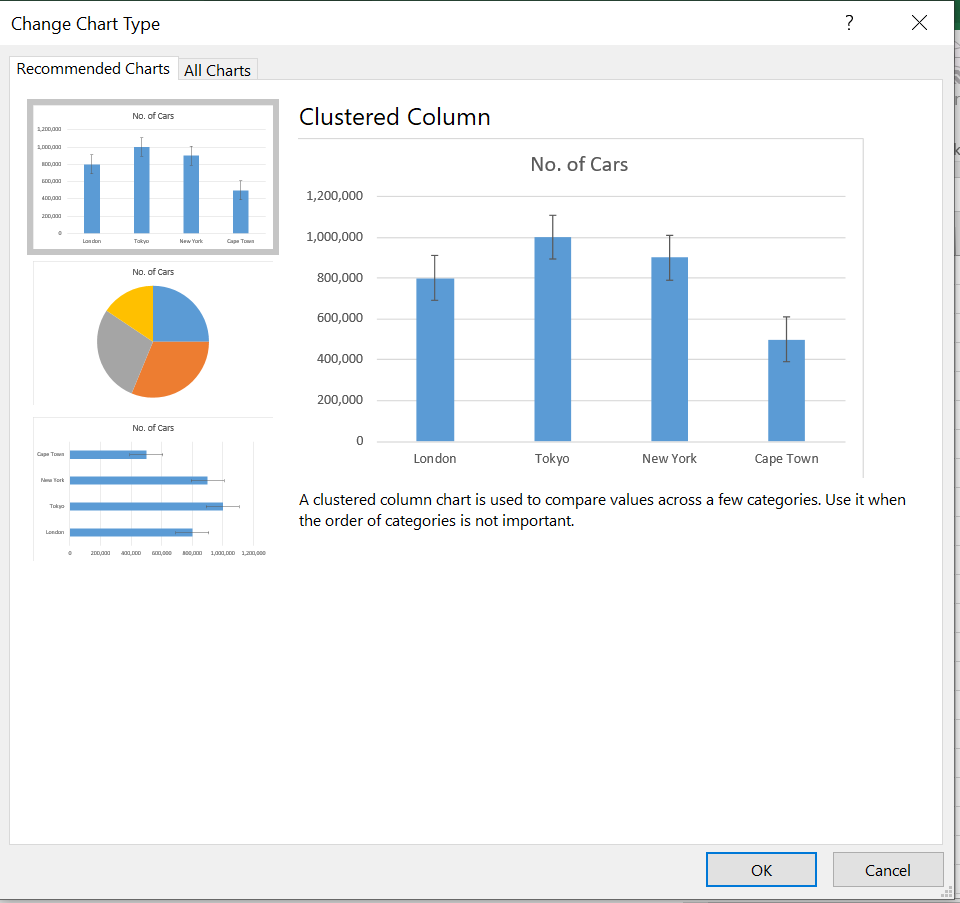
The ‘Change Chart Type’ dialog box will open up. You will see ‘Recommended Charts’ in Excel. You can select from these charts or the chart you want in the ‘All Charts’ tab. After selecting a chart, click OK.
Step 4:
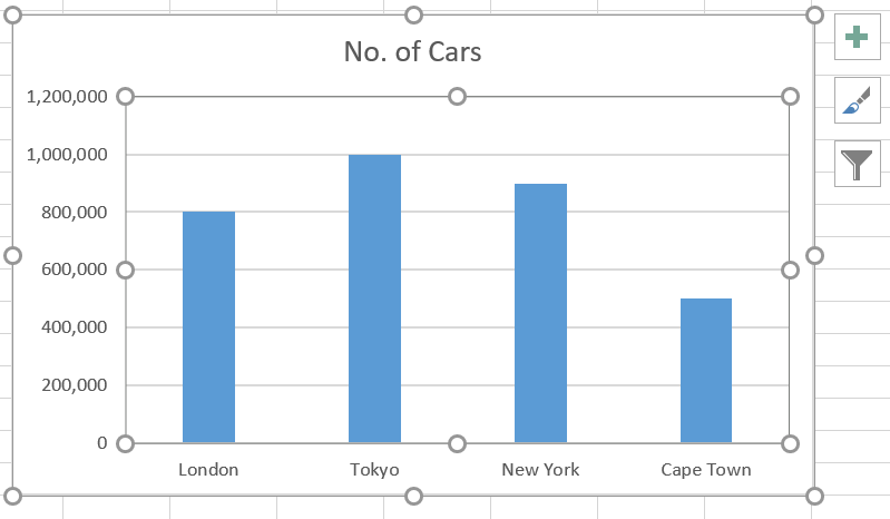
You will see the chart displayed in the middle of the worksheet.
How to Add Error Bars in Excel?
Error bars are added to show the data variability in the graph. They are especially important when your data is inaccurate, like budget and cost estimates.
Error bars can be easily added in Excel 2013 and above. To add Error bars, just follow the steps below.
Step 1:
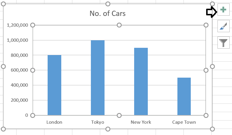
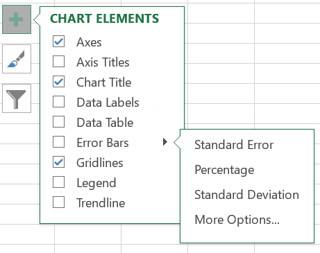
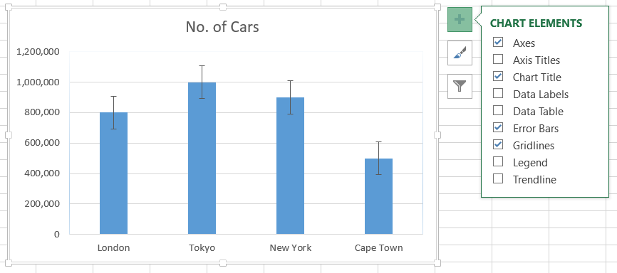
With the graph selected, Click on the Chart Elements button (The plus sign) in the top-right corner of the chart.
Step 2:
In the Chart Elements box, click on the Error bar or select the right arrow to see more options.

Step 3:
Click on the more options to fully customize your error bars. You will see a Format Error Bars panel on the right side of your worksheet. Here, you can customize the direction, style, and error amount.
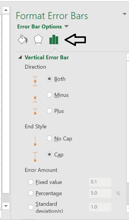
You can also click on the three individual symbols (marked by an arrow in the image) to change the line or have a shadow behind the error lines. The customization options are endless.
Note
In Excel older than 2013, click on the graph, and in the Layout tab, click on the Error bars.
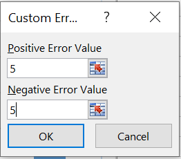
How to Add Custom Value Error Bars
The default Error bars are based on Standard Error. However, you may want them to be based on your custom value. For example, you can set a custom value for positive and negative points. Steps to add custom value Error Bars:
Step 1:
With the graph selected, Click on the Chart Elements button (The plus sign) on the top-right corner of the chart.

Step 2:
In the Chart Elements box, click on the right arrow in the Error bar to see more options.
Step 3:
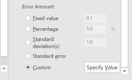
The Error Bar options will open. Scroll to the end and Click on the circle near Custom. Here, you can customize the bars by specifying the value.
Step 4:
A small Custom Error Bars pop-up box will be displayed with a positive and negative Error value. You will see that each box has an equal sign with the number 1 in curly brackets {}.
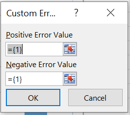
Step 5:
You can type the value you want in each box. You do not need to press equal to or add curly brackets; Excel will do that automatically. If you want to display positive or negative error bars, press 0 in the corresponding box you do not want to show. Then, click OK to see the results.

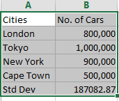
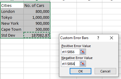
How to Use Specific Calculations as Error Bars
We have seen above how to add error bars and customize error bars. In addition, Excel shows standard deviation error bars according to its program. But what if we want to set the standard deviation rate of error bars manually?
We can add this information in the customize error bar and then display the information in the chart. Steps to add specific calculations as Error Bars:
Step 1:
First, we will select the table with our data and create a chart from it.
Step 2:
In the Custom Error Bars dialog box, set the Positive error value by selecting the cell with standard deviation. Next, do the same with the Negative value.
Step 3:
You will see that the error bars are set according to the standard deviation in the table.
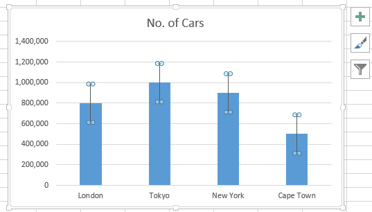
How to Insert Error Bar for Specific Data in a Multiple Data Graph
We have seen simple graphs with only one data set in the above examples. Thus it was easy to add an Error bar. But you may come across graphs with multiple data sets and need an Error bar on only one data set.
Here, you will realize that you cannot just select the Error bar option in Chart Elements, as the bars will be shown on all the Data sets. Instead, you will have to manually select the data set in the chart where you want to insert Error bars.
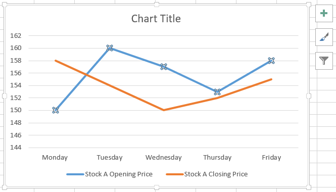
In the example below, you will see data on Stock A with both opening and closing prices. We want to insert Error bars on only the opening price. Follow the steps to see how this can be done. Steps to insert Error Bars for specific data:
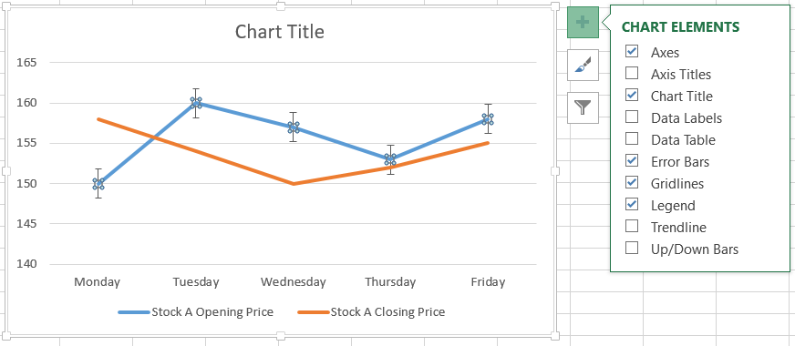
Step 1:
Click on the specific Data set in your Error bar.
Step 2:
In the Chart Elements box, tick the Error Bars box. You will see the bars are displayed on the opening price data only.
How to Customize Error Bars
Excel offers us endless options and ways to work on our data. The charts themselves can be modified and customized in various ways. Here, you will see a little insight into how you can customize your Error bars. Steps to Customize Error Bars:
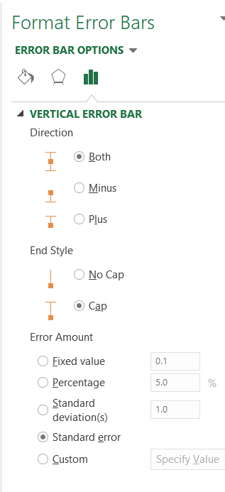
Step 1:
Click on the right arrow and click on the More options to open the Format Error Bars panel. Here you will first see the Error bars options under which you can change
- The direction of the Error bars
- The End style
- Lastly, choose between various calculations ( Standard Deviation, Percentage, etc.) on which Error bars will be based.
Step 2:
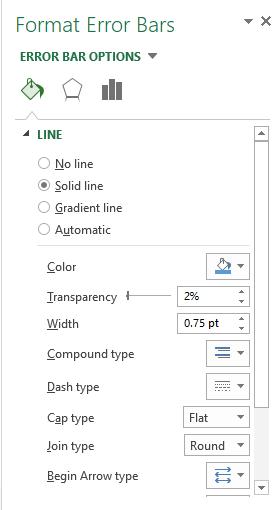
The Paint symbol is the Fill & Line heading, under which you will find customization in-
- Error bars line types (Solid, Gradient, No line)
- You can also choose between different colors, transparency of line, arrow type and size, etc.
Step 3:
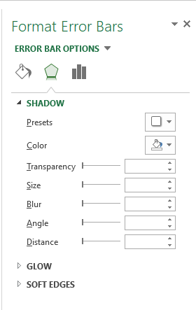
The Effect section has three sub-headings with many customization options under them, like
- Shadow: The shadow section has Presets, Color, and other customization options which change the shadow effects on the Error bars.
- Glow: This section customizes Presets, Color, Size, and Transparency on the glow.
- Soft Edges: This section customizes the soft edges of Error bars.
How to Remove Error Bars
Error bars are only useful when your data has statistical uncertainty or variability. This means that it is not useful with fixed data sets. If you have accidentally added Error bars to a fixed data set, consider removing it.
Suppose you have added Error bars and want to remove them or have a chart sent to you by a colleague with error bars you no longer want. First, you will need to know how to remove Error bars.
Whatever the reason, we have got you covered. Removing Error bars from your chart is easy. Below are the steps to remove Error bars.
Step 1:
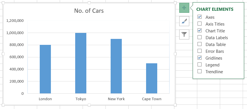
Click anywhere on the chart to select it. Three symbols will appear at the top right corner of the chart. Next, click on the Plus sign to open the Chart Elements box.
Step 2:
In the Chart Elements box, just uncheck the error bar box, and the error bars will be removed.

Free Resources
To continue learning and advancing your career, check out these additional helpful WSO resources:


or Want to Sign up with your social account?