Waterfall Charts
These are the type of bar chart often used to show how a value progresses from one state to another.


What Are Waterfall Charts?
Waterfall charts are the type of bar chart often used to show how a value progresses from one state to another. For example, you could use this chart to show how a product goes through the stages of development, from idea to production.

These charts are useful because they visually represent how a value changes over time. This can be helpful when trying to understand trends and identify areas of improvement.
If you're working with data in Excel, you can easily create this chart using the built-in charting tools. In this article, we'll show you how to create a waterfall chart in Excel and share some tips on how to use them effectively.
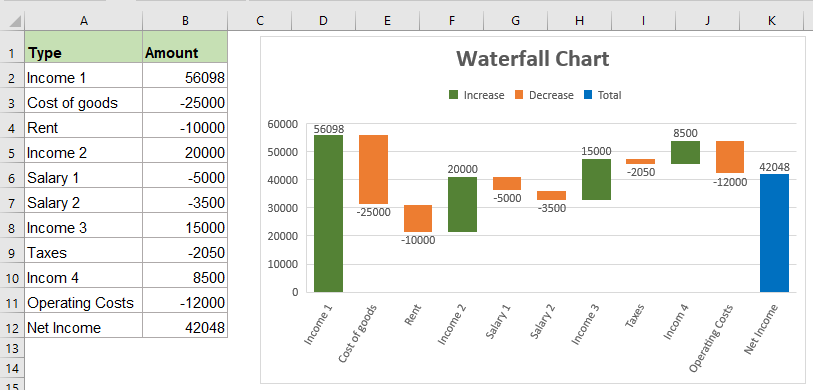
This chart is a very useful tool that allows you to see the impact of positive and negative values on a cumulative total. These charts are often used in corporate finance to track the progress of key financial metrics, such as revenue, expenses, and profit.

Excel has a built-in waterfall chart feature that makes it easy to create such charts. To create one in Excel, you'll need to have your data organized in a specific way.
First, you'll need a column for your categories, followed by columns for your starting, positive, and negative values. You can then use the waterfall chart feature to create your chart.
These can be very helpful for businesses, especially when tracking financial data. This chart is a great option if you need to track any cumulative total.
Key Takeaways
-
Waterfall charts visually demonstrate how a value progresses over time or categories, aiding in understanding trends and identifying areas of improvement.
-
Excel provides built-in tools for creating waterfall charts, making it easy to represent cumulative changes or contributions to a value.
-
Waterfall charts are particularly useful in finance for tracking financial metrics and understanding the impact of positive and negative values on a cumulative total.
-
These charts can be created by organizing data in specific columns in Excel and utilizing the waterfall chart feature.
-
Waterfall charts are versatile and applicable in various situations, whether tracking financial data or analyzing the contribution of different factors to a total value.
Understanding A Waterfall Chart
It is a type of graph that shows how a value changes from one point to another. For example, it is often used to show how a company's revenue or profit changes over time.
It is named as such because it resembles a waterfall, with the tallest column representing the highest value and the shortest column representing the lowest value.
These charts can be created in Excel using the built-in charting tools. To create one, you will need to create a data table with two columns: one for the categories and one for the values. You can then use the built-in chart wizard to create the waterfall chart.
These charts often visualize how a value changes over time or how different components contribute to a total value.
For example, this chart could show how a company's revenue changed from one quarter to the next or how different expenses/revenues contributed to a total loss/profit.
These can be helpful in a variety of situations. For example, if you're trying to understand how a value changes over time or how different factors contribute to a total value, these charts can be helpful.

Waterfall Charts Uses
These charts are a type of chart that is often used to show the cumulative effect of positive and negative values. This type of chart can be useful for showing how a series of events has led to a particular result.

They can be used for a variety of purposes, such as:
- Showing the impact of individual items on a total
- Showing how a series of events has led to a particular result
- Comparing the relative impact of positive and negative values
If you need to create a waterfall chart in Excel, there are a few different ways. You can use a built-in Excel template, create your waterfall chart from scratch, or use a third-party add-in.
However, creating your own from scratch is not difficult, and we’ll show you how to make one in the following section. In short, you will need to gather the data you would like to illustrate, find the waterfall chart tab, then create and customize it to your liking.
Whichever method you choose, creating a waterfall chart in Excel is a relatively straightforward process.
How to make Waterfall Charts
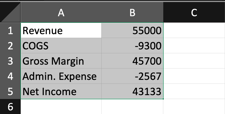
Creating a waterfall chart in Excel is a fairly simple process. First, you will need to gather your data. This data should include a start value, an end value, and any intermediate values you want to include.
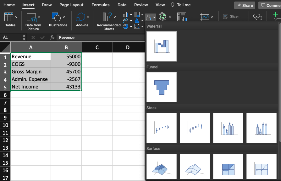
Once you have your data, you will need to create a bar chart. First, select your data and then click the “Insert” tab to do this. Then, click on the “Waterfall” chart type.
Once you have created your chart, you can customize it to your liking. You can change the colors, add labels, and utilize the quick layout and chart elements tabs to make your chart fit the data and message you’re trying to convey.
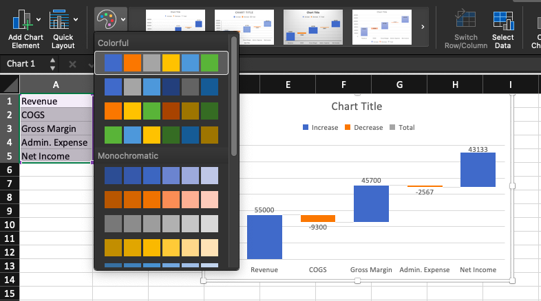
Adding labels requires you to go to the “add chart element” tab, where you can find various customization options. This is where you’ll find most labeling options, from legends to chart titles, axis titles, and more.
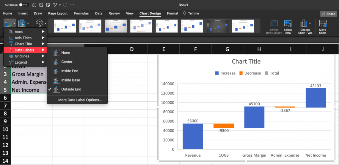
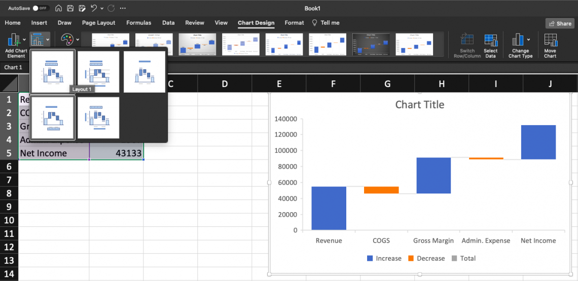
The “quick layout” tab, next to the “add chart element” tab, allows you to format your information within the chart differently. This tab may be useful if you want a certain aesthetic arrangement or are simply looking for a different way to display the same information.
To summarize:
1. Create a data table with the relevant info you want to display in your waterfall chart
2. Select data, go to the “insert” tab, and click “waterfall” chart type
3. Customize, add labels, and structure the chart in a way that makes the most sense within the context of your info.


or Want to Sign up with your social account?