While we did discuss a potential new theme / look for WSO in this previous blog post of mine: //www.wallstreetoasis.com/blog/rough-draft-of-potential-new-design-colors
...the overwhelming majority of you voted for a more muted grey background. With that in mind, my graphic designer came up with a simpler / cleaner layout with more grey, less blue, etc...below is the mockup.
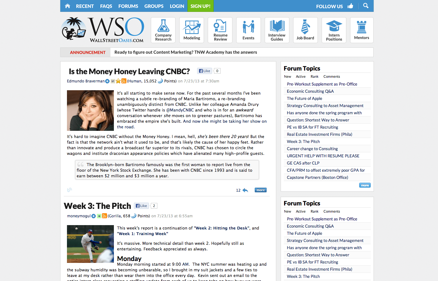
Do you currently prefer the current look (A) or potential new look (B) below:
Thanks again for your feedback guys!
Patrick


I think B; the announcement heading could be useful, and the sparse use of blue throughout will make it easier to know where "action" items are.
Any way that you could attach the picture so we can click on it and see a big version?
done
I like B as well
I like B.
I like B as well.
A looks good.
As a side note, I think there is an issue with your search function.
After inputting a term into the search box, I decided to filter by year.
Doing so opened the option to choose a month. When I tried to cancel the filter, the search function changed my term to "SF" and gave me new results with the filter still applied.
Filter blocks on Search should be working again...look good?
Thanks, Patrick
yes, that's a known issue we are trying to fix asap...thanks
B looks better
B looks best
looks like B it is!
We made some slight changes to the one you see above, but the idea will stay the same...more muted grey behind white content elements with blue nav bar along the top.
Look for us to push it live my mid August.
Thanks guys! Patrick
B is for beautiful. Yes, I am hungover. Really though, great work Pat!
Update: A lot of progress on our dev server with this new design...should have version 1.0 pushed live by enf of week at latest. Maybe even tomorrow.
Cool cool, one other question: why when I click "new" or "active" under, say, the Forum Topics box at the top right of the sidebar does it take me to a new page? Used to be that I could click those and it would stay on the same page, just switch the box
If this is the new theme... fuck yea
yes it is...some other cool things coming, but this is the base. hopefully more work friendly too
Yeah this actually looks a lot better than I anticipated
Thanks Kassad, my team appreciates that :-)
Looks great! Amazing how much this site has changed recently.
Thank you
Perhaps it's my screen settings, but I would prefer just a little bit more contrast between the white and gray background. But in general, the new design looks great.
yeah, it's something we are thinking about...we don't want to make the site feel too "grey" or dark, but maybe a touch more contrast would help?
I think a touch more contrast would be helpful for me, but perhaps I'm in the minority.
holy smokes this is really freaking bright.
Yea the brightness is the only qualm I have about the new look.
One other glitch:
When I move my mouse over the monkey icon, the drop down menu appears - however, when I move my mouse over the menu to select something, it disappears.
I've noticed that this only happens on the homepage, not when you're in a thread.
Thanks - some fixes coming to site later today including this one and some cool new features..stay tuned!
It happens to me everywhere on the site. If I keep my mouse hovered over the link for an extra half second to a second, I can continue using the menu
yeah, it's really broken as I mentioned...will be fixed by end of day.
Thanks
this is fixed now
Loving it. I assume the buttons at the top will also soon lose their iOS6-ish glare and be replaced with a flatter theme to fit the rest of the site?
That has been hotly debated :-)...when we looked at them flat, they matched better but then were very bland and looked "unfinished"...open to suggestions on how to make sure they still "pop" with a flatter look?
darker grey getting pushed across later today that helps the white sections stand out better and will create less glare to those with bright screens, but not sure if we'll be changing the tiles anytime soon.
We now have a slightly darker grey and more textured background to provide more contrast to those of you that keep your computer on bright levels...any thoughts?
cool. when you look at the user profile, "social login identities" doesn't fit in the box. just a heads up.
I like it. I think the enhanced contrast is an improvement
The slight change = much better
Et numquam rerum adipisci qui voluptatem tempore facilis dignissimos. Repudiandae cupiditate atque aut explicabo. Qui libero odit dolores. Id ut laudantium nulla molestiae est rerum. Est quia reiciendis non veniam. Eos sunt nobis esse dolor non.
Eius consequatur laboriosam est. Quia corporis quo tenetur veritatis asperiores. Quo vel et exercitationem iste. Et mollitia non sapiente ad qui voluptatum. Ea eaque in et nostrum recusandae autem. Quasi est sequi minus at suscipit debitis. Ea suscipit amet et non eos.
Et voluptatem architecto corporis numquam ab quod aut cumque. Ipsa ut est voluptas. Corrupti asperiores provident quia eligendi. Ratione mollitia voluptatum in eos tenetur. Ut magni provident error voluptatem ut blanditiis aut. Delectus est dolor minima saepe.
See All Comments - 100% Free
WSO depends on everyone being able to pitch in when they know something. Unlock with your email and get bonus: 6 financial modeling lessons free ($199 value)
or Unlock with your social account...
Dolorum vel explicabo et qui minima similique et amet. Praesentium voluptates quibusdam reprehenderit et non quam voluptatem illo. Dolor quo harum enim sint ipsam est.
Ut alias minus quia quod voluptatem recusandae voluptas sint. Exercitationem nostrum itaque aut iusto adipisci sunt tenetur qui.
Ea tempore error enim quis nulla quaerat est. Doloremque cumque veniam quas omnis consequatur alias autem. Deleniti rerum saepe sed qui quia. Odit debitis dolor iusto perferendis dolorum sit distinctio non.
Earum id aut et deleniti consectetur dicta. Temporibus odit voluptatem sequi est praesentium unde.