
Houlihan rebranding

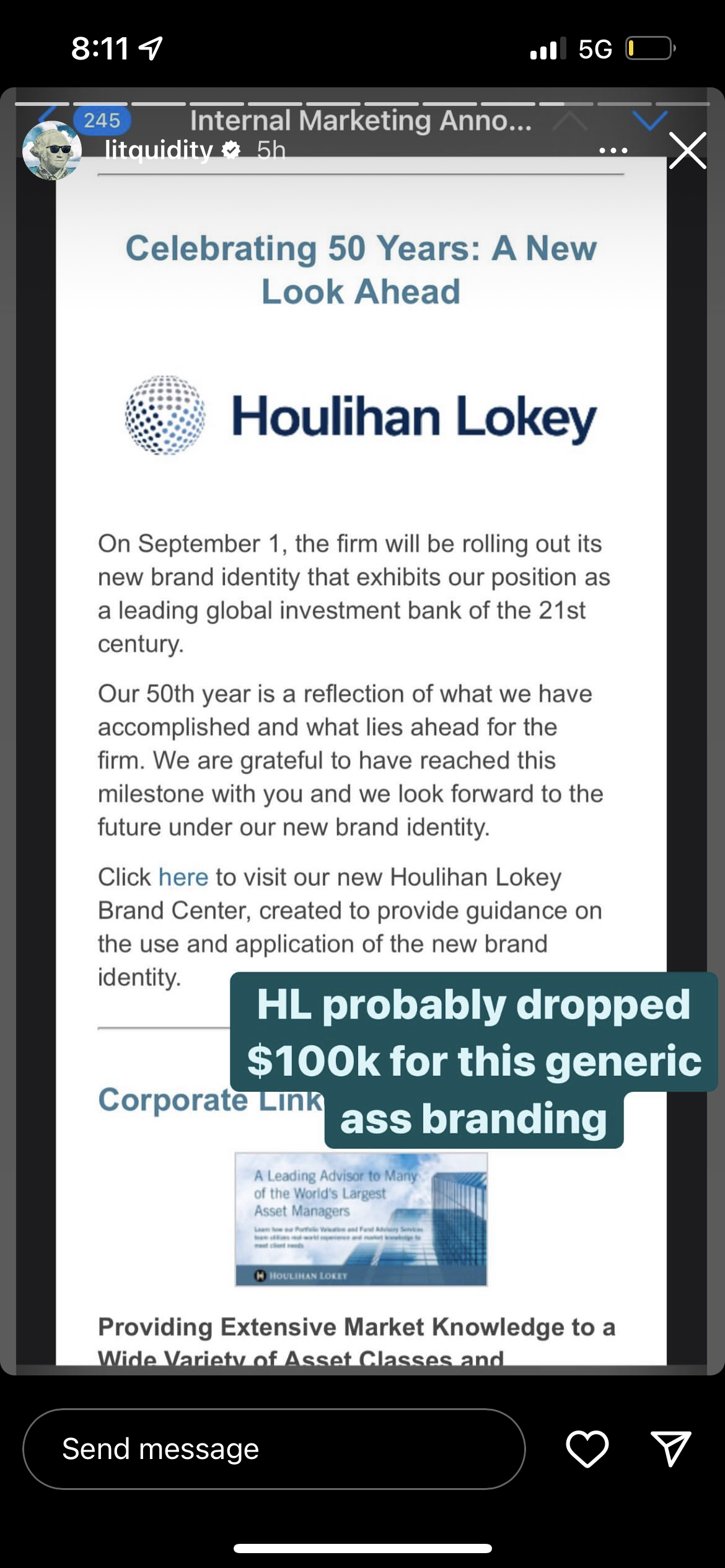
Houlihan announced that they’re rebranding the firm’s aesthetics on September 1 — personally think this new design looks wack as hell. Old HL was classic
Houlihan announced that they’re rebranding the firm’s aesthetics on September 1 — personally think this new design looks wack as hell. Old HL was classic
| +211 | Just One More Year | 17 | 4h |
| +178 | Piper Sandler in talks to acquire PWP | 74 | 5d |
| +124 | UBS Appears to be Exploring Sale | 19 | 2d |
| +87 | Paradise Is Paradise | 8 | 9h |
| +77 | Drunk VP. How to manage? | 27 | 1d |
| +38 | How do I take my foot off the gas? (AN1) | 4 | 1d |
| +38 | Lazard US Views 2026/2027 | 13 | 1d |
| +32 | M&A is Paradise | 1 | 6d |
| +25 | Why did EVR succeed vs GHL or PWP that ended up getting acquired? | 7 | 3d |
| +24 | HR is starting to worry me, do I throw a hail mary during an upcoming chat with an MD? | 4 | 51m |
Career Resources

Get instant access to lessons taught by experienced private equity pros and bulge bracket investment bankers including financial statement modeling, DCF, M&A, LBO, Comps and Excel Modeling.





Short HL. Will probably renege SA '23 offer due to how prestigious this "rebranding" is.
Eh, it's fine. One of the few cool things about GCA was their logo, and the shadowy diamond in the H was always a bit confusing to me.
globe thing looks generic but the old logo was possibly the ugliest logo among IBs so definitely an improvement
Honestly the logo makes it look generic (besides in IB logos are usually the bank name alone), but to me the #1 issue is the loss of the color scheme. Black and gold was unique and distinct.
The "Houlihan Lokey" looks similar to Rothschild's logo
Change of logo = Salary bump
Quisquam iusto repudiandae dolor qui et. Laudantium eum aut adipisci ducimus consequatur architecto. Molestiae voluptates corrupti ut est. Sit sunt exercitationem vitae occaecati architecto dignissimos. Asperiores soluta in eaque consectetur est pariatur voluptatem a.
Modi necessitatibus fugiat at nostrum quos. Et sit qui sed esse sed dolores voluptatem error. Non ipsam ducimus vel omnis a. Dolorem quisquam saepe eaque maiores nihil eum.
Expedita deserunt dolorem et iusto. Quisquam sequi est ducimus quia et repellat perferendis.
Pariatur voluptatem eum qui omnis. Eum nesciunt suscipit architecto est sapiente dolorem facere. Ut omnis voluptatem aliquid magnam.
See All Comments - 100% Free
WSO depends on everyone being able to pitch in when they know something. Unlock with your email and get bonus: 6 financial modeling lessons free ($199 value)
or Unlock with your social account...