
Investor Presentations.. Mediocre Formatting/Design Standards?

Is it just me or have you also noticed that a lot of the investor presentations put out by F500 firms look like they were put together by middle-schoolers?
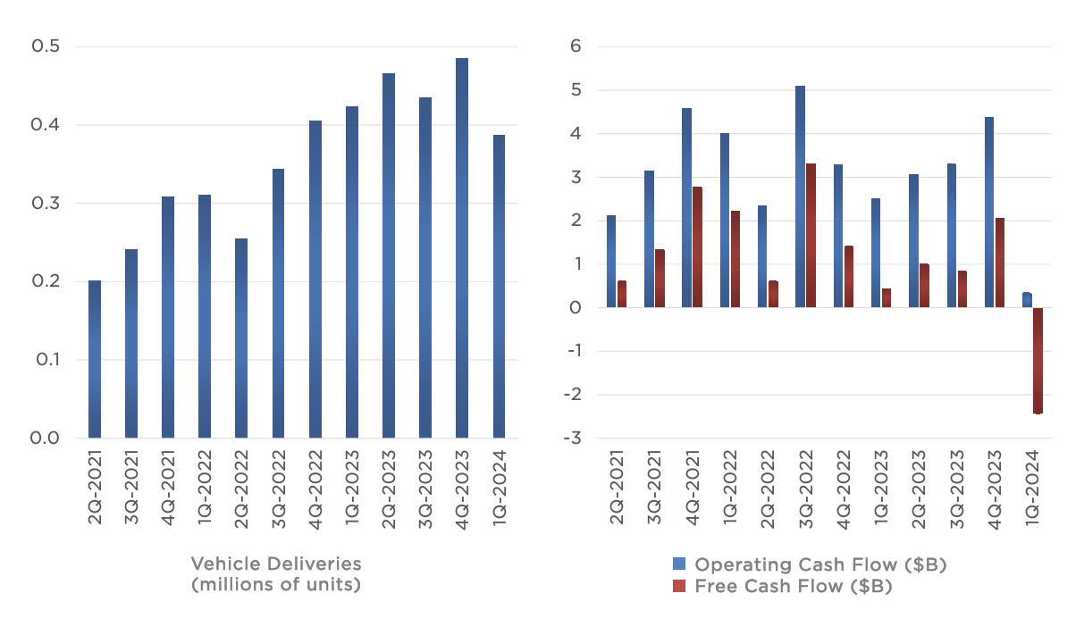
I was recently reviewing Tesla's latest earnings presentations and was very put off at the way they were presenting data on graphs (no labels on the bar graphs, bad formatting, etc). I'm pretty sure we would all get reamed out by Senior Bankers if we tried submitting something of this nature.
I've seen some good Investor Presentations before but it seems a lot of Investor Relation groups get away with putting out very bad quality slides. Any thoughts?






Oh please do not become an MD you will be awful to work for....
It's because the real audience of investor presentations are asset managers, hedge funds and ER and those Chads don't give a phuck about formatting. Only dweeby ib Bankers who are not investors care.
Molestiae sed velit tempora voluptatem. Odio eos porro error et tenetur. Praesentium ex atque nostrum totam quibusdam ut. Ut hic est et odit ad accusantium.
Facilis facilis laboriosam nisi temporibus sed ullam eum. Nemo eos voluptatem magni nulla eligendi. Eligendi delectus quo et et illum soluta perspiciatis quam. Et dolores unde consequatur molestiae ab. Nam voluptatem facere ex similique quod officia. Enim quis neque harum amet culpa labore et. Et voluptatem amet rem molestias soluta ab.
Et nisi perferendis ipsa. Quo nihil qui accusantium nemo. Consequatur eligendi quo ducimus et. Laboriosam vitae velit cumque accusamus soluta similique quam. Et eum occaecati maxime explicabo voluptas perferendis vitae.
Dolores tempora tempora explicabo at non. Adipisci distinctio ea velit velit. Odit deserunt voluptas tempore consequatur. In corporis ea nisi vero dolores.
See All Comments - 100% Free
WSO depends on everyone being able to pitch in when they know something. Unlock with your email and get bonus: 6 financial modeling lessons free ($199 value)
or Unlock with your social account...