This should go without saying, but since there is still resistance in some practitioner circles to this notion, I will say it anyway. Some countries are riskier to invest in, either as an investor or as a business, than others. The risk differences can be traced to a variety of factors including where the country is in the life cycle (growing, stable or declining?), the maturity of its political institutions (democracy or dictatorship?, smoothness of political transitions), the state of its legal system (in terms of both efficiency and fairness) and its exposure to violence. Not surprisingly, how you perceive risk differences will depend in large part on which dimension of risk you are looking at in a country.
While I look at risk measures that look at
threat of violence, degree of corruption,
dependence of the economy on a commodity (or commodities) and
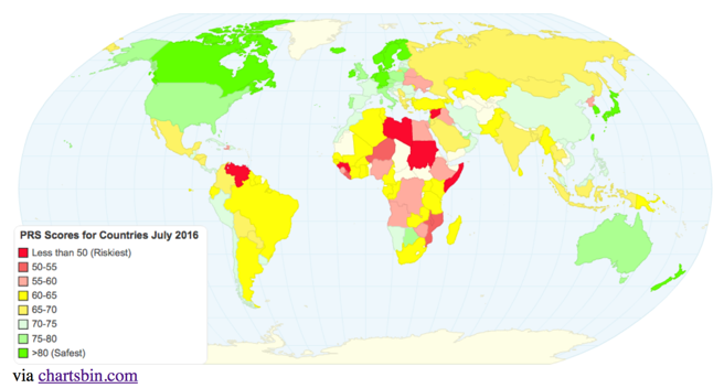
protection of property rights individually in the full paper, I also report on a composite measure of risk that I obtain from Political Risk Services (PRS), a Europe-based service that measures country risk on a numerical scale, with lower (higher) numbers representing more (less) risk. The picture provides a heat map of the world using this measure as of July 2016. (The heat maps don't seem to show up on some browsers. So, I have replaced them with snapshots. If you click on the links below the snapshots, you should be able to see the heat maps.. I think).
As we move from 2015 to 2016, it is interesting to see how much risk changed in countries, rather than the level of risk, and again using political risk score, the heat map above reports on changes in the PRS score over the last year (if you hover over a country, you should see it).
Finally, there is an alternate and more widely used measure of country risk that focuses on country default risk, with sovereign ratings for countries from Moody's and Standard & Poors (among others) and the picture below provides these ratings, as of July 1, 2016, globally:
I know that ratings agencies are much maligned after their failures during the 2008 crisis, but I do think that some of the abuse that they take is unwarranted. They often move in tandem and are generally slow to respond to big risk shifts, but I am glad that I have their snapshots of risk at my disposal, when I do valuation and corporate finance.
Country Risk: Market measures
There are two problems with non-market measures like risk scores or sovereign ratings. The first is that they are neither intuitive nor standardized. Thus, a PRS score of 80 does not make a country twice as safe as one with a PRS score of 40. In fact, there are other services that measure country risk scores, where high numbers indicate high risk, reversing the PRS scoring. The second is that these non-market measures are static. Much as risk measurement services and ratings agencies try, they cannot keep up with the pace of real world developments. Thus, while markets reacted almost instantaneously to Brexit by knocking down the value of the British Pound and scaling down stock prices around the globe, changes in risk scores and ratings happened (if at all) more slowly.
The first market measure of country risk that I would like to present is one that captures default risk changes in real time, the sovereign credit default swap (CDS) market. The heat map below captures sovereign
CDS spreads globally, as of July 1, 2016:
Note that the map, if you scroll across countries, reports three numbers: the
CDS spread as of July1, 2016, a
CDS spread net of the US
CDS (of 0.41%) as of July 1, 2016 and the in the sovereign
CDS spread over the last twelve months. Reflecting the market's capacity to adjust quickly, the UK, for instance, saw a doubling in the market assessment of default risk over the last year. The limitation is that sovereign
CDS spreads are available for only 64 countries, with more than half of the countries in the world, especially in Africa, uncovered.
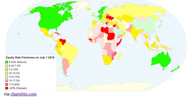
The second market measure of country risk is one that I have concocted that is based upon the default spread, but also incorporates the higher risk of equities, relative to government bonds, i.e., an equity risk premium (ERP) for each country. The process by which I estimate these equity risk premiums, which I build on top of a premium that I estimate every month for the S&P 500 (and by extension, use for all AAA ratted countries), is described more fully in this post from the start of the year. The updated ERPs for countries is captured in the heat map below.
Note that as companies globalize, you need the entire map to estimate the equity risk premium to value or analyze a multinational, since its risk does not come from where it is incorporated but where it does business.