Market Cap to GDP Ratio (the Buffett Indicator)
A valuation metric that measures the total value of all publicly traded stocks divided by the GDP of a country


What is the Market Cap to GDP Ratio?
The market cap to GDP ratio, also known as the Buffet indicator, is a valuation metric where the total value of all publicly traded stocks is divided by the Gross Domestic Product (GDP) of the country.
This measure is also known as the Buffet indicator because Warren Buffet famously uses this metric to look at the market valuation.
Essentially, the Market Cap to GDP Ratio helps us understand if the stock market is overvalued or undervalued. Like other valuation ratios, it also uses a historical comparison to arrive at a relative intrinsic value.
The GDP number used should be trailing twelve-month (TTM) numbers as the updated market cap is readily available. This means the GDP values and insights should come from the previous 12 months, trailing behind the current date.
The data can be applied to global as well as individual markets. But the market cap to GDP data cannot be compared across countries as the comparison is done on a relative basis to its historical data.
- The Market Cap to GDP Ratio, or Buffett Indicator, is vital for evaluating overall stock market health by comparing total market capitalization to a country's GDP.
- It helps investors gauge market valuation. For the US, a ratio below 100 suggests undervaluation, while 90-115% signals moderate overvaluation. The historical US average is 79%.
- Like other metrics, it relies on historical data. Comparing the current ratio to historical averages informs investors about market health and potential trends.
- Factors like the number of listed companies and their valuations impact the ratio. More IPOs and rising valuations can increase it, possibly indicating overvaluation.
Market cap to GDP ratio formula
The formula for the Buffet Indicator:
Buffet Indicator = 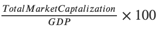
A simple interpretation for valuations of the US market is that if the ratio is below 100, i.e., if the entire market capitalization is lower than the GDP, the market is said to be undervalued.
Understanding the Market Cap to GDP Ratio
The ratio works like any relative valuation metric, like a price-to-earnings (P/E) or a price-to-sales (P/S) multiple, where it is compared with the historical average to get a relative valuation verdict.
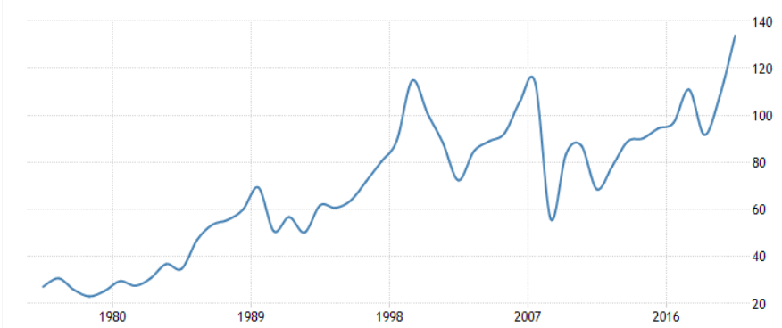
The US markets are said to be fairly valued when the ratio is between 75% to 90%. When the ratio is between 50% and 75%, it is said to be moderately undervalued. It is moderately overvalued if the ratio is between 90% and 115%. The historical average for the US market cap to GDP ratio is 79%.
Several factors can affect the overall market cap to GDP ratio. As more companies are listed on the exchange, the listed market cap will increase, and stock valuations will also rise.
Wilshire 5000 is commonly used for the calculation as it covers all the listed stocks in the United States and gives the most accurate representation of the total market capitalization.
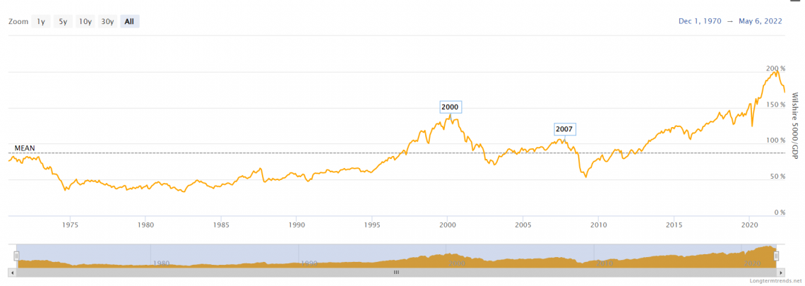
The above chart shows the historic data for the US market cap to GDP ratio. Currently, the market is in a highly overvalued territory with a ratio above 160%, where the fair value mark is near 75% to 90%.
One country's value is not indicative of other countries as these countries have similar valuation metrics for their market cap to GDP; it changes for every country.
If the ratio goes into the modestly overvalued and significantly overvalued territory, it does not mean that the market will immediately correct. Still, it does mean that the current valuation won't be sustainable for a long time.
There are two outcomes to overvaluation, either the valuation will correct, or the GDP will expand. It is difficult for GDP to grow and catch up to such valuations in a short period of time, so valuations usually end up dropping.
Even in a valuation drop, there are two possible outcomes: the earnings catch up to the valuations, or the price corrects.
Interpreting the Market Cap to GDP Ratio
Let us take a look at different instances and interpret the ratio for better understanding of the concept.
Exhibit 1: Japan
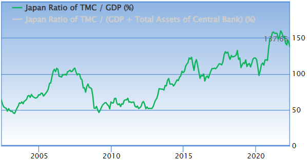
The ratio for Japan currently stands at 137%, as shown in the image above.
Japan is said to be fairly valued when the ratio is 81% to 99% and significantly undervalued when the ratio is below 63%.
The ratio is now at 137%, which is above the significantly overvalued range of 117%. The current ratio is very close to its 20-year high of 159%.
The Index used is the NIKKEI 225
Exhibit 2: India
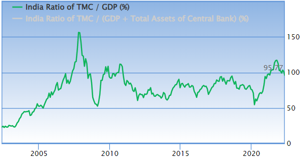
India’s market cap to GDP currently stands at 96%.
India is said to be significantly undervalued when the ratio is below 56% and modestly undervalued between 56% to 73%, and fairly valued at 73% to 89%.
Right now, the ratio is between the modestly overvalued range of 89% to 105%. India is still far from its 2008 peak of over 150%.
The Index used is the S&P BSE Sensex.
Global Market Cap to GDP
The global market cap to GDP ratio right now is at an all-time high, even higher than the Dotcom bubble and the great financial crisis levels.
This means that, on average, the valuations are not sustainable globally. But there are certain flaws to this data set. The chart uses MSCI World Index as the index for the global market cap.
MSCI world index has a 68% weight in the US & Europe, which means the valuation of those markets highly influence the data set.
Bond Yields and Buffet Indicator
Historically, the bond yields and buffet indicator have shown a correlation close to 1
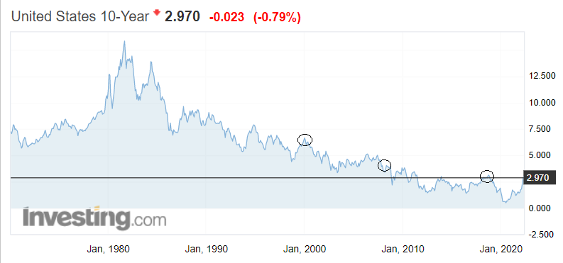
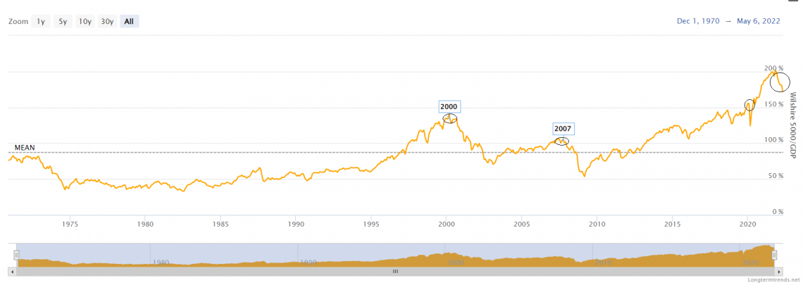
The above two images are the US 10Y bond yield and the US Buffet indicator, with the data ranging back to before the 1980s.
It clearly shows at many instances during the 2000s Dotcom bubble, the 2008 great financial crisis, the 2020 Covid crash, and the current 2022 valuations, the bond yields have been at their highest.
The bond yields have not sustained their high and immediately crashed along with the markets.
The reason for this is that as yields start to go up, money comes out of the stock market and goes into the fixed income securities, as on a risk-adjusted basis, bonds start to look better.As money exits, the market valuations start to drop, creating a domino effect.
Several other factors should be taken into consideration, and there is a lower level of liquidity in the market as the borrowing cost also goes up, which limits investments and spending. Your investment can be positioned by analyzing these factors into assets that benefit or stay stable during a decline in the market and interest rates.
Gold is a great example of an asset class that performs well during a decline. The reason that gold does so well is that it is a good store of value, and due to its limited supply, the demand is continuous and increasingly rising.
Gold and the market show a historically negative correlation, so every time there is some uncertainty and the possibility of a market crash, gold prices always start to go up.
Calculating the Market Cap to GDP Ratio
Below are some of the examples for the actual calculation of the ratio. Let us understand by taking a step-by-step guide below:
Example 1: Canada
Canada’s total market capitalization stands at $3.3 Trillion and the Q4 2021 Data for Canada’s GDP is $2.1 Trillion.
So the Buffet Indicator for Canada will be
= ![]()
= 157%
A 157% Market Cap to GDP can be termed as modestly overvalued for Canada.
Example 2: United Kingdom
UK’s total market capitalization stands at 3.9 Trillion GBP or $4.81 Trillion at the most recent exchange rate and the 2022 GDP for the UK stands at $3.3 Trillion
So the ratio comes at
= ![]()
= 145%
A ratio of 145% makes the UK significantly overvalued.
Advantages of the Buffett Indicator
Some of the advantages are:
- The ratio is easy to calculate, and the data is readily available through reliable sources.
- As it is a relative metric, the current data can be compared with the empirical data at various time periods to assess and review the current scenario.
- For E.g., Many countries had their market cap to GDP reach their max during the dot com bubble of the 2008 great financial crisis.
- Now the current valuations can be compared with these two points in history to see how does ratio is when compared to an all-time high.
- It can be applied to any country with a decently active financial market from which the total market cap can be collected.
- The two variables of the ratio, the market cap, and the GDP, will accurately represent the value.
- The market cap is a valuation metric that captures the actual changes in total market valuation, while the GDP is a more fundamental metric of profitability and productivity.
- A combination of profitability and valuation will give a good representation of the overall value of the country’s markets.
Shortcomings of the Buffett Indicator
On the other hand, the shortcomings of this indicator are:
- The ratio ignores profitability as it has no considerations for margins or return ratios.
- Another problem with the Buffet indicator is that historically it is observed that the mean and average of the metric have kept on rising. This creates the issue of what to consider as fairly valued.
- The ratio cannot be compared across countries, even in similar economic and political environments.
- The ratio is also susceptible to new IPOs where over time, the market cap will keep rising, but the GDP won't be able to catch up as fast, which will give a false sense of overvaluation.
- A recent example of this will be the listing of Saudi Aramco, which tripled the ratio for Saudi overnight.
- Another shortcoming is the lack of private companies; in some countries, the stock market is not quite as developed, or some firms have chosen not to list on the exchange, so this also creates an issue in valuation.

Researched and authored by Aditya Salunke I LinkedIn
Free Resources
To continue learning and advancing your career, check out these additional helpful WSO resources:


or Want to Sign up with your social account?