Excel Dashboards
These are important yet complicated to develop considering the number of tables, charts, figures, and gauges that you input to present the data


What Is An Excel Dashboard?
Do you ever have massive data that needs to be analyzed in Excel? Going through all those rows and columns and individually looking at the key metrics can be difficult.
Well, that's where the Excel Dashboards come in! It enables Excel users to analyze key performance indicators (KPIs) and other metrics by transforming raw data into a visualized form called a visual representation of data.
A Dashboard can be thought of simply as a visual representation of data.
Looking at raw data can be challenging. Yes, the crucial numbers are present. However, it is frequently impossible to absorb and comprehend all of those rows and columns.
Dashboards are useful in this situation. By producing various graphs, tables, and other visual components that offer you a broad perspective of the data, they transform the data into information.
Your spreadsheet's normally complex data is simplified by a dashboard, which turns it into a visual format that is simple to comprehend and, consequently, use.
People mostly confuse it with reports. However, in broad terms, a dashboard 'can' be a report, but all messages cannot be dashboards.
So whether you need to get insights on the existing data, customize your reports or keep track of important financial metrics, dashboards get the job done efficiently.
Excel dashboard Prerequisites
Dashboards are essential yet complicated to develop, considering the number of tables, charts, figures, and gauges you input to present the data.
Hence, before you go ahead and build a dashboard, ask yourself a few questions - why do you need the dashboard, what is the purpose of the dashboard, where do you intend to get the data from, or what critical vital metrics do you need in the dashboard?
If one of your clients needs help building an Excel dashboard for business, get together and discuss it by drawing its layout on a piece of paper. This way, you and the client will understand how the data will be represented.
Once they approve the design, then you can go ahead and build the dashboard.
1. Source of data
What will be the data source, and how will you arrange it to review the data effectively? If the source data updates, would the data in Excel automatically update by connecting it to it or manually editing the source of data?
Once you are sure about the standardized format for the data source, it even becomes more accessible for a third person to interpret the data quickly.
2. Important metrics in the dashboard
The next question would be, what would be the key metrics you want in the dashboards? There can be a lot of unnecessary data that would add value to your clients and senior managers in the organization.
Always separate or ignore such data and stick with the most important one.
3. Who needs the dashboard?
The most crucial aspect of creating the dashboard is who you are making it for. Is it for personal use, a client project, or organizational purposes?
If it's for the clients, should it be a complex or simplified design? Make a layout such that it caters to the needs of the person for who you are making it for a while minimizing their time to understand the report.
4. What Excel version is the client using
You shouldn't just assume that the client must be using the latest Excel version. Being on the same page with the client is of the utmost importance since many functions that work in Excel 2019 or Excel 365 might not work in earlier versions.
As a result, you might have to redo all the work that you had previously worked on.
Creating the Excel dashboard
Once you have a clear view of why you need to represent the data visually, head back to Excel.
For convenience, you can divide the Excel workbook into three different spreadsheets consisting of:
What we will be going through is an example of creating a dashboard. Remember that no two interactive dashboards can be created in the same way.
There might be instances where what we have portrayed can be done entirely differently (since Excel knows how to do the same things in different ways).
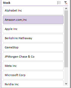
Suppose that you work for a hedge fund and need to make a dashboard for the stocks that the fund trades in. For example, the hedge fund XYZ primarily trades only in the ten stocks as illustrated below:
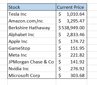
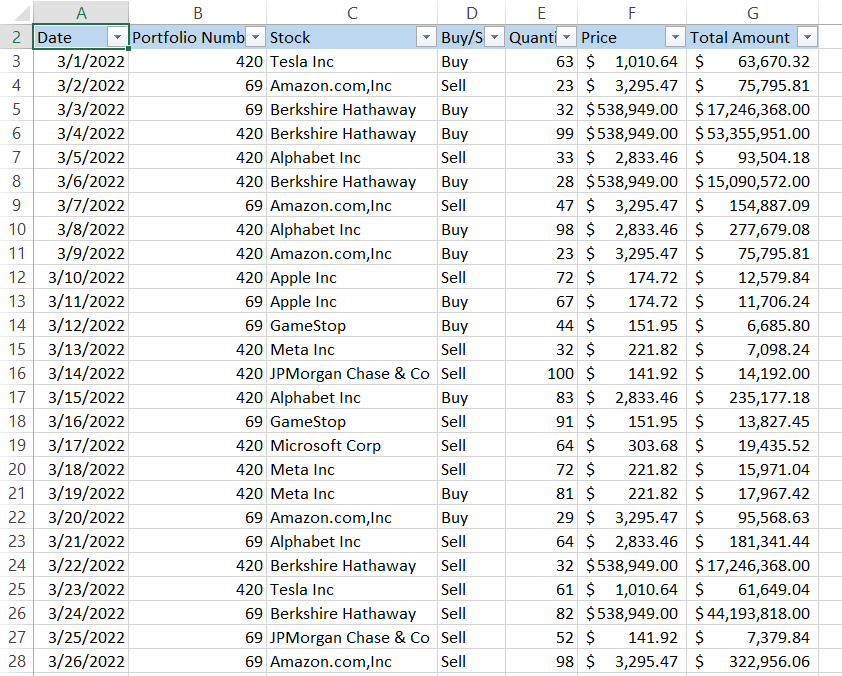
Firstly, select all the data and copy it into the "Data" spreadsheet. For convenience, it's always better to transform the raw data into tables. Currently, our data in the spreadsheet consist of trades from 1st March 2022 up to 31st December 2022 as below:
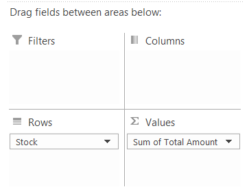
Firstly we will create various pivot tables in 'Calculations' spreadsheets. Then, select the entire data and click on Pivot Tables in the Insert tab, or you can alternatively use the keyboard shortcut of Alt +N + V and press Enter.
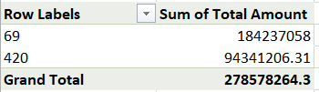
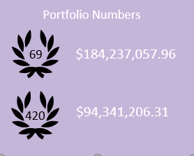
1. Portfolio Tracker
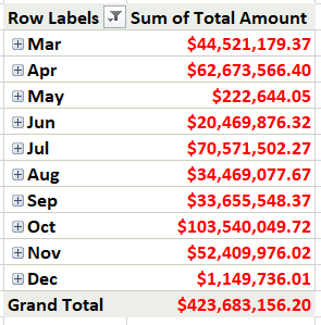
The first tracker we will create is to check the current value of the portfolio. Since we have two portfolios, 69 and 420, the fields we have selected to create the pivot table are the Portfolio number and the Total Amount.
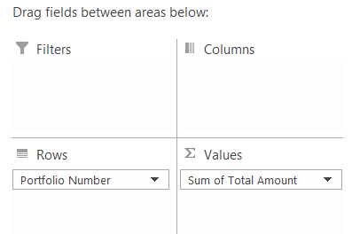
The pivot table should look as illustrated below:
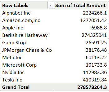
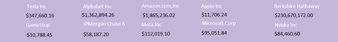
2. Individual Stocks Tracker
Another pivot table will consist of all ten stocks and the net amount the hedge fund holds in two different portfolios. The pivot table fields selected are:
Your pivot table in Excel will look as follows:
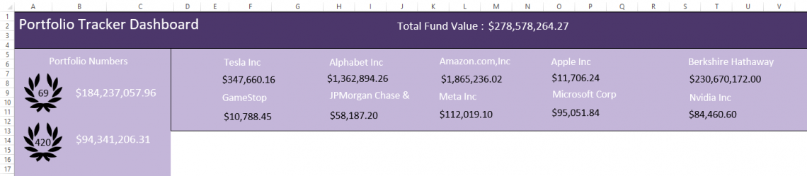
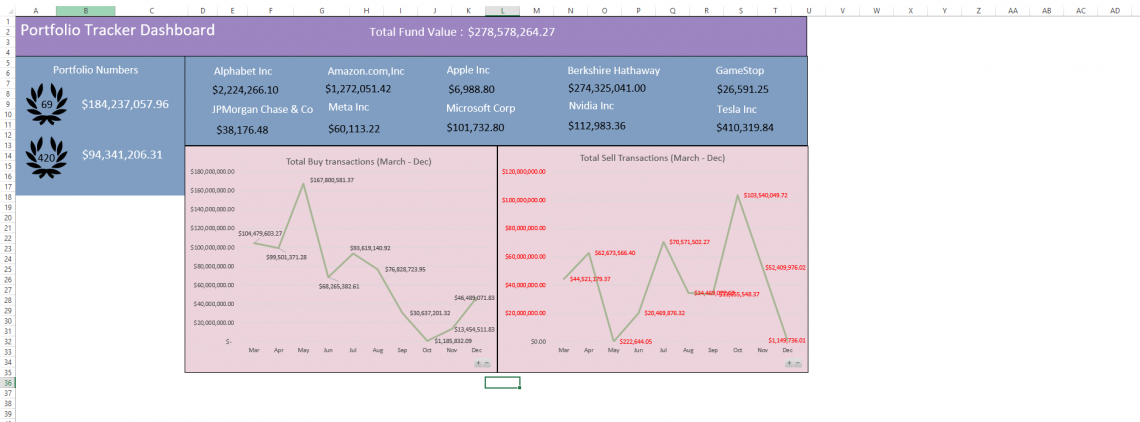
Since we have the first two pieces of the jigsaw, we will begin creating our dashboard.
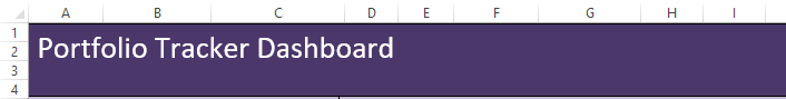
Insert a rectangular shape and add text as "Portfolio Tracker Dashboard." Fill in the color of your choice.
Add another square and a rectangle, one for the portfolio tracker and the second for the stock tracker. The one below is our portfolio tracker linked to our pivot table, which displays the net portfolio value in the dashboard.
We have added some symbols, which you can find in the 'Insert' tab, to make the dashboard look more attractive.
Now comes the most crucial part - linking data with the dashboard. Add a textbox to display those numbers on the dashboards.
But wait! You might have noticed that you cannot directly link the textbox with the pivot tables. To attach the values, you must follow the following procedures:
Still do not have a clear view as to what we are building? If you have followed the instructions up until now (that is if you are creating the dashboard as well with us), it should look something like this:
Still in its nascent stage, but not too shabby, right? Well, what could we do next? Something relating to portfolio numbers? Umm, Nah, we already did enough on that. Maybe let's try and plot a line chart for total buy and sell transactions that occurred each month.
This will better indicate what month the hedge fund had a good stock turnover and what month was relatively quiet.
3. Line Chart for 'Buy' Transactions
Firstly, we create the pivot table for all the 'Buy' transactions in our spreadsheet. The fields that you would drag in rows and value fields are:
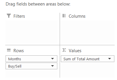
Once selected, your pivot table should look as illustrated below:
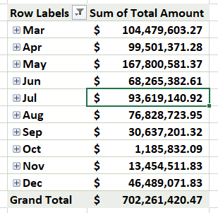
Note that we have added a filter to the 'Buy/Sell' field so that only the buy transactions are returned in the pivot.
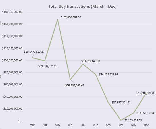
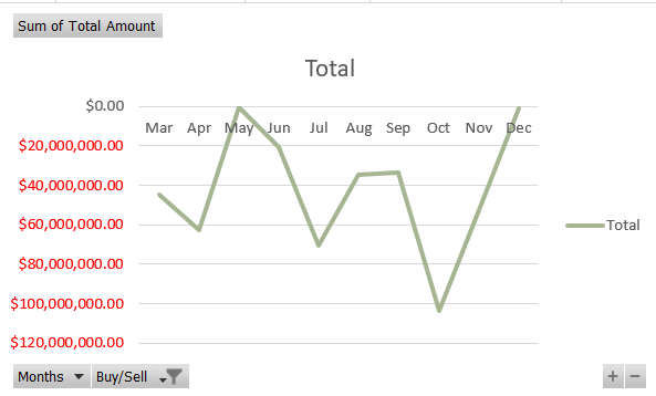
Select the data, go to Insert, and select the 2-D line chart. Now you need to make all the customizations, such as changing the chart titles, adding the data labels, changing the background color for the chart, etc.
There is no limit to the extent that you can customize the dashboards - be creative!
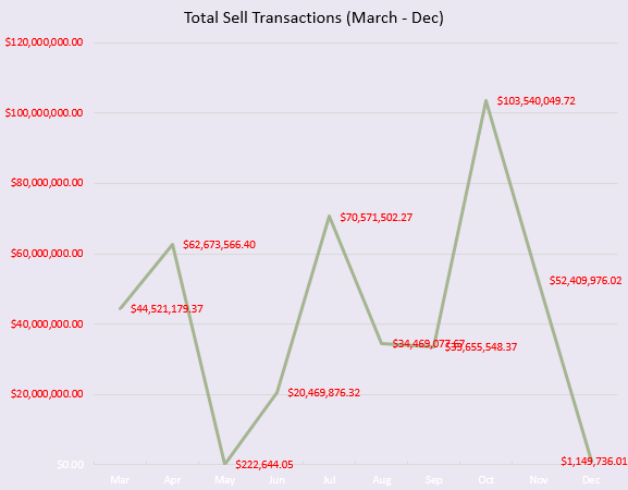
4. Line Chart for 'Sell' Transactions
Well, we did the 'buy' transactions, so it's only fair to do the 'sell' transactions for the hedge fund. The process will be similar but with a simple difference since our 'Sell' transaction, values are harmful in the raw data.
The different fields that we will drag for the pivot tables are:

As opposed to the buy transactions, here, we will filter all the 'sell 'transactions to create our pivot. So, first, add the Buy/Sell field along with the Total Amount.
Now you can see a filter above the pivot data, click on it and select the 'Sell' transactions.
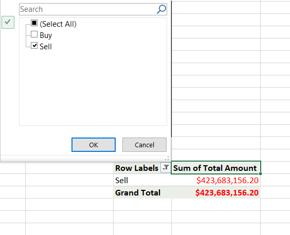
Finally, add the Months field into the pivot rows pane to give your pivot table as illustrated below:
Another line chart will be added by selecting the data for the 'Sell' transactions pivot table. But wait! Why does the chart look funny? Well, it's because you have negative values for the Y-axis. As a result, the chart is formed in the 4th quadrant.
We do, though, have a solution for this dilemma. First, select the Y- axis and press Ctrl + 1. This should open up a format axis dialog box on your right-hand side as:
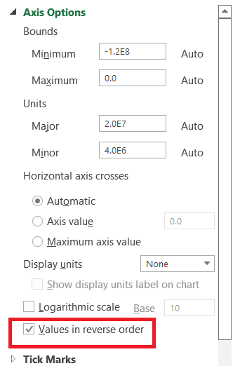
It would help if you ticked the checkbox for 'Values in reverse order. Notice the flip in the chart orientation to its mirror image? Next, select the X - axis and again press Ctrl + 1.
On the right side, scroll down a bit, and you will find an option for 'Label Position' under the ribbon 'Labels.' Select the Label Position as 'High'
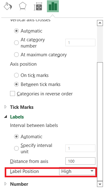
Once these two changes are made, you can go ahead and make all the customizations that you like for the chart - hiding the labels, changing the color for the chart, renaming the chart title, etc. After the last changes, the diagram should look as follows:
Should we take a look at our dashboard as well, or Nah? Well, come on, you deserve it after making it this far through the article. The dashboard looks as illustrated below:
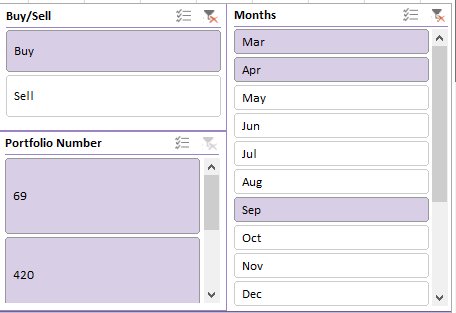
Next, we will add a couple of slicers to our dashboard. Slicers are an excellent tool for sorting data.
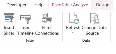
So let's say that if you wanted to know the amount of 'Apple Inc' Stock in either portfolio, then you can use the slicers to know it. First, you need to head over to the respective pivot table and select it, click on 'Pivot Table Analyze' in the Menu tab, and then on 'Insert Slicer.'
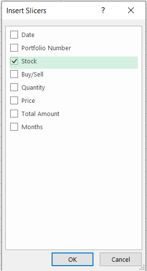
Select the check box for Stock and then click on Ok.
The slicer will look as illustrated below:
We want this slicer to control the data for multiple pivot tables by establishing connections between the pivot tables.
So let's assume that if I click on Apple Inc on the slicer, it should automatically give me the average trading price of the Stock as well as its total amount in each portfolio. For this, the two pivot tables are:
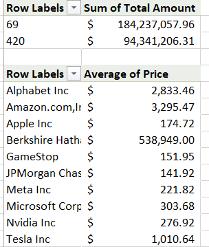
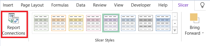
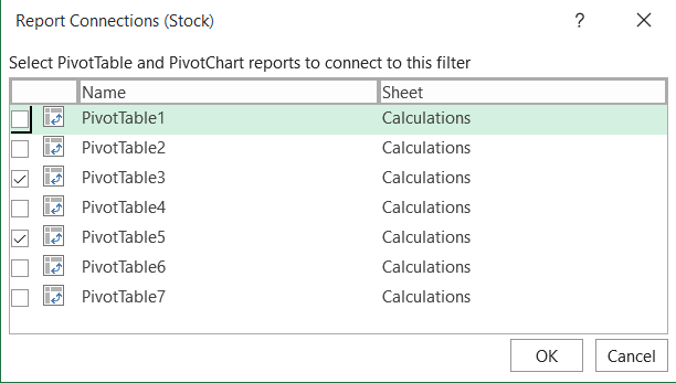
The pivot on the top will give the total amount of Stock in each portfolio, while the lower pivot will give the Stock's average price. Since we have already created the slicer for Stock, select the slicer and click on the Slicer tab. Now choose the option to 'Report Connections'
Here, we need to select the pivot tables that show the average stock price as well as the one that gives the total amount of stocks in both portfolios (For us, it's PivotTable3 and PivotTable5. It may change on your end depending on what pivot you create first)
Now click on OK. If you use the slicer now, say select Apple Inc, our dashboard should make the changes as illustrated below:
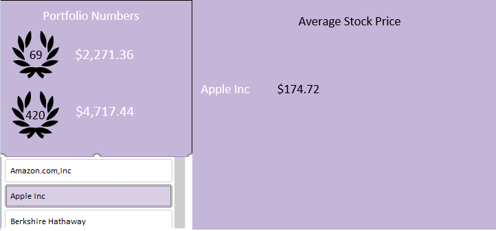
So selecting only the Apple Inc stock on slicer gives us its average trading price and its total worth held in either portfolio.
We have further made slicers for Buy/Sell transactions, i.e., it will show the total amount of buy/sell transactions for individual stocks and the monthly transactions slicer, which will display the total individual net stock worth purchased/sold in a particular month.
Finally, a third slicer is to display the total value of both portfolios at the top of the dashboard as well as give the individual worth of each portfolio (another example for establishing connections between two or more pivot tables)
Once you have included all the components of the dashboard as per your requirement, the dashboard should look something as:
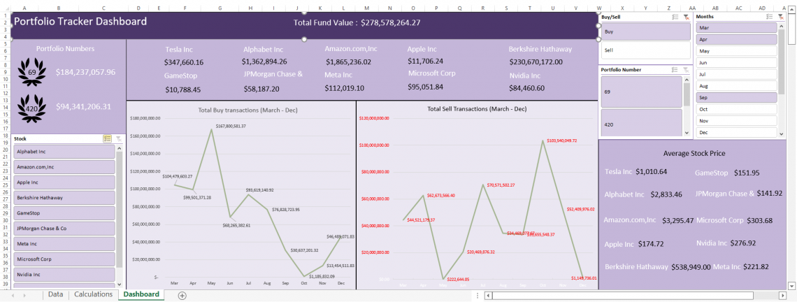
And that's it! You have created a dashboard that can be used to monitor all the trades undertaken at the hedge fund. Remember, there is no limit to the creativity that you can display in making these visual representations.
If you are still confused about how to use the slicers, check out our dedicated article here that covers all the aspects of the slicers, including their basics!
Functions in Excel Dashboards
We made a great dashboard even without the Excel functions. So why even use these different formulas and functions?
- Firstly, they make the dashboards far more interactive and robust.
- Secondly, functions potentially open the door to far more capabilities in designing and returning results that might be limited without its use.
Some of the critical tasks that you can use in the dashboard are:
-
SUMPRODUCT function: A SUMPRODUCT function multiplies the two or more ranges of cells and adds up their resulting product. It is one function that works great with its peers to make multiplication, addition, subtraction, and division possible.
-
INDEX MATCH: If you need to look up a particular result in raw data, you can use the combination of the INDEX MATCH function. Using the VLOOKUP is also a viable option, but it lacks in not returning the values to the left of the lookup value.
-
IFERROR function: IFERROR function will return all the errors in your calculations as some other value you input. This way, you don't need to worry about errors in the dashboard.
What function you might use while creating your dashboard might be totally different from what most people commonly use.
Do not limit yourself, though. There is no right or wrong while making the dashboards. All that matters is that it serves the purpose of why you are building the dashboard in the first place.
Do’s and Don'ts for Excel Dashboards
If you need to build efficient dashboards, there are some general suggestions and advice that we would like to give you.
You can follow these do's and don'ts to make your dashboard more effective.
1. Do's
A few do's that need to be followed are:
-
Keep the dashboards simple. The easier they understand, the better it will be for a third person to use it in your absence. Simple background colors, minimal designs, and limited symbols improve the readability of your dashboard.
-
Keep the data organized. As you saw, we prepared three different spreadsheets for raw data, calculations, and the dashboard. Separating the simple things avoids confusion once the dashboard is created.
-
Try distinguishing your dashboard with different shapes. A monotonous dashboard consisting of just rectangles to hold the charts and data can be tedious. Insert other conditions, such as circles, squares, and diagrams, to make your dashboard more attractive.
2. Don'ts
A few dont's that need to be followed are:
-
Do not use bright colors for different components of the dashboard. Make sure that each color compliments the other colors used in the dashboard.
-
Have a general idea of what the dashboard should show the user. Don't try too many complicated things that a different user might not understand.
Limitations of Excel Dashboards
Dashboards are an excellent tool for data analysis for all kinds of data, but they come with their drawbacks as well, such as:
-
A lot of manual data - If you work on dashboards, you will need to 'clean' and organize a lot of the data. There are many things behind the scenes in the 'Calculations' spreadsheet that go unnoticed.
As we saw that, we built seven different pivot tables to represent the data in our dashboards.
-
Possible human error - Since you would be working on a large amount of data, the possibility for a mistake substantially rises. However, you can minimize the errors once you get the hang of working with extensive data, with correct do's and don'ts.


or Want to Sign up with your social account?