Histogram
A column or a bar chart data analytic tool that shows the distribution of continuous numerical data


What Is A Histogram?
A histogram is a column or bar chart data analytic tool showing continuous numerical data distribution. By counting the values in a dataset, a histogram groups them into bins (intervals) based on the frequency with which they occur.
- A histogram is a data analytic tool representing the distribution of continuous numerical data. It groups data into intervals (bins) based on frequency, visually representing data patterns.
- The Title, X-axis, Y-axis, Columns/Bars, and Legend constitute a histogram. These elements collectively describe and illustrate the data and its frequency distribution.
- Histograms are essential in statistics for visually representing variable distributions within defined intervals. They facilitate pattern observation and frequency analysis, aiding a deeper understanding of data.
- Histograms display the frequency of numerical data in bars, while bar charts compare different categories of data.
Parts of a Histogram
A histogram chart is made of five different parts:
- Title: The title of the histogram describes the represented data in the continuous numerical data.
- X-axis: The X-axis represents the scale for a group of intervals formed based on data for which we need to find the frequency in our histogram.
- Y-axis: The Y-axis represents the scale that shows the occurrence of a value within a group of intervals corresponding to the X-axis.
- Columns/Bars: Bars represent the height and width of the data. Height portrays how often a particular value falls within an interval, while the width represents the covered area.
- Legend: The legend describes the data represented in the histogram.
How Histograms Work
Histograms are a fundamental statistical tool, providing a visual representation of the distribution of a specific variable within predefined intervals.
They offer a clear way to observe patterns and frequencies within data sets.
For example, in a study about people’s ages, a histogram could show how many are in each age group.
You can change how it looks to fit what you want to see better. It’s like a graph that makes data easier to understand, helping us see patterns and make sense of information.
Histograms facilitate a deeper understanding of the underlying data distribution, enabling meaningful insights for informed analysis and decision-making.
Histograms vs. Bar Charts
Don’t confuse yourself between a histogram and a bar chart. Though they may both look similar,
The differences between them are illustrated in the table below:
| Histogram | Bar Chat |
|---|---|
| A histogram shows the frequency of numerical data in the form of bars. | A bar chart shows the comparison between different categories of data. |
| The bars cannot be reordered. | The bars can be reordered. |
| The width of each bar doesn’t need to be the same. | The width of each bar will be the same. |
| Values are grouped together and are considered as intervals. | Values are not grouped together and are individual entities. |
How to create a histogram
There are several methods with which you can create a histogram in Excel. We will explore each method to find the one that works the best for you.
Method 1: Using the Data Analysis ToolPak
Before we use this method to create a histogram, we need to ensure that you have activated the Data Analysis ToolPak in Excel. To do this, follow the steps given below:
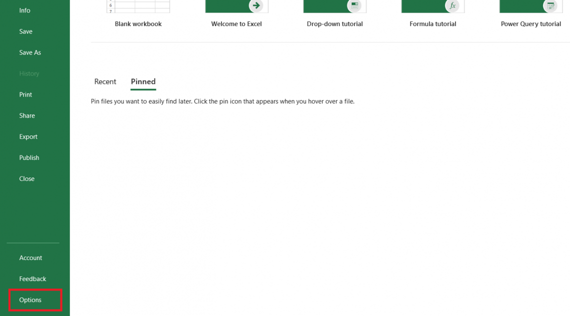
Click on the File tab and navigate the mouse to select Options.
This will open up the dialog box for Options. Click on Add-ins to check whether you have the Data Analysis ToolPak activated.
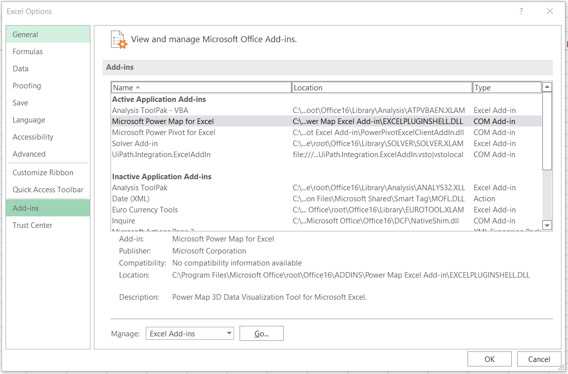
If the ToolPak is active, it will appear under the ‘Active Applications Add-ins’. However, as we can see here, our Analysis ToolPak is still inactive.
Now select the ToolPak and click on Go.
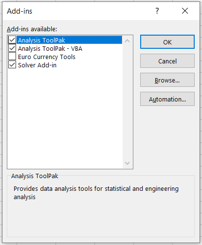
This will open up another dialog box called Add-Ins. Now, you need to tick the Analysis ToolPak box and click OK.
Once activated, you will find the data analysis tool in the Data tab at the end in the ‘Analyze’ section.
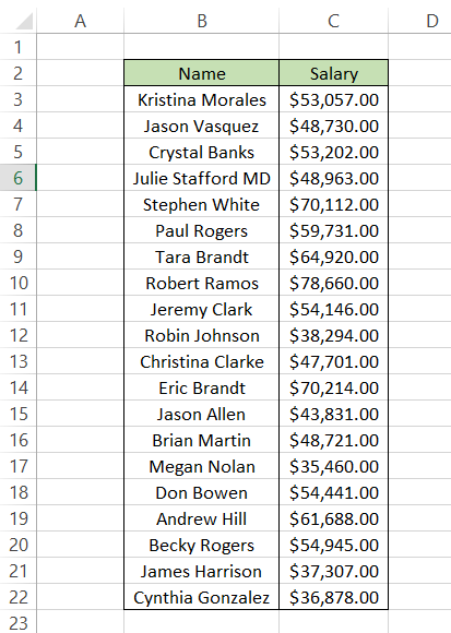
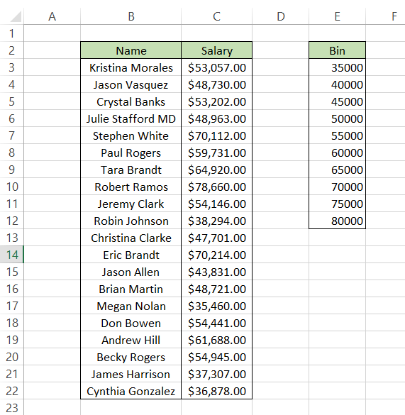
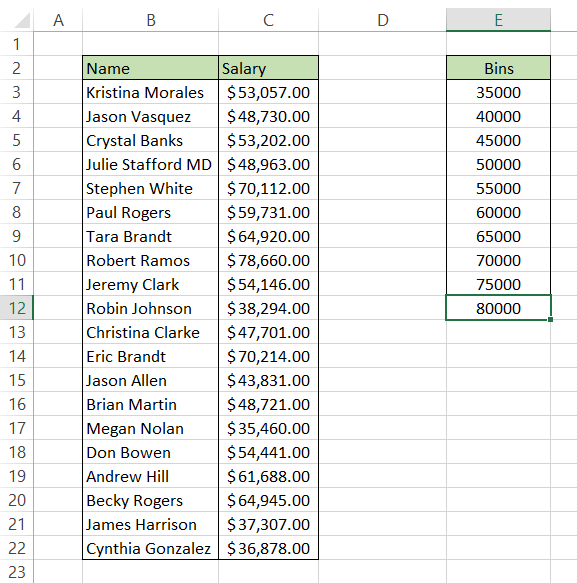
We will make a histogram of the salaries earned by employees at company XYZ. The data for employee salary is as follows:
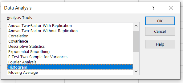
After clicking on the Data Analysis tool from the Data Tab, we will get the dialog box displaying various analysis tool options. Since we aim to create a histogram, we will select it and click OK.
Next, Excel asks us to input different parameters, such as ‘Input Range’ and ‘Bin Range’ to create the histogram. Our input range will be the salaries represented in column C. But what exactly is a bin range?
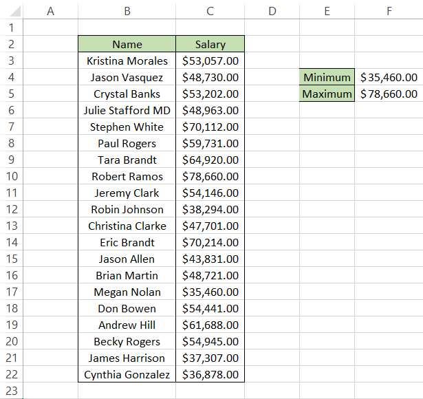
If you want a really simple method to create the bin range, first, you need to find the minimum and maximum value from column C. By using the MIN and MAX formula in cells F4 and F5, i.e., =MIN(C3:C22) and =MAX(C3:C22) respectively, you will get the lower limit and upper limit of salaries.
Next is the creation of a bin range.
A bin range is an interval by which our salary data will be grouped. The interval can be of $2,000, $5,000, or even $10,000. It entirely depends on us. We will create a bin range with an interval of $5,000, beginning from $35,000 and ending with $80,000.
With bin range in place as well, our spreadsheet looks as illustrated below:
Now, we will go ahead and reference the data to create our histogram. The range C2:C22 will be our ‘Input Range’ while the range E2:E12 will be our ‘Bin Range’. Next, tick the box that says ‘Labels’ as well.
The final and most crucial selection you must make is tick the box that says ‘Chart Output’. Without it, Excel won’t display the histogram to you.
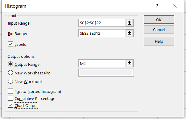
You can either opt to have the histogram in a new spreadsheet, a different workbook, or in the desired cell of the same spreadsheet. For example, we want our output in cell M2. Now click on OK.
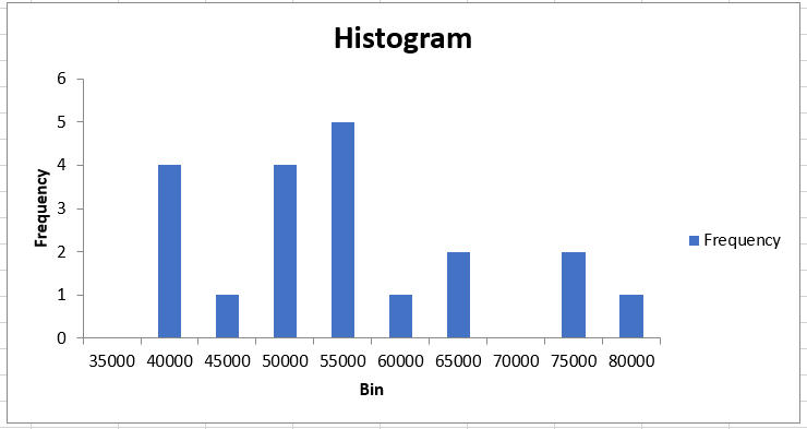
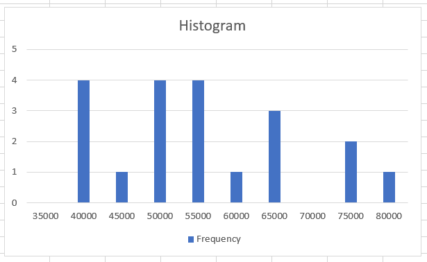
You will get the result as:
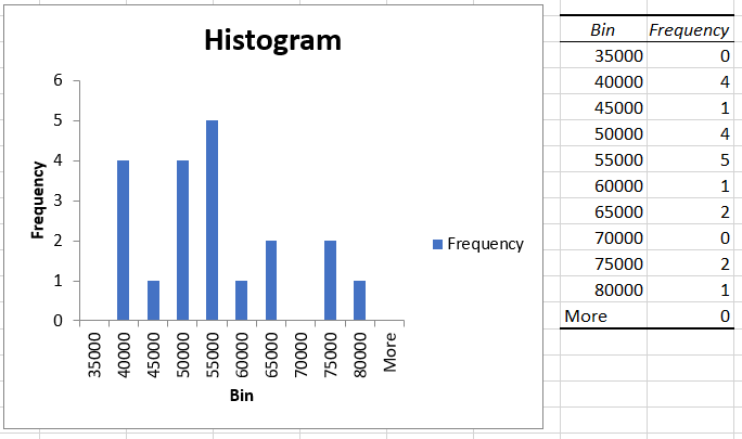
As you can see, based on our bin range, Excel calculates the frequency of salary that falls into those intervals. So if you add all the values in the ‘Frequency’ column, you will get a total of 20, equal to the number of employees in company XYZ.
On the left side is our histogram based on the bin range representing the X-axis and the frequency of occurrence of different salaries in ‘bin range’ intervals on the Y-axis.
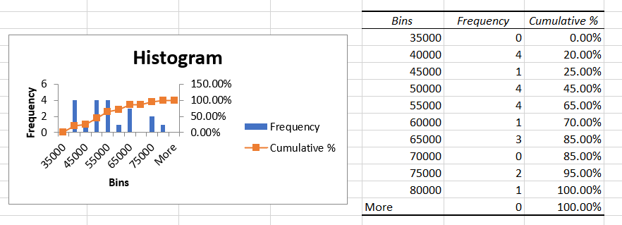
You can also include a cumulative percentage line in your histogram by selecting the ‘Cumulative Percentage option in the histogram setting. After ticking the checkbox, your histogram will look as follows:
As you have noticed, using the Data Analysis ToolPak makes creating a histogram in Excel really easy. However, if some of the data in your table changes, you must create a new histogram. Other methods will help you create dynamic histograms in Excel, such as using formulas or pivot tables.

Method 2: Using formulas
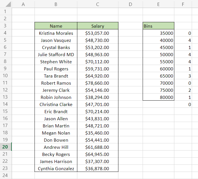
You can create dynamic histograms in Excel using the FREQUENCY, or COUNTIFS functions that automatically update the histogram when you change values in the table. For example, assume we create a histogram for the salaries earned by employees at company XYZ.
The data for employee salary along with the bin range is as below:
Using the FREQUENCY function, we will check the occurrence of a value in the bin range and draw our histogram based on the summary table.
As the name suggests, the FREQUENCY function checks the occurrence of a value within a specified range while ignoring the blank or text values.
The syntax for the FREQUENCY function is:
=FREQUENCY(data_array, bins_array)
where,
- data_array = range of values for which we need to calculate the frequency
- bins_array = the range of intervals to check the occurrence of values from data_array
Using the formula =FREQUENCY(C4:C23, E4:E13) in cell F4, you will get an array that spills up to cell F14.
This completes your frequency table using the FREQUENCY function. However, please note that we have used Excel 365 to get our results. Since =FREQUENCY(C4:C23, E4:E13) is an array formula, press Ctrl + Shift + Enter to get the result in other Excel versions.
Note
Online Excel is an excellent tool if you need the results of array-based formulas. For example, you could have used the FREQUENCY function in online Excel and then copied the table into your spreadsheet.
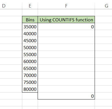
The COUNTIFS function works similarly to the FREQUENCY function but is a bit more complicated than the latter since it consists of three different COUNTIFS formulas that you need to use.
The syntax for the COUNTIFS function is:
=COUNTIFS(criteria_range1,criteria1…)
where,
- criteria_range1 = the range of values that needs to be evaluated for the criteria
- criteria1 = condition upon which the range of values will be evaluated.
The formula that you will use for the first bin(interval) will be
=COUNTIFS($C$3:$C$22, "<="&$E3)
while the formula to calculate the value for over the bin will be
=COUNTIFS($C$3:$C$22, ">"&$E12)
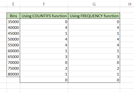
This is what the frequency table currently looks like:
Next, we will use the final formula
=COUNTIFS($C$3:$C$22, ">"&$E3, $C$3:$C$22, "<="&$E4)
That will give the values for range F4:F11 such that our result using both the formulas is as follows:
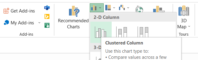
Now, all you need to do is enter a column chart. Click on the Insert tab and then select the Column chart.
Honestly, you might have to play around a bit by changing the data sources, changing the scale of the Y-axis, and renaming the title of the chart, but the final result that you will get is as follows:
You can check out our article on the secondary axis, which covers the section on how to change the data source for the chart.

Method 3: Using a Pivot table
Next, we will see how to make histograms using pivot tables. This is our preferred method since it eliminates the time-consuming task of finding the frequency of values as per the bin intervals.
To insert a Pivot table in the spreadsheet, use the keyboard shortcut Alt + N + V + T after selecting the data. Press on OK.
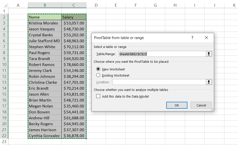
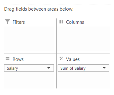
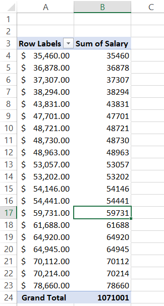
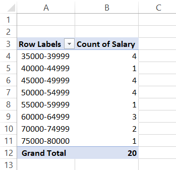
Now, we need to find the frequency of values in column C. In the Pivot table fields, add ‘Salary’ for both Rows and Values areas.
The spreadsheet should look as illustrated below:
Now, there are two crucial things that you must do. First, remember the COUNTIFS formula we had used to return the frequency of values? We will apply a similar approach to get the frequency for each value in the range A4:A23.
To do that, right-click on any value in the ‘Sum of Salary’ column and then select the Value Field Settings option.
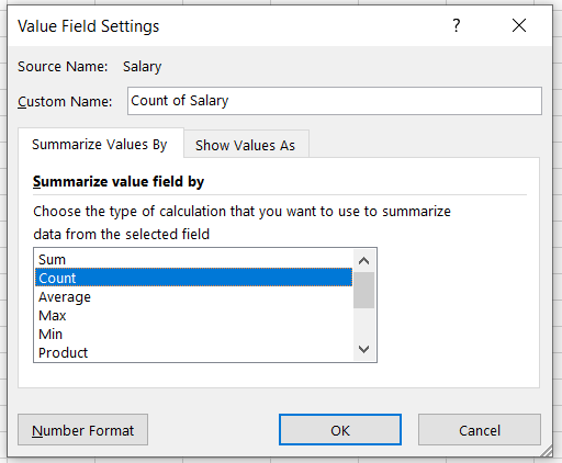
Select ‘Count’ to summarize your value fields by count instead of sum. Press Ok. Your table will be updated as follows:
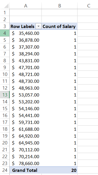
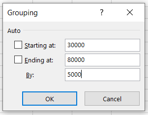
Twenty values equal to twenty counts. So far, so good. But we still haven’t made our bin intervals. So right-click on any cell in the ‘Row Labels’ column and select the ‘Group’ option to add bin intervals. The parameters that we have selected for the group are:
By grouping the values in the ‘Row Labels’ column, we have formed our bin intervals while the ‘Count of Salary’ column corresponds to our frequency of salary. The final table will look as illustrated below:
You already know what the next step is! After selecting the data from the table, hit the keyboard shortcut Alt + N + C + Enter to insert the histogram.
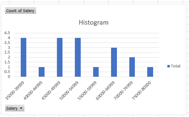
Customizing the histogram
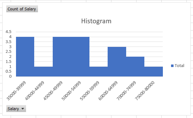
You can remove the spaces between the bars since that’s how most traditional histograms look. A different color can also be a preference for people while working on detailed reports. The different customizations that you can do for the histogram are:
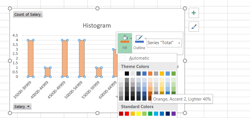
Changing the bar color
You can change the bar’s color in just a few simple steps. First, select the histogram such that all the columns are highlighted.
Right-click on the column, select the ‘Fill’ option and select any color that you need to fill the column with. Similarly, you can change the background color by following the same procedure.
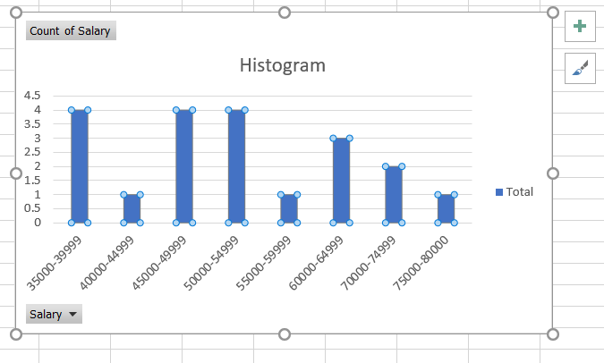
Removing space between the bars
To remove the space between the bars, select all the histogram columns. Then, right-click on any column and select the ‘Format Data Series’ option.
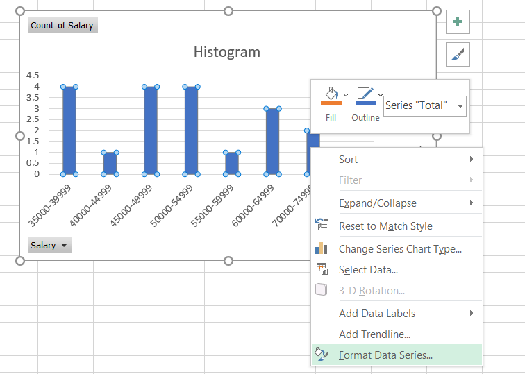
On the right side of the Excel, you will get an option to change the ‘Gap Width’, which you need to change to zero. After making the changes, your histogram should look as illustrated below:
Free Resources
To continue your journey towards becoming an Excel wizard, check out these additional helpful WSO resources.


or Want to Sign up with your social account?