FOMC Dot Plot
AKA, the Federal Reserve's "dot plot," is a graph showing the forecasts for each Fed official's main short-term interest rate.

What is the FOMC Dot Plot?
The FOMC Dot Plot, or the Federal Reserve's "dot plot," is a graph showing the forecasts for each Fed official's main short-term interest rate.

The dots represent what each U.S. central banker believes. Should the economy develop as anticipated, the appropriately fed funds rate midpoint will be at the end of each calendar year three years from now.
The dot plot displays 19 individual projections when the Fed is fully staffed; however, one vacancy on the Fed's board of governors results in one fewer dot.
The St. Louis Fed President Jim Bullard, who has been vociferous about wanting to omit his projections, is also absent from the Fed's longer-term forecasts.
The fed funds rate is plotted on the Y-axis, and the forecasted year is on the X-axis.
The committee comprises the Federal Reserve Bank of New York president, the seven Federal Reserve Board of Governors, and members.
Presidents of the remaining 11 Fed banks fill the remaining four seats on a rotating basis. These presidents are in office for a year. Each of the following regional groups of Fed banks has one selected member; these regions include:
- Philadelphia, Boston, and Richmond
- Cleveland and Chicago
- Atlanta, Dallas, and St. Louis
- San Francisco, Kansas City, and Minneapolis.

The federal funds rate will peak at this long-term outlook once the Fed has finished "normalizing" or tightening policy from its current levels. The dots' median is used to get the official rate forecast.
For the projections, the direction of movement is more crucial than the total amount. Investors want to know if the FOMC is moving toward tighter (hawkish) or looser (dovish) monetary policy. This would produce lower or higher interest rates.
For instance, when the dot plot shifted toward higher rates in March 2014, stocks and bonds saw a brief sell-off due to investors' concern that the Fed might raise rates earlier than anticipated.
- The FOMC dot plot is a visual representation of policymakers' projections for future interest rates. It provides insight into the Federal Open Market Committee (FOMC) members' views on the future path of monetary policy.
- The dot plot displays individual FOMC members' anonymous projections for the federal funds rate over several time horizons, typically including the current year and the next few years.
- Each dot on the plot represents the projected level of the federal funds rate by an individual FOMC member at the end of each forecast period.
- Dots positioned higher on the plot indicate higher projected interest rates, while dots lower on the plot suggest lower projected rates.
How to Read the Fed’s Dot Plot?
Here are some benefits of the Fed's dot plot: You can deduce where the Fed's bias may be by identifying the locations of the largest clusters.
Even while the precise rate path is still uncertain, one may surmise that this is a typically more hawkish Fed if some Fed officials predict rates will rise even higher than they already have.
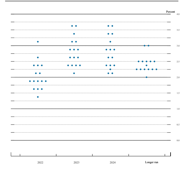
A good amount of Fed officials believe that at the end of 2022, interest rates will be set by the American central bank and will be between 1.75% & 2%.
While four more predicted slightly less aggressive rates, seven more predicted rates to rise even higher than that range, suggesting that Fed officials are almost unanimously committed to tighter policy.
Officials anticipate the Fed funds rate will be 2.5% in the long run. Although this rate typically doesn't change, it might in the future as officials revise their predictions for inflation, unemployment, and growth.
It may seem intimidating, but if you have a high-yield savings account or credit card debt, the chart offers hints from the individuals in charge of deciding where rates may be in a year or two.
However, there are clear limitations: The future never develops as the Fed anticipates.
An example: The Fed may very well increase interest rates above the target range of 1.75-2 percent that they had anticipated reaching by the end of 2022 by the end of the July meeting.
Note
One reason officials act even more quickly than anticipated is that inflation has stayed strong as projected.
Why was the FOMC Dot Plot Created?
Fed policymakers started utilizing the dot plot in 2012, when the economy was still recovering from the Great Recession and interest rates were still quite low.

The central bank recognized that Fed communication could frequently be as effective at shaping investors' expectations as rate increases, so it intended to give Fed observers a head start on what officials thought before making official policy decisions.
According to Ryan Sweet, director of real-time economics at Moody's Analytics and head of its monetary policy research, it was a type of "aggressive forward guidance," a concept that former Chairman Ben Bernanke developed to prepare markets for the Fed's departure from the unconventional support measures it introduced to keep the economy afloat.
Although economists and investors frequently use the FOMC dot plot to assess potential changes in monetary policy, Fed officials have indicated that they do not place much weight on it.
This is because the Federal Reserve's monetary policy, which considers variables including inflation, economic trends, and global events, heavily relies on statistics.
For instance, the FOMC dot plot from December 2019 showed that the federal funds rate would remain unchanged in 2020. However, the Federal Reserve changed the federal funds rate by setting it near zero in response to the coronavirus pandemic.
Note
The dots are not a better predictor of future rate increases since they are highly uncertain, as Fed Chair Jerome Powell said at the June 2021 FOMC meeting.
Why not place too much emphasis on the FOMC Dot Plot?
The main concern is the rate of increase. Over the past year, consumer prices have soared, reaching their highest annual level since December 1981 in May.

That increase caused the Fed to make a significant change. Since inflation has continued to be higher than anticipated, Powell and the company now appear more likely to consider raising interest rates by more than half a percentage point than they did previously.
Officials are expected to propose boosting interest rates by three-quarters of a percentage point at their meeting in June, which would be the largest rate hike since 1994.
Powell has often emphasized that policymakers want to be flexible with their rate hike path and react to new data as it becomes available. However, forecasts will probably change because people are very reactive, which could mean that each dot has a short shelf life.
For example, Wall Street erupted in panic after the Fed issued a hawkish post-meeting statement in December calling for "further, gradual increases" and publishing a dot plot showing two additional increases in 2019.
Note
Even Fed officials have questioned the effectiveness of the Fed's dot plot.
In the current environment of greater uncertainty, "a few participants expressed concerns that the policy rate projections prepared as part of the Summary of Economic Projections do not accurately convey the Committee's policy outlook," according to minutes from the January 2019 meeting of the Fed.
Powell has frequently said that the chart needs to be clearer. Still, he also stated in a speech from March 2019 that it "can be a constructive element of comprehensive policy communication" if understood correctly.
According to Julia Coronado, president and creator of MacroPolicy Perspectives and a former member of the Fed's board of governors, the dot plot promotes transparency over Fed activities.
"The Fed needs to justify and explain why it is acting as it is. One component of a transparency policy is the dot plot and the SEP, according to Coronado.
But that does not imply that the general public or markets will find it useful. It may be deceptive as well as confusing.

For instance, regional presidents without voting privileges can nonetheless enter their projected interest rates. However, because only 12 members have voting rights and no one knows how each leader arrived at their forecast, there is frequently more noise than signal.
What the FOMC Dot Plot Should Not Be Used For?
When viewing the chart, remember that each dot represents a member's opinion of the range at which rates should be at that particular moment. Their dot is in the middle of the range's middle. Put another way. The dots shouldn't be interpreted as a member aiming at a particular number.

It's crucial to remember that the Fed is still data-dependent and modifies its policy in response to global events, inflation, and economic trends.
The most current dot chart might no longer represent member projections in the event of significant occurrences, including a terrorist attack, a severe economic slump, or a dramatic increase in inflation.
As a result, the projections on the dot plot farther away from the present have less significance than those closer to it.
Long-term policy changes could also result from leadership changes at the Fed when terms end, people move down, and others take their places.
Note
Investors cannot determine how much significance to give any outlier dots because it is impossible to determine which dot belongs to which member.
It's impossible to distinguish between the dots belonging to 2019 Fed Chair Jerome Powell and those belonging to a Fed bank president who isn't currently a member of the FOMC.
This will continue traders from interpreting many of the specific averages produced by each fresh iteration of the Fed dot plot. As a result, bond investors should anticipate that this publication will be a fresh catalyst for market volatility following each Fed meeting.


Researched and authored by Karnic Boudoughian
Free Resources
To continue learning and advancing your career, check out these additional helpful WSO resources:


or Want to Sign up with your social account?