How to Make a Graph in Excel?
Data visualization is an integral part of the analysis done by financial analysts and investment bankers


What Are Graphs and Charts in Excel?
Graphs are the pictorial representation of data over some time. By analyzing the graph, one can identify the trends in the data and year-on-year (YOY) changes in the value of the data.
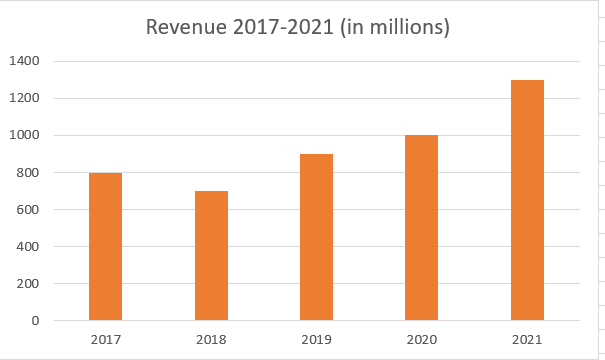
For example, suppose there is data available for revenue earned by company XYZ for five years beginning from 2017. By plotting a graph for payments from 2017-2021, one can quickly identify when the income has been the lowest and when it has been the highest.
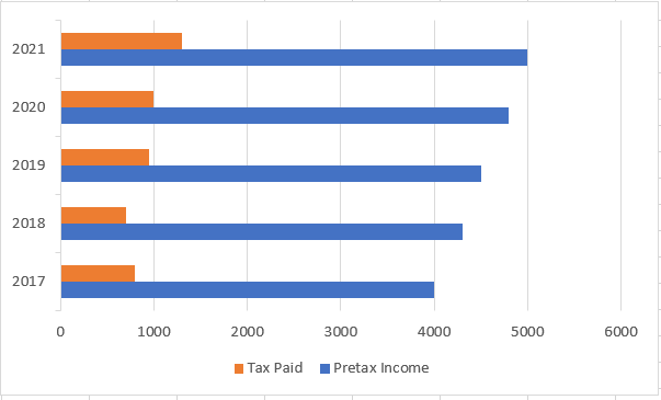
One can answer questions like - Is the revenue increasing steadily? Was there a sudden dip in the income earned? The revenue column graph would look as illustrated below:
Before diving deeper into creating graphs and charts in Excel, let's see the different types of options available for usage.
When to Use Each Chart and Graph Type in Excel
Excel provides a wide variety of charts that one can use for data visualization.
The different types of graphs that one can use in Excel include:
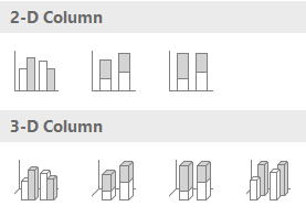
Column Charts
The most commonly used charts in Excel are the column charts. They are usually used when one needs to compare information relating to different categories of variables over some time.
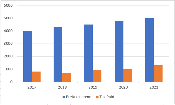
For example, we are comparing the taxes paid in an organization for some time against the pretax income.
The variations used in Excel include 2-D Columns and 3-D columns with an additional option for clustered, stacked columns, or 100% stack columns.
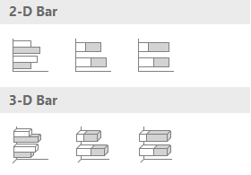
Bar Charts
“Wait, didn't we already read about these in the previous section”?
Both are somewhat similar, but the most significant difference between the bar charts and the column charts is that the former is represented with horizontal ‘bars’ as opposed to vertical as in column charts.
To easily differentiate them, think of bar charts as loading bars, while column charts could be remembered by referencing buildings or towers. The bar graph represents the constants on the Y axis while the variable parameter is defined on the X axis (opposite to that of the column chart)
Again, there are different options that one can go to, such as the clustered or the stacked bars in Excel.
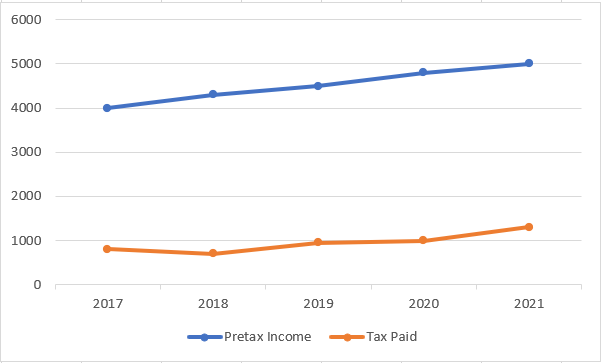
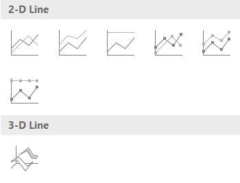
Line Graphs
Line charts let you display the trend for the categories of the different variables over time. A straight line connecting several points can quickly check when the value decreases or increases.
For example, in the line graph illustrated below, one can see that even though there was a dip in Taxes paid in 2018, the pre-tax income was steadily rising.
The different types of line charts that one can use are:
- Line
- Stacked line
- 100 % stacked line
- Line with markers etc
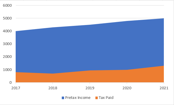
Area Graph
Area graphs are another way to show trends over time.
If one observes the line and area charts, one can see almost the same, barring the exception that the area below the line is covered with a solid surface in the area charts.
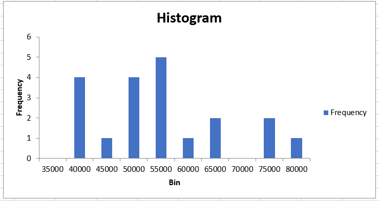
Histograms
Histograms are a bit different from traditional pictorial representations. They organize data into bins which are user-defined intervals for the data. Check out WSO’s dedicated article here to learn more about histograms.
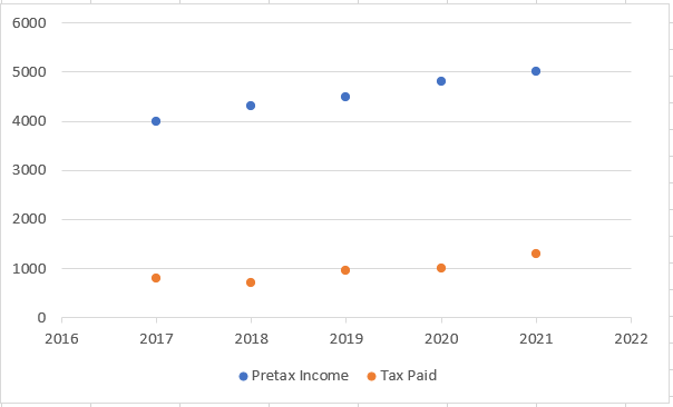
Scatter Plots
Scatter plots are the types used to display changes over time for two different variables in a data set. They lack the straight line that connects the points in the line graphs.
Using the scatter plots, one can correlate how one variable's value can affect another.
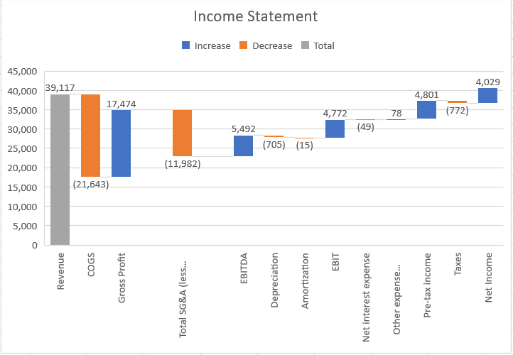
Waterfall
The most intriguing type of chart on the list is the waterfall chart. A waterfall graph has subsequent bars based on adding or subtracting values from the total value.
This is usually helpful to visualize how the following values differ from the first. For example, the best example where waterfall charts can be formed is for Income statements. Assume that one needs to make a waterfall graph for Nike Inc 2019 income sheet for the data as illustrated below:
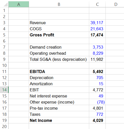
With revenue as the total value, the subsequent bars formed in the waterfall will be as:
Check out WSO’s dedicated article here to read about different graphs in-depth.
How to Make a Graph in Excel?
The first requisite that is necessary to make a graph is data. One may have to prepare summaries or represent data in tabular form. When one receives data from external sources, it is usually not clean or consistent.
There may be duplicate values, extra spaces between the texts, or other outlier values that one usually wants to avoid in the final pictorial output.
Data Cleansing
- Remove duplicates from data - If the data consists of duplicate values, Excel has a built-in function that helps deal with them with a single click.
Select the data to check the duplicates, click on the Data tab, and select ‘Remove Duplicates’ from the Data tools section.
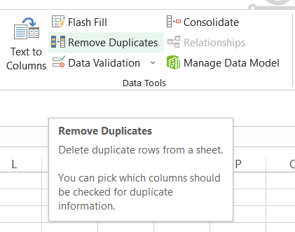
Alternatively, one can also use the keyboard shortcut of the Alt + A + M key after selecting the range of cells.
- Removing the extra spaces between text - If using text as the constant on the X-axis, it's essential to remove any additional spaces between them since it can ruin the alignment of the charts.
Use the formula =TRIM(cell reference), which will remove all the additional spaces except between text.
- The find and replace tool best changes a particular value, such as x to y.
For example, input the parameters and use' Replace All' if a column says the value as “NULL” and needs to be replaced by zero or an empty cell.

Making The Graph
Here comes the most anticipated section - how to make a graph in Excel. After the data is cleaned, one needs to ask: What is the chart's purpose? What is the objective of the result, and what could be the range of cells that needs to be used as a data source for the chart?
Assume that there is data for two different portfolios maintained by WSO. The information for the transactions undertaken is illustrated below:
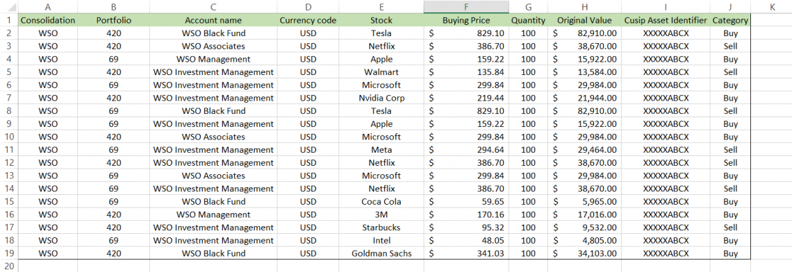
The goal is to create a chart comparing the current value of accounts in both portfolios to understand the trend of which portfolio is more actively invested in than the other.
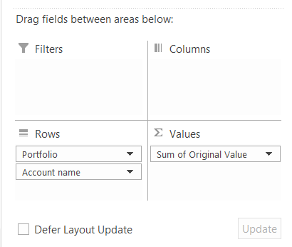
Since the ‘Account name’ has duplicates, pivot tables are used to get the unique and the current value for each account.
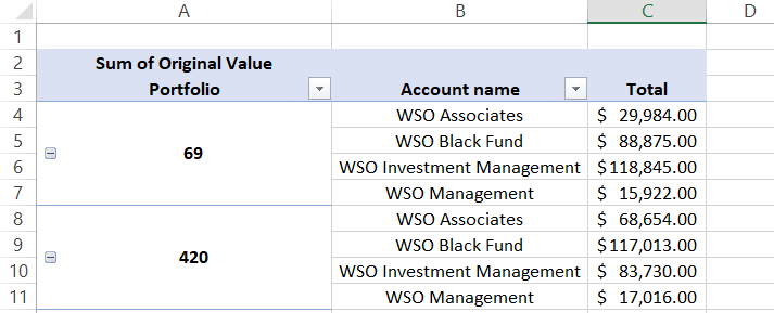
Drag the Portfolio and Account name to the ‘row' area while the Original Value is dragged to the ‘value' area of the PivotTable fields.
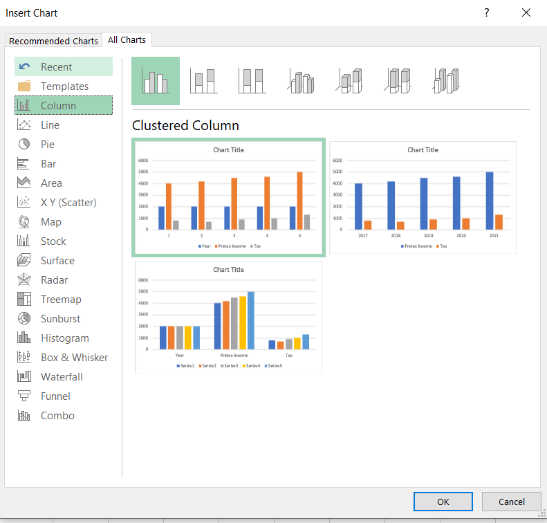
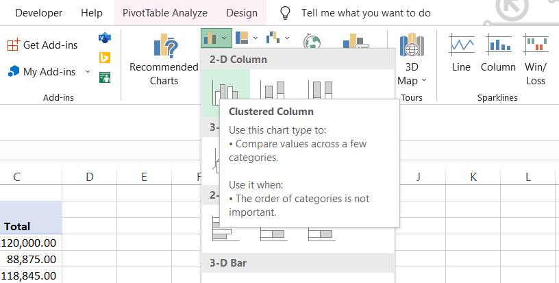
Once done, paste special (Ctrl + Alt + V + V) values from the pivot in a different spreadsheet. Now, add a chart that best suits the data analysis. After selecting the data, click on the Insert tab and like a 2-D clustered chart from the charts section.
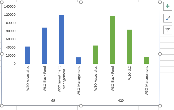
Great job on entering the chart in Excel. However, this is not the end product that most clients are satisfied with just yet. Data cleansing and selecting the appropriate chart is one side of the coin.
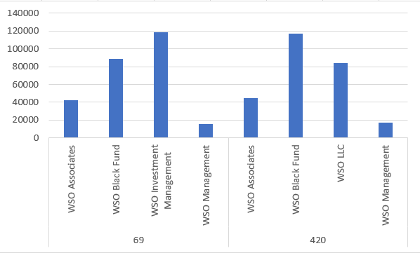
The other side includes chart customization, data source implementation, additional axes if required, etc. Our added chart currently looks as:

Customizing The Chart
At the current stage, the graph is far from complete. To begin with, this might not even be a proper chart type if reviewers cannot analyze and compare different data variables. First, move to sort out the correct data source for the pictorial representation.
1. Changing the data source
If unsatisfied with the data represented on the chart, right-click on the chart and click on the option ‘Select Data. This will open up the dialog box as illustrated below:
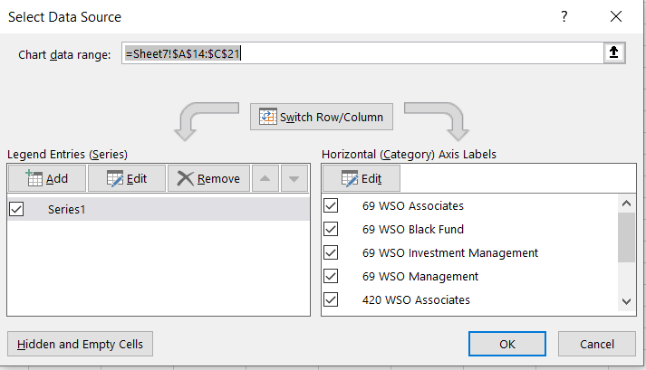
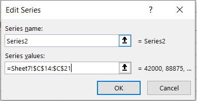
Here, different series can be added to represent the Y-axis, while X-Axis labels can also be modified. Say, if needed to add a series, click on the Add option on the left-hand side.
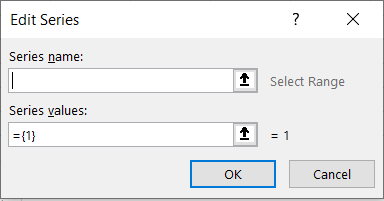
The Series name will be a cell reference/text. In the example, we utilize the phrase ‘Series2’. The series values represent the data points we intend to plot on the graph. Select the range of cells that has the concerned data for chart visualization. Once done, click on Ok.
2. Custom color for columns
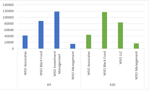
Since there are two different portfolios on the graph, distinguishing the columns with separate colors can aid in better data visualization. For all the account name’s under portfolio number 420, we will use green paint to distinguish them from accounts under portfolio 69.
- Double-click on the column to select it.
- Right-click on the column and choose the option to ‘Fill.’
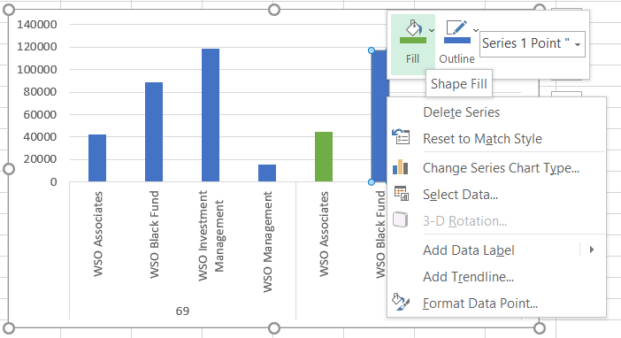
- Outline the color selected for each column to distinguish them further.
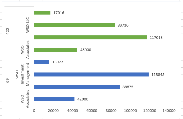
- After making the changes, the graph should look as:
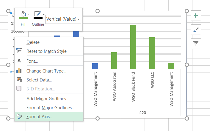
Formatting The Axes
Since the Y axis has the variable data, select the axis to make changes in the scale. Select the option to ‘Format Axis’
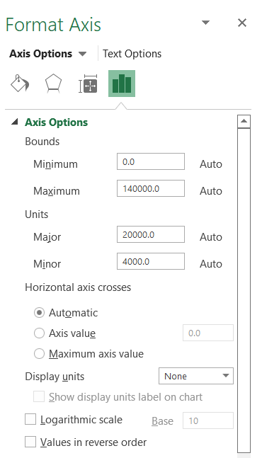
On the right side of the screen, a window will pop up. Here, the Y axis's minimum and maximum values and the axis's scale are represented by bounds and units. Currently, the Y-axis scale is 20000, while the minimum and maximum values are 0 and 1400000, respectively.
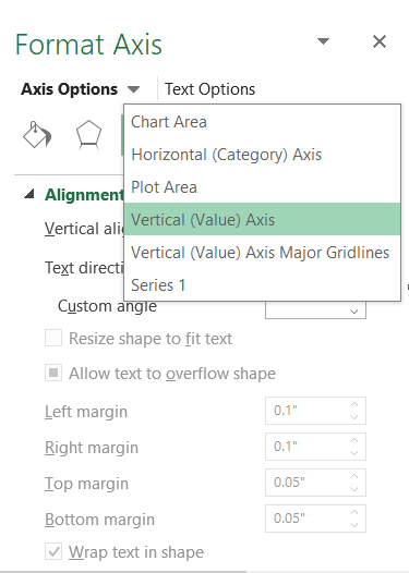
Similarly, chart area, horizontal axis, plot area as well as series can all be formatted by using the drop-down shortcut in the dialog box as:
Once done, the graph should look as illustrated below:
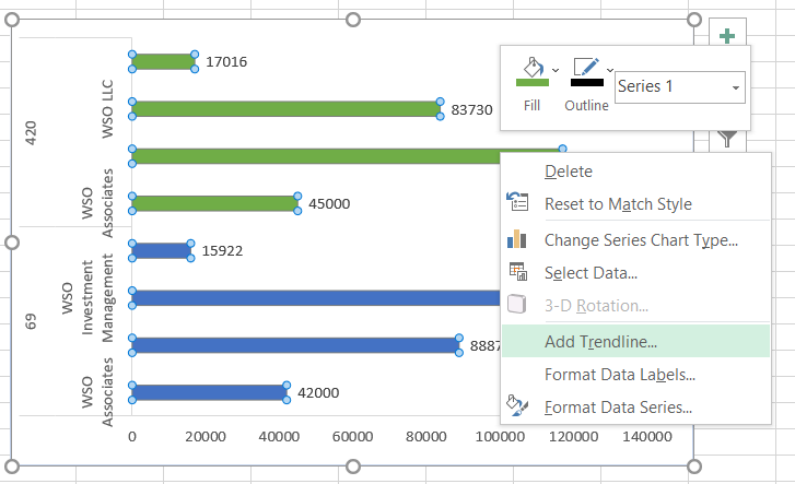
Adding The Data Labels And Trendlines
Data labels are essential since they make the graphs easier to understand by improving the readability of different data points of the data series. To add data labels, right-click on any graph column and select the option for 'Add Data Labels.
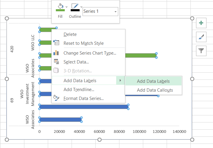
The preferred option is to ‘add data labels’ since it occupies less space on the graph. ‘Data callouts’ tend to make graphs more congested, but it is a personal preference.
Similarly, one can add a trendline to the chart by right-clicking on the graph. A trendline is a straight or curved line that will indicate the overall orientation of the data.
Changing The Graph Type
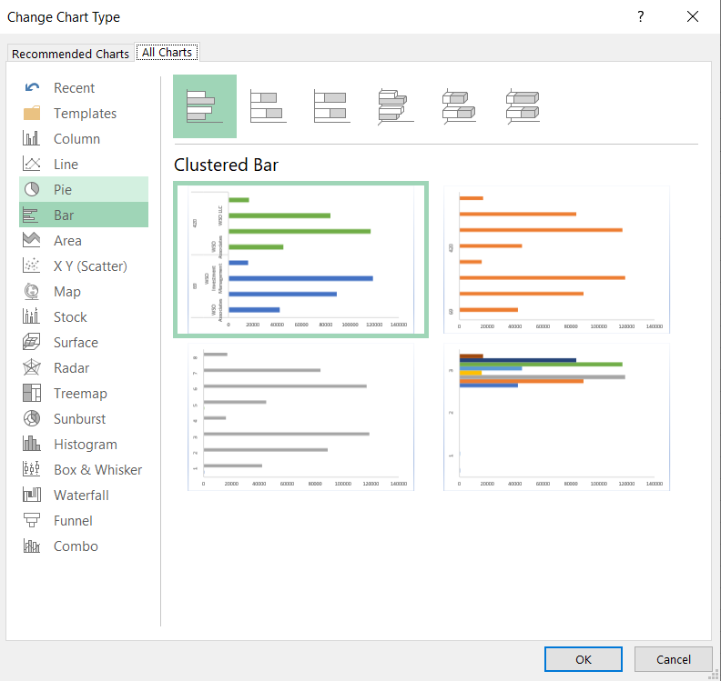
If the graph doesn't fulfill the requirement of data visualization, it can be directly changed without changing it throughout the process. Just select the chart, click on the Chart Format, and choose the option of ‘Change Chart Type.’
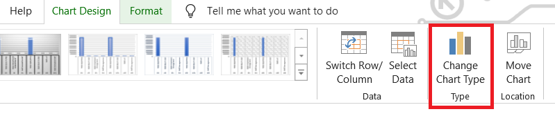
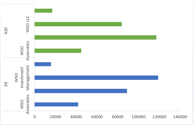
This will open a familiar dialog box that allows different graphs and charts to be selected. In this example, we will choose the bar graph.
Using a bar graph, the X axis becomes the variable scale, and the Y axis becomes the constant.
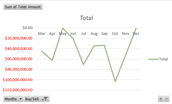
A graph has four quadrants. So far, only the first quadrant has been worked through, i.e., the value for both the X and Y axis is positive. But what if one of the axes has a negative value? The graph formed will be inverted as illustrated below:
Changing Graph Orientations
Select the Y - axis to fix the chart and press Ctrl + 1. This will open up the format axis dialog box on the right side.
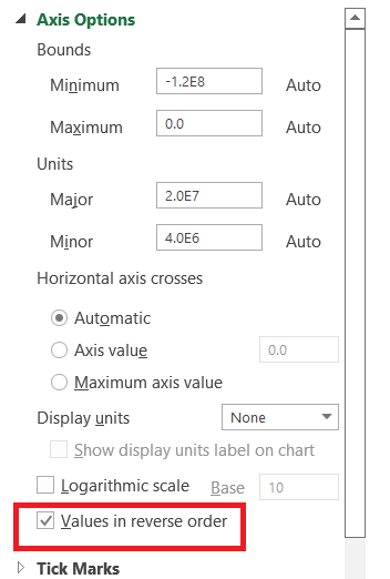
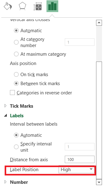
Tick the box for Values in reverse order. This will change the orientation of the graph. Next, select the X axis and again press Ctrl + 1. Scroll down and select the label position as ‘High.’
And that’s it, and the graph will look as normal as it should. To read about the process in depth, check out the article on dashboards which covers a section here.
Adding Additional Graph Elements
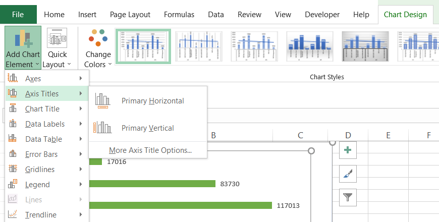
To add additional elements to the chart, such as a secondary axis or a chart title, select the graph and click on Chart Design. The first option is ‘Add Chart Element. If another title is needed for the Y axis, click on axis titles and then on ‘Primary Vertical.
WSO has also covered an article on adding a secondary axis in Excel graphs. The report provides in-depth knowledge about the secondary axis here.
Best Practices while making a graph in Excel
If graphs are over-customized, it may minimize the effectiveness of the diagrams. The most important aspect of presenting such graphs and charts is to look professional.
Some of the best practices to follow while using graphs in spreadsheets are:
KISS
Before beginning to work on the graphs, remember to use the acronym KISS, i.e., Keep it simple, stupid. Use gentle colors on the eyes and avoid excessive customizations that may make the graph challenging to understand.
If not needed, hide all unnecessary information, such as legends, data labels, and trend lines.
Add Suitable Titles Whenever Necessary
An excellent and up-to-the-mark title will help the clients and managers quickly understand what the graphs represent. Keep an appropriate orientation for any text represented on the X or Y axis.
Avoid Overcrowding Of Elements
If various factors are present in the graph, try to align them so that no two parts diminish the importance and effect of the other.
The problem can mainly be seen using the data labels covering the columns or data points in column and line graphs, respectively.
Create Unique Dataset
Use the pivot table to get our graph's unique ‘Account name.’ Follow the same method if the data persists or any other suitable way, such as removing duplicates using the keyboard shortcut Alt + A +M.
A ‘cleansed’ data will provide better data visualization results than data consisting of errors.


or Want to Sign up with your social account?