Technical Analysis – A Beginner’s Guide
A trading approach that helps investors and traders make decisions by studying statistical patterns derived from trading activities, like price changes and trading volumes.


What Is Technical Analysis?
Technical analysis is a widely practiced trading approach that helps investors and traders make decisions by studying statistical patterns derived from trading activities, like price changes and trading volumes.
Unlike fundamental analysis, which focuses on a company's financial performance, technical analysis concentrates on analyzing price and volume movements in the market.
It has a long history and is widely accepted among professionals, regulators, and academics, especially in behavioral finance. While technical analysis follows specific rules, its interpretation is subjective and depends on the analyst's style and approach.
This method aims to predict future price movements of securities, such as stocks or currency pairs, by analyzing market data.
The underlying principle is that market participants' collective buying and selling actions accurately reflect all relevant information, establishing a fair market value for the security. It is a valuable tool for traders and investors seeking insights into market trends and potential trading opportunities.
- Technical analysis is a trading approach that relies on historical price and volume data to predict future price movements, making it a valuable tool for traders and investors.
- It involves interpreting price movements and patterns, allowing investors to make informed decisions.
- Technical analysis tools include candlestick charts, moving averages, MACD indicators, support/resistance levels, Bollinger Bands, and RSI, offering a comprehensive overview of methods to analyze market trends and potential investment opportunities.
- Technical analysis offers additional tools like Bollinger Bands and the Relative Strength Index (RSI) to help traders assess market conditions and make informed decisions.
Understanding Technical Analysis
Technical analysis is a discipline investors use to evaluate investment opportunities.
If you’re a university student who has recently gained some interest in capital markets but is a complete amateur, this article is perfect for you. Technical analysis is an extremely helpful tool to assist you in making investment decisions.
Many retail day traders make a living purely off investing or trading in the stock exchange and post outrageous daily returns. However, this analysis is not limited to retail investors, as many finance professionals rely on technical indicators to improve their investment decisions.
Unfortunately, nothing generates absolutely risk-free returns as with all investment strategies. You are still taking a risk with every trade you make, and whatever analysis you carry out is merely attempting to minimize that risk and maximize potential return.
When evaluating stocks, technical analysis takes a different approach than fundamental analysis. But, generally speaking, there will be clear differences in the beliefs, attitudes, and mindsets toward investment decisions.
Most sophisticated investors understand both viewpoints and will likely use a mix of both. Therefore, if you are new to investing, you need to have a feel for the mentality of investors who use technical analysis before you decide it is the right way to invest.
So, what are you doing when technically analyzing a stock? You’re looking at historical data (often prices), analyzing it, and computing particular mathematical formulas that allow you to see how the stock has been trading from a unique standpoint.
Subsequently, you will use your analysis to predict how the stock price will move. For example, if the company’s 50-day moving average share price trades below its 200-day moving average, some traders may interpret it as a potential sell signal, although interpretations can vary.
technical analysis using Candlestick charts
The New York Stock Exchange (NYSE) has trading hours between 9:30 am and 4:00 pm Eastern Time from Monday to Friday. During this time, the market prices of stocks are updated every time a trade takes place, and there are ~12,000 million shares exchanging hands daily.
It is safe to say that the market prices of shares fluctuate considerably during trading hours. Therefore, when trading stocks, a candlestick chart is one method to incorporate all that fluctuation into a company’s share price. Here is what a typical candlestick looks like:
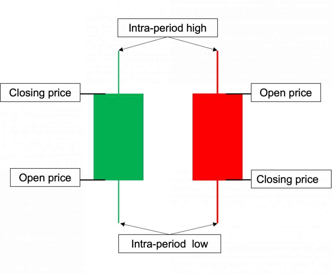
A candlestick will show how the price has fluctuated based on the selected period (Eg. 15-minute, 1-hour, or 1-day intervals). For example, if you decide to choose the 1-day interval candlestick, then it will show you:
- The open price
- The highest price it traded at during the day
- The lowest price it traded at during the day
- The closing price
The candlestick will take on either a green or red color depending on whether the stock’s price has gone up or down during that period. If the stock price increases during the chosen period, the candlestick will be green. If the price has decreased, the candlestick will be red.
Once you’ve looked at candlesticks for some time, you will start to get very comfortable reading them because they are extremely intuitive and simple to understand. In addition, the benefits of using a candlestick chart over a simple line chart are pretty straightforward.
For example, if you were researching a company’s stock and decided to plot its daily share price using a line chart, you’d only see its closing prices and nothing about how it traded during the day. That would not be an issue with the candlestick chart.
However, a candlestick is not without flaws. For example, although you’d be able to get a feel for how prices have fluctuated, you wouldn’t be able to see at what price the stock was mostly traded or the Volume-Weighted Average Price (VWAP) of that stock.
For example, if a stock opened at $2, closed at $5, mostly traded around $3, and reached an intra-day high of $7, you would see a green candlestick with a tiny upper shadow only if the closing price was higher than the opening price. If the closing price was lower, the candlestick would be red.
Note
You can think of the volume-weighted average price that calculates the average price that the stock has traded based on every single time a trade has happened. The VWAP can reduce noise and display the price that most investors are buying the stock at.
Candlestick Patterns - Bullish
Now that you understand candlesticks, there have been patterns that investors use to determine whether there is a bullish or bearish signal based on how a stock has been trading. Then, depending on the signal, investors would decide whether to long or short that stock.
If there is a bullish signal, it is a sign to buy the stock and open a long position.
A long position is where an investor buys a stock anticipating an increase in the price. In contrast, short-selling involves selling borrowed shares with the expectation of buying them back at a lower price, profiting from the price difference.
There are many bullish indicators, with some requiring just one candlestick and others requiring 2-3 candlesticks. It is seen here as follows:
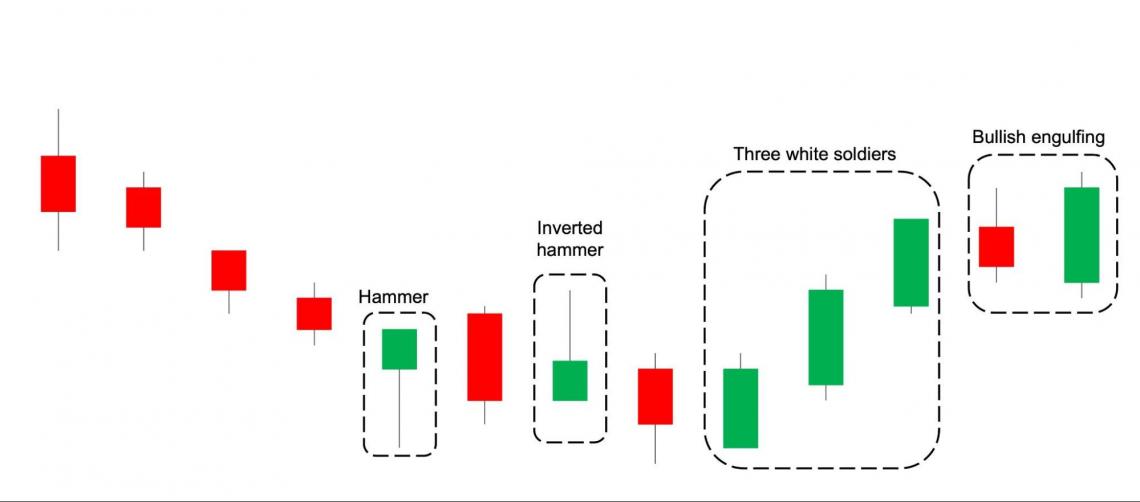
- Hammer: Has a short candle with a long lower shadow. Despite the induced selling pressure, the price has managed to close above open, suggesting more buying power.
- Inverted hammer: Has a short candle with a long upper shadow. This shows that some selling pressure followed strong buying power. The overall indicator is more buyers than sellers because the price has closed above open. This is the exact opposite of a normal bullish hammer candle.
- Bullish engulfing: Formed when a large green candle “engulfs” the prior trading day red candle. The bullish engulfing pattern typically forms when a stock opens lower and closes higher than the prior trading day.
- Three white soldiers: Often occur after a string of selling days and is a reversal from the previous lows. The pattern is indicated by three consecutive days where the price has closed substantially from its open price.
Candlestick Patterns - Bearish
Subsequently, bearish indicators signal that it might be a good idea for investors to sell their current open positions or open a new short position.
Although there are many candlestick indicators, one (general) rule of thumb is that the bearish candlesticks take the opposite shape of the bullish candlesticks, requiring 1-3 candlesticks to form a signal. It is demonstrated as follows:
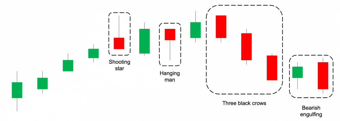
- Shooting star: Opposite of an inverted hammer (in terms of price movement, not the look of the candle); has a small candle with a long upper shadow. This shows that buying pressure is running out, and investors are starting to take profits.
- Hanging man: Opposite of a hammer; has a small candle with a long lower shadow. Even though prices closed above their low intraday, selling has overpowered buying pressure.
- Bearish engulfing: Opposite of the bullish engulfing; this pattern can be seen when a stock opens higher and closes lower than its prior green trading day. The result is a much larger red candle going downwards, indicating strong selling pressure.
- Three black crows: The opposite of the three white soldiers. Usually seen as the end of a bull run, prices are expected to trend downwards from thereon. This pattern is formed after 3 consecutive red candles that are considerably large.
The examples above are by no means an exhaustive list. There are many candlestick patterns out there, and you should dive deeper into this topic yourself if this is something that you find appealing.
However, please do not rely purely on candlestick patterns to invest your hard-earned money. That would be considered more gambling than investing. Instead, use more technical indicators alongside other fundamental indicators.
Note
If you are ever confused between the term “bull” and “bear”, think about how these animals attack. A bull charges by swinging its horns upwards (go up), while a bear attacks by swiping its claws downwards (go down). This reflects the direction of the stocks.
technical analysis based on Moving averages
It was concluded above that stocks experience daily volatility and, as a result, adjust frequently. Sometimes, these prices can fluctuate to a strangely large extent although there is no catalyst driving the share price.
What does “no catalyst” mean? Without going too much into detail, a company’s share price is expected only to adjust dramatically when new relevant information is released (see the efficient market hypothesis).
When there is no new information, the stock’s price is not expected to move very much because there is no reason for it to do so - prices have reflected all presently available information and are considered “efficient”.
Therefore, many investors consider these unjustified fluctuations in the stock price as noise. Essentially, noise can be characterized as deviations from the share price’s efficient value—the greater the daily volatility, the noisier the market.
The candlestick chart will capture all the noise in a company’s share price. So you’d be able to see all the prices that the stock has traded at, and in some cases, investors might find the noise misleading. Therefore, this is where the moving average will come in.
The moving average calculates the average share price that a company has traded during the specified period. For example, a company’s 50-day moving average share price will show the average closing price of the last 50 days.
Calculation
Calculating a company’s moving average price has the benefit of reducing the amount of noise that goes on during trading hours. There are two moving averages:
- Simple moving average (SMA)
- Exponential moving average (EMA)
The simple moving average calculates a company’s average closing price for a specified duration. The formula can be seen as:
SMA = (Pt + Pt-1 + Pt-2 +... + Pt-n+1) / n
Where:
- P = Closing price
- t = Time
- n = Number of days
Don’t overthink this formula too much, and understand its intuition. A company’s 5-day simple moving average share price represents its average closing price for the last 5 days. It is simple arithmetic math.
The exponential moving average reacts more quickly to price changes due to the exponential smoothing technique, which places greater weight on recent trading days, making it more responsive to recent price movements than the simple moving average (SMA).
In the interest of space, the formula for the exponential moving average will not be shown here. Either way, most stock information websites (Yahoo Finance, Market Watch, etc.) can calculate these formulas automatically.
Using Moving Averages
How are moving averages useful? Aside from tuning out the noise in capital markets, moving averages can also be used to indicate bull or bear signals and calculate certain indicators. Let’s start with the simplest signals.
The simplest strategy that investors use is crossovers. Investors do this by computing two moving averages (one long & one short period) and decide to buy or sell company stock based on the interaction between both moving averages. A crossover strategy looks like this:
- Calculate a long simple moving average (commonly 200 days)
- Calculate a short, simple moving average (commonly 50 days)
- It is a bullish sign when the short SMA intersects and crosses ABOVE the long SMA. This is considered the formation of a golden cross, and investors should go long or close existing short positions.
- It is a bearish sign when the short SMA intersects and crosses BELOW the long SMA. This is considered a death cross formation, and investors should go short or close open long positions.
The chart below shows a clear example using Apple stock, with the orange line referring to its 50-day SMA and the purple line referring to its 200-day SMA.
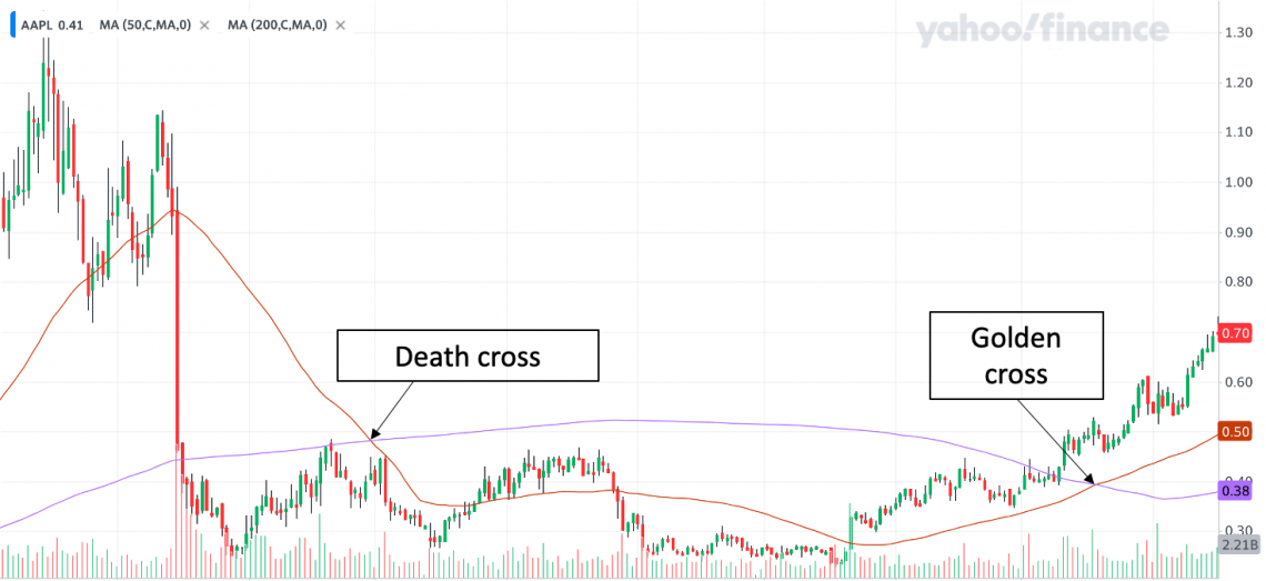
As you can see, selling after the Death Cross did help investors cut some losses, while buying after the Golden Cross provided some returns to investors. This is why crossovers are a useful reference for investors.
However, one massive flaw in the crossover strategy is that they are inherently lagging. Therefore, there is a potential that investors may have missed the boat as markets have already moved before the crossover strategy picks it up.
Note
There isn’t really any hard and fast rule behind deciding the number of days into the SMA calculations. That really depends on your time frame as an investor.
Some people also compare the short SMA to the trading price of the company stock. If the daily share price crosses above the short SMA, then investors would consider that as a buy signal, and vice versa.
MACD: the key indicator of technical analysis
The MACD indicator really takes your technical analysis ability to the next level. As with all technical indicators, the MACD aims to identify buy and sell signals. There are 3 parts to the MACD:
- The MACD line
- The signal line
- The histogram
The MACD line essentially aims to simplify the interpretation of the crossover strategy explained above by comparing a long and a short moving average. The formula for the MACD is as follows:
MACD = 12 day EMA - 26 day EMA
Perhaps the long-period moving average isn’t very long, but this is the commonly used formula. The benefit of using 12 & 26 days and the EMA over SMA is that this indicator is much more reactive to market movement.
Because of this formula, you can expect the MACD to oscillate above and below the value 0. The following are some key interpretations regarding the MACD value:
- When the MACD takes on a positive value, the 12-day EMA is greater than the 26-day EMA
- When the MACD takes on a negative value, the 26-day EMA exceeds the 12-day EMA.
- When the MACD is 0, it can be interpreted similarly as either a golden cross or a death cross because when the MACD is 0, the 12-day EMA and 26-day EMA intersect.


How does the MACD differ from the crossover strategy?
Well, not only does an increasing (decreasing) MACD indicate that the market is in a bull (bear) run, but there is more to the MACD.
This would be where the signal line comes in. The signal line is calculated as the 9-day exponential moving average by default. Without going into too much detail, the crossovers between the signal & the MACD line would be your bull and bear signals. Basically:
- When the MACD line crosses ABOVE the signal line, it is a buy signal
- When the MACD line crosses BELOW the signal line, it is a sell signal
The last part of this indicator is the histogram. The main purpose of the histogram is to measure the distance between the MACD line and the signal line. Therefore, traders will use the trend in the histogram to identify patterns and potential crossovers.
Let us look at the example of Apple once again:
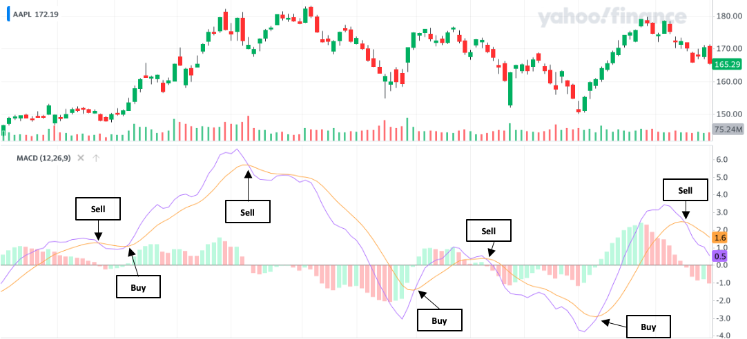
The purple line here represents the MACD line, whereas the orange one represents the signal line. When the MACD crosses above (below) the signal line, investors are recommended to buy (sell) Apple stock. From this chart itself, there is one very clear benefit to using the MACD.
You can notice that the buy or sell signals are indicated much earlier than when the MACD line hits 0. Therefore, this model does predict earlier movement.
Remember, using easier moving average crossovers had an issue of being too slow due to inherent lag in the indicator. In this scenario, the 26-day and 12-day EMA intersect and form either a golden or death cross when the MACD line hits 0.
Note
As with regular crossovers, there isn’t any hard and fast rule behind the number of days used to form the MACD indicator- it is simply the default formula. In most cases, you can change the number of days calculated in this formula as you see fit.
Because the number of days chosen in the MACD is of a relatively short time frame (and the indicator uses EMA over SMA), the MACD is considered more useful to short-term day traders than long-term investors.
Other indicators for technical analysis
So far, this article should have done well in introducing you to the basics of this concept. However, there are many more indicators for you to dive deeper into. Therefore, here are some indicators to look at alongside basic descriptions.
Support and resistance levels
Support and resistance levels are among the most common indicators in technical analysis. By looking at candlestick charts, investors can see points where the share price always experiences reversals.
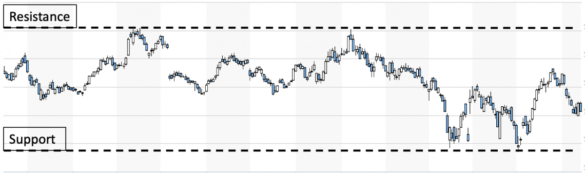
The support level can be characterized as the “lowest possible” price at which a company stock will trade. Investors view support levels as an opportunity to open a long position because there is little downside, as prices are expected to bounce back after hitting their support level.
The resistance level can be characterized as the “highest possible” price at which company stock will trade. Investors view resistance levels as an opportunity to take profits and sell their positions to realize the maximum upside because prices won’t go up any higher.
However, support and resistance levels aren’t invincible and can be broken. If support levels are broken, it is a bearish sign that investors have lost hope in the stock, and it is expected to trend further downward. The opposite applies to broken resistance levels.
There is no ideal methodology for determining support and resistance levels. For example, some investors may look at a company’s all-time high and conclude that to be the resistance level.
Aside from that, investors may notice that a stock has never traded below a certain price for the past year and determine that the support level should be around that price point.
Bollinger bands
Bollinger bands were developed by John Bollinger and were designed to capture most of a company’s share price movement. This is done by constructing an upper and lower band around a company’s 20-day simple moving average.
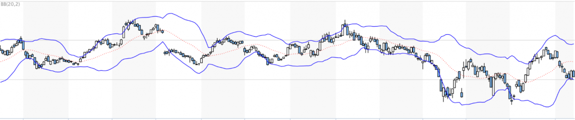
Although it is customizable, Bollinger bands are generally constructed two standard deviations away from the default 20-day simple moving average. You can see this from the image above, where the blue lines represent the bands while the dotted orange line is the 20-day SMA.
Therefore, if the share price is trading near the lower (upper) band, there is some indication that the stock may have been oversold (overbought), and a reversal is expected to occur.
Investors who believe in the likelihood of this reversal should then capitalize on this opportunity by taking the appropriate action - buy when prices are near the lower band and sell when prices are near the upper band.
The Bollinger band also has the additional benefit of indicating market volatility. The greater the volatility in a company’s share price, the wider the Bollinger bands would be.
If they are very far apart, investors could trade the stock more conservatively or aggressively depending on their goal, thus making Bollinger bands a useful tool for investors and traders.
Relative strength index (RSI)
The relative strength index is often compared to the MACD because it is also displayed as an oscillator. Although often compared to the MACD, the process of deriving the RSI is significantly different and should, therefore be treated as a different indicator.
The RSI is designed to oscillate between the numbers 0 to 100. Any number below 30 is an indicator that a stock has been oversold, and any number above 70 is an indicator that a stock has been overbought. You can see an example using the image below:
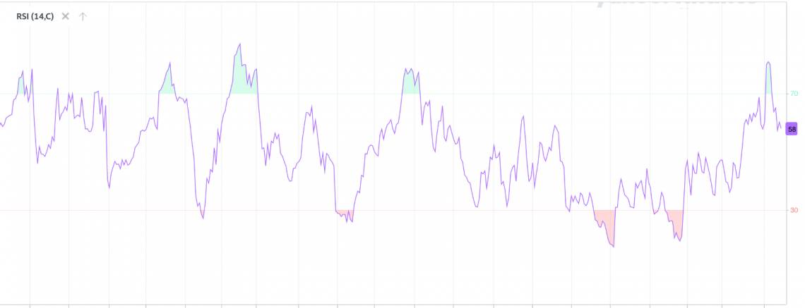
The RSI is calculated by comparing the average gain to the average losses over a default 14-day period. If a company’s share price appreciates too much over 14 days, that will tempt many investors to take a profit. A high RSI value will capture this.
The RSI will also capture oversold conditions when the share price drops too much over 14 days. Because markets are cyclical, investors who take a long position in company stock when its RSI value is 30 or lower will often see their position appreciate in value.
Fundamental Vs. Technical analysis
Capital markets play a big part in the economy, from helping individuals generate passive income to giving corporations access to financing for various expenditure types. Therefore, it would be safe to say there isn’t only one way to invest in markets.
As mentioned earlier, technical analysis follows a completely different approach from fundamental analysis.
Investors who fundamentally analyze company stock will attempt to establish its intrinsic value, which essentially means how much money the company can generate and, thus, how much you should be paying for the company.
To fundamentally analyze a company, you’d need to understand its industry, its financial statements, revenue drivers, etc. Furthermore, you’d have to understand how this company will operate in the future and what its earnings will look like.
In contrast, investors who technically analyze a company don’t bother much about that type of information. Instead, they’d focus more on the company’s price charts and relevant indicators.
To understand better, let's take a look at the difference table below:
| Aspect | Fundamental Analysis | Technical Analysis |
|---|---|---|
| Approach | Analyzes intrinsic value, industry, financial statements, future earnings, etc. | Focuses on price charts and relevant indicators, believing historical data can predict future trends and momentum. |
| Information Considered | Company-specific data and industry analysis. | Price charts and historical market data. |
| Belief about Market Efficiency | Believes in the efficient market hypothesis, where stock prices reflect intrinsic value. | Believes markets are not always efficient, and historical data can provide opportunities to profit. |
| Investment Time Frames | Longer investment periods. | Shorter investment time frames, including day trading. |
| Buy/Sell Strategy | Typically follows buying low and selling high strategy. | May involve buying high and selling low, focusing on momentum and trends. |
| Investment Decision Basis | Intrinsic value and financial health of the company. | Historical price patterns, trends, and market momentum. |
| Used by Investors | Commonly used by value investors and long-term investors. | Commonly used by day traders and short-term investors. |
| Blend of Approaches | Sophisticated investors may combine both fundamental and technical analysis for a balanced perspective. | Investors might use a mix of fundamental and technical analysis for comprehensive decision-making. |

Researched and authored by Jasper Lim | Linkedin
Free Resources
To continue learning and advancing your career, check out these additional helpful WSO resources:


or Want to Sign up with your social account?