Dashboard Creation in Excel
A systematic process of designing and constructing a visual data representation to oversee and analyze key performance indicators and metrics.


What Is Dashboard Creation In Excel?
Dashboard creation in Excel is a systematic process of designing and constructing a visual data representation to oversee and analyze key performance indicators and metrics.

Excel dashboards are robust tools that offer a comprehensive and visually captivating way to present and analyze data for decision-making purposes. By leveraging Excel functionalities, these dashboards can transform raw data into meaningful insights.
They possess the flexibility to be customized according to specific requirements. They can consolidate data from multiple sources, allowing users to effectively communicate information, identify trends, and make well-informed decisions.
The key advantage of Excel dashboards lies in their ability to represent data visually. By using charts, graphs, and other visual elements, complex data sets are presented in a clear and organized manner.
Whether it's a line chart displaying sales trends over time, a pie chart illustrating market share, or a scatter plot revealing correlations, these visualizations help users grasp patterns and relationships instantly.
Visual elements can be personalized to enhance clarity and highlight significant information. For example, conditional formatting can be utilized to emphasize outliers or employ color schemes aligned with branding guidelines.

The analytical and decision-making capabilities of Excel dashboards are invaluable. By consolidating data from various sources or worksheets, dashboards provide a centralized view of key metrics and performance indicators.
The interactive nature of these dashboards, such as data filtering or slicing through slicers or drop-down lists, enables users to explore various scenarios and gain deeper insights.
These capabilities empower users to:
- Make data-driven decisions by swiftly identifying opportunities
- Pinpointing areas for improvement
- Evaluating the impact of different factors on performance
Excel dashboards also offer flexibility and customizability. With a wide availability of tools and features, users can design dashboards that meet their specific needs.
They can select the most suitable chart types, apply formatting and styles, and exercise control over the visual appearance of the dashboard.

Automation features, such as formulas, functions, and data connections, enable users to update their dashboards with real-time or near-real-time data. This flexibility ensures that the dashboard remains dynamic and adaptable to evolving business requirements.
Whether sharing reports with colleagues, presenting to stakeholders, or collaborating on data analysis, dashboards eliminate confusion and allow users to focus on the key takeaways.
This collaborative aspect fosters data-driven decision-making and cultivates a shared understanding of the information among team members.
Furthermore, Excel dashboards are scalable across industries and purposes. They can be employed for various types of dashboards, including
- Sales
- Finance
- Project management
Excel's versatility ensures that users can easily add or remove data, charts, or other elements as their needs evolve, guaranteeing that the dashboard remains relevant and valuable over time.
With their ability to unlock the full potential of data, Excel dashboards empower users to drive business success through informed decision-making.
- Dashboard creation in Excel involves designing visual representations of data to provide insights and facilitate decision-making, typically consist of charts, graphs, tables, and other visual elements.
- Dashboards serve as centralized tools for monitoring and analyzing data trends, performance metrics, and business insights.
- Excel dashboards facilitate performance tracking by visually representing KPI metrics and enabling the identification of areas for improvement, empowering users to analyze data, uncover insights, and make informed decisions.
- They enhance communication and collaboration by presenting information in an organized and visually appealing manner, fostering a shared understanding among team members.
Importance of Excel Dashboard
Dashboards are crucial in data analysis and decision-making across various industries and domains for the following reasons.
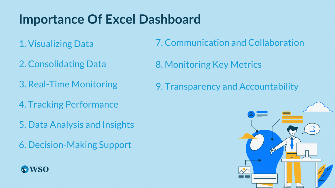
1. Visualizing Data
Dashboards offer visual representations of complex data sets, making it easier for users to understand and interpret information quickly.
Visual elements like charts and graphs help identify patterns, trends, and correlations, simplifying the communication of data insights and enabling stakeholders to grasp information effortlessly.
2. Consolidating Data
Dashboards consolidate data from multiple sources into a single view, eliminating the need to navigate through numerous spreadsheets or databases.
This saves time and effort by providing an overview of key metrics and performance indicators, allowing users to access and analyze relevant data in one place for a simplistic understanding.
3. Real-Time Monitoring
Dashboards can be changed and updated in real-time and when required, helping users monitor data and metrics as they change. This real-time component is useful in changing environments where up-to-date information is crucial for decision-making.

Real-time dashboards empower users to respond promptly to emerging trends, anomalies, or critical events.
4. Tracking Performance
Dashboards visually represent key performance metrics, allowing users to track progress toward goals and objectives.
By monitoring performance indicators in real-time, stakeholders can assess the effectiveness of strategies and initiatives. Dashboards facilitate the identification of areas for improvement and the ability to make data-driven adjustments to enhance overall performance.
5. Data Analysis and Insights
Dashboards facilitate data analysis by enabling users to explore data sets, apply filters, and interact with the data dynamically. Users can drill down into specific segments or time periods to uncover insights and better understand the underlying data.
NOTE
Dashboards enable the identification of trends, outliers, and correlations, empowering users to make informed decisions based on data-driven insights.
6. Decision-Making Support
Dashboards provide decision-makers with timely and accurate information, enabling them to make informed choices. By presenting relevant data in a visually appealing and organized manner, dashboards facilitate clear and concise communication of insights.
Decision-makers can assess the impact of different factors, evaluate scenarios, and identify opportunities or risks, leading to more effective decision-making.
7. Communication and Collaboration
Dashboards serve as a common platform for sharing data insights and promoting collaboration among team members.
By presenting information visually compellingly, dashboards enhance communication and foster a shared understanding of the data.
8. Monitoring Key Metrics
Dashboards enable users to monitor and track key metrics and KPIs in real time. By setting up alerts or thresholds, stakeholders receive notifications when certain metrics deviate from the desired targets.
This proactive monitoring enables prompt action to address issues or capitalize on opportunities.
9. Transparency and Accountability
Dashboards promote transparency by providing stakeholders with access to relevant data and metrics.
This fosters accountability within organizations, as stakeholders can objectively monitor and evaluate performance. Dashboards create a shared understanding of performance expectations and facilitate discussions around performance metrics.
Creating a Dashboard in Excel
Let's take a look at creating a dashboard in Excel using these steps :
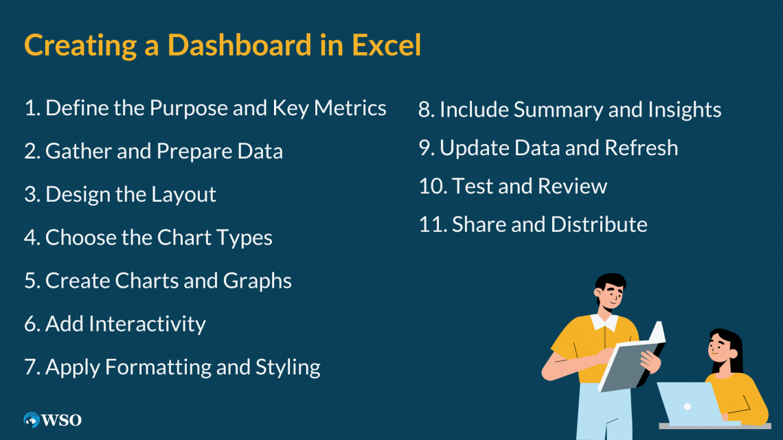
1. Define the Purpose and Key Metrics
Clarify why you're creating the dashboard and identify the specific metrics you want to track. Consider the target audience and their information needs.
2. Gather and Prepare Data
Collect the necessary data for your dashboard and ensure its accuracy, completeness, and organization. Clean and format the data as needed by removing unnecessary columns or rows.
3. Design the Layout
Strategize the desired appearance of your dashboard. Decide which charts, graphs, and visual elements will be included. Consider their placement and arrangement to optimize readability and visual appeal.
Also, check if the outline meets the initial layout for which you decided to create the dashboard. Once it meets your needs and all charts and elements are in place, you can move to the next step.
4. Choose the Chart Types
Select the most suitable chart types that effectively represent your data and support your analysis. Excel provides various chart options, such as column, line, and pie charts. Choose the ones that best convey the information you want to communicate.
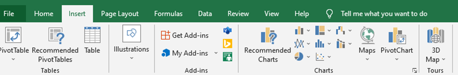
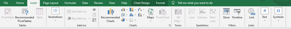
You can go to the insert section in charts and then to the charts section.
5. Create Charts and Graphs
Insert the chosen charts and graphs into your dashboard using Excel charting tools. Customize chart elements like axes, labels, legends, and colors to enhance clarity and visual impact.
6. Add Interactivity
Make your dashboard interactive by incorporating features like dropdown lists, slicers, or filters. These elements enable users to dynamically explore the data and analyze specific segments or time periods of interest.
7. Apply Formatting and Styling
Format your dashboard to enhance its visual appeal and readability. Maintain consistent colors, fonts, and styles throughout the dashboard to achieve a cohesive and professional appearance. Utilize conditional formatting to highlight important data points or emphasize specific insights.
8. Include Summary and Insights
Integrate summary sections or text boxes to provide context and key insights. Explain the findings hidden inside the data and highlight any patterns, trends, or conclusions that can be derived from it.
9. Update Data and Refresh
Establish data connections or formulas if your dashboard relies on live or connected data sources. This ensures that your dashboard updates automatically, reflecting the most recent information.
10. Test and Review
Thoroughly test the functionality of your dashboard and review its accuracy. Confirm that the charts and graphs accurately represent the data and that any interactive features perform as intended.
11. Share and Distribute
Once you're satisfied with your dashboard, save and share it with the intended audience. You can distribute it as an Excel file or a PDF or publish it on a shared drive or web platform for easy access.
NOTE
These steps are a general guide, and you may need to change them based on your data and desired output. Excel offers various features to enhance your dashboard creation process.
Use of Excel dashboards in the industry
In today's data-centric world, various industries rely increasingly on Excel dashboards to transform raw data into actionable insights. It offers a comprehensive and visually captivating way to present and analyze data, empowering decision-makers to make well-informed choices.

This article explores the wide range of uses of Excel dashboards in different sectors and underscores their importance in driving business success.
Sales And Marketing
Excel dashboards are pivotal in tracking key performance indicators (KPIs), monitoring sales trends, and evaluating marketing campaigns.
These dashboards facilitate accurate sales forecasting and strategic decision-making by visualizing revenue figures, customer acquisition rates, and conversion rates.
Marketing professionals benefit from metrics such as website traffic, leads generated, and social media engagement, which enable them to optimize strategies, identify high-performing channels, and measure campaign effectiveness.
Finance And Accounting
Excel dashboards revolutionize financial analysis and reporting by consolidating:
- Financial data
- Generating real-time insights
- Facilitating budgeting and forecasting
- Visual representations of income statements, balance sheets, and cash flow statements offer a holistic view of financial performance.
Accountants can efficiently track accounts payable and receivable, detect anomalies or discrepancies, and generate financial reports, enhancing efficiency and accuracy.
Operations And Supply Chain Management
Excel dashboards play a crucial role in optimizing operations and supply chain management. They allow professionals to monitor inventory levels, analyze production data, and track key operational metrics like cycle time, lead time, and order fulfillment rates.
They offer insights into supply chain performance, enabling businesses to identify bottlenecks, streamline processes, and improve efficiency.
NOTE
They also facilitate demand forecasting, aligning production and inventory levels with customer demand and enhancing customer satisfaction.
Human Resources
Excel dashboards streamline workforce management, talent acquisition, and employee performance evaluation in the human resources domain.
HR professionals can access consolidated metrics such as employee turnover, recruitment analytics, training effectiveness, and performance ratings. This empowers HR teams to identify trends, assess training needs, and make data-driven talent management and succession planning decisions.
Additionally, dashboards help monitor key HR indicators like absenteeism rates, employee satisfaction scores, and diversity metrics, fostering a proactive work environment.
Project Management
Excel dashboards are invaluable tools for project management. They allow managers to track progress, monitor milestones, and evaluate resource allocation.
These dashboards visually represent project timelines, task dependencies, and resource utilization, offering a clear overview of project performance. Project managers can identify critical paths, manage risks, and make informed decisions to ensure project success.
Excel dashboards have emerged as indispensable industry tools, revolutionizing data analysis and decision-making processes. Their diverse applications empower organizations to unlock the full potential of data and drive business success.
Is an Excel dashboard the only option?
No, an Excel dashboard is not the only option available for creating dashboards. Numerous dashboard tools in the market offer advanced features and capabilities for data visualization and analysis. Some popular alternatives for creating dashboards are:
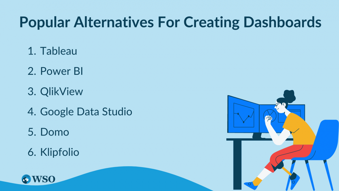
1. Tableau
Tableau is a widely used business intelligence and data visualization tool known for its ability to create interactive dashboards and reports. With its user-friendly interface and drag-and-drop functionality, Tableau supports various data sources and provides advanced visualizations, interactive filters, and real-time analytics.
2. Power BI
Developed by Microsoft, Power BI is a powerful business analytics tool that allows users to build interactive dashboards and reports. It offers seamless integration with diverse data sources, advanced data modeling capabilities, and rich visualizations.
NOTE
Power BI facilitates collaboration and sharing of dashboards within organizations.
3. QlikView
QlikView is a robust data discovery and visualization tool that allows users to explore data and create dynamic dashboards intuitively. Its unique associative data model enables interactive visualizations, drill-down capabilities, and advanced data analytics features.
As a free cloud-based dashboarding tool, Google Data Studio enables users to create customizable and interactive dashboards by connecting to various data sources such as Google Analytics, Google Sheets, and databases.
5. Domo
Domo is a comprehensive cloud-based platform that offers end-to-end data integration, visualization, and analytics capabilities.
NOTE
Domo provides a drag-and-drop interface for creating interactive dashboards, supports real-time data updates, and includes features for data governance, collaboration, and mobile accessibility.
6. Klipfolio
Klipfolio is a cloud-based dashboard and reporting tool that empowers users to build custom dashboards using various data sources.
It provides pre-built data connectors, flexible data manipulation options, and a library of visualizations. Klipfolio also offers collaboration features and supports automated data refresh.
These are just a few examples of the dashboard tools available in the market. Each tool has its strengths and features, so it's important to consider your specific requirements and evaluate different options to select the one that best suits your needs.
What is Excel Dashboard FAQ

Yes, Charts are a much more organized form of representing data hence using charts to show important details in the dashboard is an accepted practice.
Excel is free and readily available software in many organizations; hence it has become one of the top listed software in dashboard creation.
You can use add-ins provided by Excel; Add-ins like Excel Solver, Power Query, Power Pivot, Power View, and Excel Power Map can help enhance the look and feel of the created dashboard.
Yes, you can use Formulas and Functions, Pivot charts and Tables, Macros, Data validation, and various other techniques to achieve this.
Yes, Excel supports cross-platform sharing where dashboards developed in Excel can be saved and exported as PDFs and in PowerPoint presentations.

Free Resources
To continue learning and advancing your career, check out these additional helpful WSO resources:


or Want to Sign up with your social account?