How to Read Stock Charts
Stock charts display a stock's price movements and trading activity over a specific timeframe.


What are Stock Charts?
Stock charts display a stock's price movements and trading activity over a specific timeframe. They are crucial for traders and investors who want to research and decide whether to buy or sell stocks.
Traders, investors, and analysts frequently utilize stock charts to assess market trends, choose investments, and spot prospective trading opportunities.
When analyzing a stock chart, an upward-trending green line is preferable to a downward-trending red line. However, stock charts can show a lot of additional information.
Stock charts can provide information about a company’s value, the price at which the stock is currently trading, and the company's performance over time, depending on the data.
Stock charts mainly help you decide whether a firm is worthwhile to invest in.
For instance, a brief decline in stock prices following an extended period of rise can be an excellent chance to buy at a discount. Another option is to invest in a reasonably young company that is doing well and has affordable share prices before it really takes off.
- Stock charts can be a useful tool for comprehending publicly available data.
- For investors attempting to formulate a thesis about whether a company has merited your support, stock charts can be helpful.
- Metrics shown on a financial chart that moves in a manner that may be recognized is known as chart formation.
- If a pattern repeats frequently, traders can backtest it by examining past price performance during such times to establish a baseline for future occurrences.
Types of Stock Chart
The type of chart determines the presentation of the data. Charts plot historical data using a combination of price, volume, and/or time periods.
The horizontal line represents the time (X axes), while the vertical line represents the price (Y axes). These three charts are the ones that day traders most frequently utilize.
1. Line Chart
In a line chart, the closing prices (or other specified price data points) for each defined time interval are connected by a single line running from left to right. A simple graph appears in the chart. In a single line, it provides an aerial view of the previous price movement.
2. Candlestick Chart
The most common type of chart traders utilize is the candlestick chart, which has almost universal adoption across all platforms. The chart creates a candlestick plotted on a price chart using the opening, high, low, and closing price data for each selected time interval.
The body, upper tail, and lower tail comprise the candlestick's three components. Wicks are another name for tails. The opening and closing prices for the period make up the body.
Note
The candlestick's body is either red or green in shade. Green candles show that the closing price was higher than the opening price, which is bullish because it leads to an increase in price overall.
3. Bar Charts
Bar charts are made up of many price bars that show how the price of a security or asset changed over a specific period of time. Although each bar normally displays open, high, low, and closing (OHLC) prices, this can be changed to merely displaying the high, low, and close (HLC).
Components of a Stock Chart
Reading stock charts is a crucial ability for investors and traders wanting to make wise judgments in the financial markets.
When analyzing charts for trading, there are several key components that every trader should focus on to make informed decisions. These components provide valuable information about price movements, trends, and potential trading opportunities.
Here are the key components:
1. Timeframes
Stock charts can display data over various timeframes, such as minutes, hours, days, months, or years. Choose the timeframe that suits your analysis.
2. Price & Volume
The vertical axis represents the stock price, while the horizontal axis represents time and beneath the price chart.
You'll often find a bar chart showing trading volume. Volume can provide insights into market participation and strength.
3. Candlesticks
Candlestick charts offer more information. Each candlestick shows the opening, closing, and high and low prices for a particular period of time.
4. Trendlines & Patterns
To determine the direction of the stock's price movement, draw trendlines. Lower highs and lower lows indicate a downtrend, and it is easy to spot significant support (price floor) and resistance (price ceiling) levels on the chart. Potential price reversals may be predicted using these levels.
5. Technical Indicators
Use technical indicators to analyze momentum, overbought/oversold circumstances, and prospective trend changes, such as moving averages, the Relative Strength Index (RSI), MACD (Moving Average Convergence Divergence), and others.
6. Chart Patterns
Recognize common chart patterns like head and shoulders, double tops/bottoms, flags, and triangles. These patterns can signal potential reversals or continuations in price trends.
Pay attention to price and technical indicator divergence. A probable reversal is indicated by bullish divergence, which happens when the price makes lower lows while the indicator makes higher lows. However, when the signal and price reach lower highs, there is a bearish divergence.
8. Fundamentals
Be aware of significant news and events that impact the stock price. These can cause sudden price movements, potentially invalidating technical analysis.
How to Read Stock Charts?
Reading stock charts entails examining graphic representations of historical price and volume data for a stock over various time frames.
Important actions include choosing a chart type, picking an appropriate time frame, comprehending how to use the price and time axes, and examining the price data. Additional information can be gleaned from technical indicators like RSI and moving averages.
Future price movements can be predicted by identifying trends and chart patterns (such as double tops).
To evaluate the strength of trends or prospective reversals, volume data is used. It's also crucial to keep an eye on news and developments that can affect the price of a company.
To enhance your proficiency in chart analysis, which should be integrated with fundamental analysis and risk management when making investment choices, it's crucial to prioritize practice, historical analysis, and ongoing learning.
If you are new to technical analysis, you might wonder what it is. In its basic form, technical analysis is the study of prices in freely traded markets with the intent of making profitable trading or investment decisions.

Here’s a chart on the stock Nvidia (NVDA). This is a candlestick chart with 3 indicators which are the MACD (Moving Average Convergence Divergence), which is the bottom indicator, Volume, and the Moving Average with 2 green lines representing the support and the resistance.
The time frame is the 1-hour timeframe, representing the price movements during the day. If we switch to a higher timeframe, we can see how the price moves in the long term.
Every trader and investor can choose the timeframe they’re comfortable with, depending on their strategy.
Trading Time Frames
There are numerous options for time periods. There are charts with time intervals of one minute, five minutes, ten minutes, or one day, three days, five days, up to several months and years.
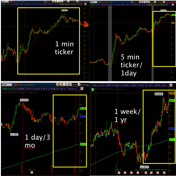
The chart must use the time period that best suits the trader's demands. For instance, a position trader shouldn't use 1-minute increment charts, and a day trader shouldn't use monthly charts.
Using the incorrect time frame for a certain strategy raises the likelihood of losing transactions. An investor might improve their chances of success by choosing the right time frame.
The following are some examples of time frames (bar increment/window increment) for each strategy:
- Scalping: 1 minute/60 minutes only
- Day Trading: 1 minute/60 minutes, 1 minute/120 minutes, 5 minutes/1 day
- Swing and Momentum Trading: 1 minute/180 minutes, 5 minutes/1 day, 10 minutes/3 days, monthly
- Position Trading: 5 minutes/1 day, 10 minutes/3 day, monthly
Although time frames will aid in tying an entrance, the difficulty is in locating an actual entry signal. For the time being, employ the appropriate time frame chart and technique.
Technical Indicators
Technical indicators are indications generated by the price, volume, and open interest of a security or contract and are utilized by traders who follow technical analysis. They can be heuristic or pattern-based.
Technical analysts utilize indicators to forecast future price changes by examining historical data. The Relative Strength Index (RSI), stochastics, moving average convergence divergence (MACD), Bollinger Bands, and others are examples of common technical indicators.
Volume
Volume in the stock market is crucial since it validates price movement. The volume provides the trader with information about the level of interest in a stock. For volume, follow these guidelines:
- Price movement is confirmed by volume; when volume rises, prices do as well. Prices drop when volume declines.
- Divergence in the relationship between price and volume occurs when the price does not rise as the volume does. The stock usually moves dramatically the following day.
- Breakout Expansion: When a stock emerges from consolidation, there should be above-average volume to support the movement. Low-volume breakouts typically do not hold, and the price returns to where it was before.
- Volume should drop or decline when a stock consolidates following a breakout. This demonstrates sound consolidation, buyers' continued ownership of the stock, and a shortage of sellers. In high-volume trading, these consolidation levels frequently come before additional breakouts.
Risk Management
Risk management plays a key role in technical analysis because it enables traders to recognize, evaluate, and manage the potential risks associated with a trade or investment.
Technical analysts should consider a number of important risk management tenets, such as establishing defined risk and return objectives, diversifying their portfolios, utilizing stop-loss orders, and controlling position size.
It is a crucial but frequently disregarded requirement for effective active trading. After all, without a sound risk management plan, a trader who has made substantial profits could lose it all in just one or two disastrous trades.
Technical analysts can efficiently manage risk and raise their chances of market success by utilizing certain concepts and methods, including position sizing and portfolio diversification.
It is crucial for traders to periodically examine their risk management plans and make any necessary modifications in response to shifting market conditions.
Take-profit (T/P) and stop-loss (S/L) points are two important ways that traders can plan ahead while trading. Successful traders know the prices they are willing to buy and sell items for.
They can then compare the resulting returns to the likelihood that the stock will achieve its objectives. They close the trade if the adjusted return is high enough.
On the other hand, failed traders frequently start a transaction with no concept of the points at which they would sell for a profit or a loss. Emotions start to take over and direct their trades, similar to gamblers on a lucky—or unlucky—streak.
Technical Analysis Sites
Tools are necessary for investors who independently trade financial assets like stocks so they can research the securities they want to buy or sell. Technical analysis is the practice of analyzing stock movements and trading patterns.
To decide whether to purchase or sell stocks, ETFs, options, currencies, cryptocurrencies, and other sorts of investment vehicles, traders employ charts and other analysis tools.
Here are some websites for technical analysis:
- TradingView: TradingView provides sophisticated charting tools, a wide range of technical indicators, and a sizable trading community that exchanges ideas and information.
- StockCharts.com: StockCharts.com provides a variety of technical indicators, scanning capabilities, and charting tools.
- Barchart: Barchart provides tools for technical analysis, graphing, and financial data.
- Fidelity: Fidelity's trading platform offers powerful tools for technical analysis, such as sophisticated charting features.
- NinjaTrader: NinjaTrader can help develop, test, and simulate a trading system for stocks, foreign exchange, and futures using the trading environment. For advanced charting, backtesting, and trade simulation, NinjaTrader is free to use, although some indicators created by third parties have a cost.
Both free and paid subscription options are available for the above websites.
News and Events
Investment choices and market dynamics are significantly influenced by news and happenings in the financial markets. Economic indicators, such as GDP reports, unemployment statistics, and inflation rates, provide information on the state of an economy and impact currencies and bonds.
Corporate earnings releases can significantly influence stock price changes. Geopolitical events, central bank statements, and changes in commodity prices can bring uncertainty to the market.
For investors and traders looking to make informed and timely decisions in the financial markets, staying updated about these aspects is crucial.
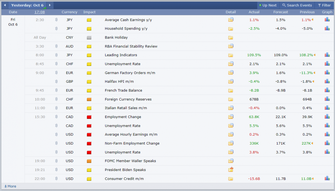
This picture provides economic data for currencies and stocks (only the high-impact ones, i.e., the red ones).
Any information that is anticipated to affect the price or perceived value of a stock is subject to fundamental analysis.
Cash flow, return on assets, and cautious gearing are some stock fundamentals. It can be difficult to perform basic research because it necessitates sifting through financial statements to determine whether the stock price is inaccurate.
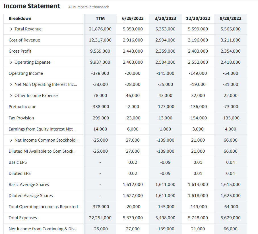
In this picture, we can see the income statement of the company AMD (Advanced Micro Devices). These numbers are released quarterly, and they are the main fundamentals of stocks, along with the balance sheet and cash flow statement.
Chart Patterns
In technical analysis, chart patterns are certain forms that show up on price charts. They are visual representations of past price movements that analysts and traders use to forecast future price fluctuations.
These patterns assist traders in spotting possible trend reversals, trend continuations, and other important price changes in the financial markets.
Here are some chart patterns:
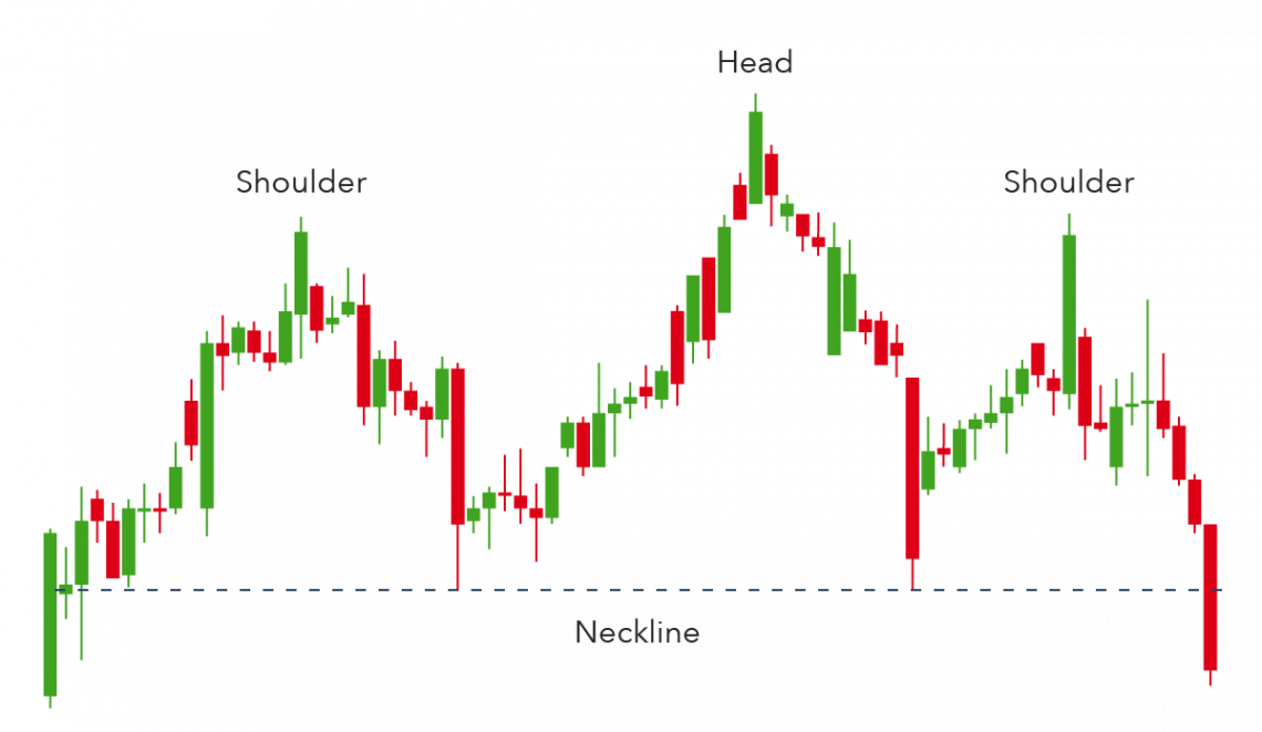
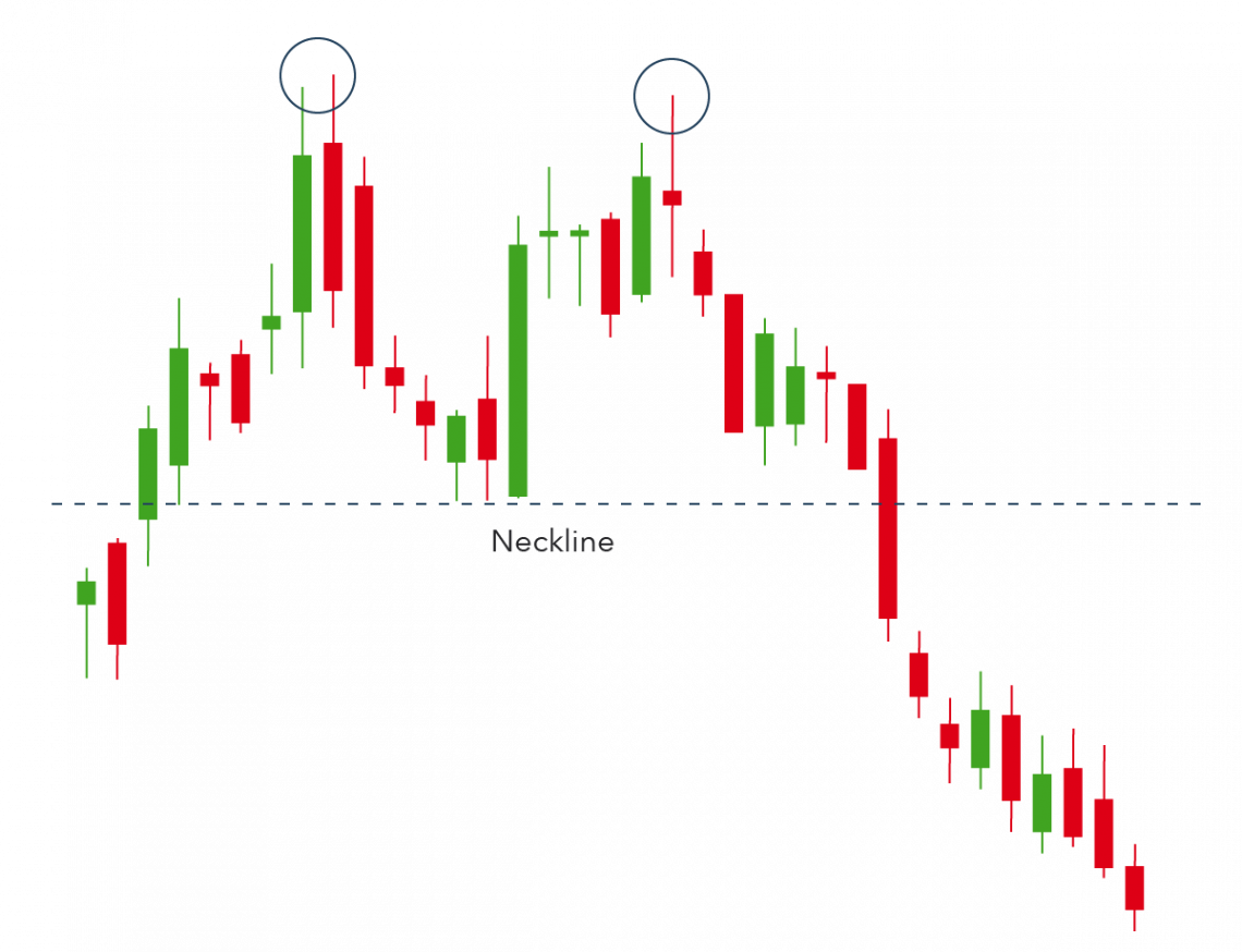
1. Head and Shoulders
A head and shoulders chart pattern has two slightly smaller peaks on either side of a huge peak. To forecast a bullish-to-bearish reversal, traders look for head and shoulders patterns.
The first and third peaks will often be smaller than the second peak, but they will all revert to the same degree of support, or the "neckline," as a result. It is expected that the third peak will break out into a bearish decline once it has retreated to the level of support.
2. Double Top
Another pattern that traders employ to draw attention to trend reversals is a double top. An asset's price will often reach a peak before declining to a level of support. Then, it will ascend again before turning around more permanently against the current trend.
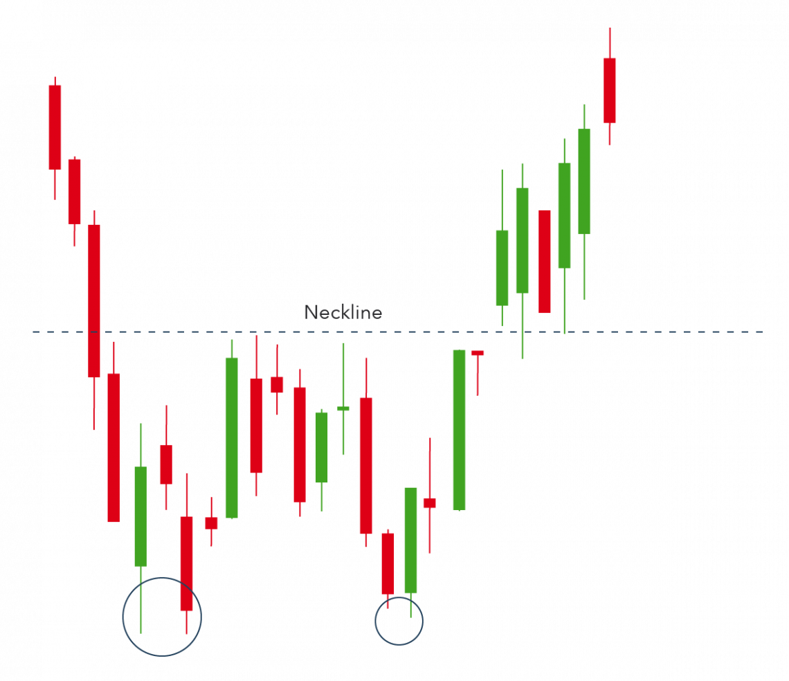
3. Double Bottom
A period of selling that caused an asset's price to fall below a level of support is indicated by a double-bottom chart pattern. It will then increase till a point of resistance before declining again. Finally, as the market turns more positive, the trend will invert and start moving upward.
Because a double bottom signals the conclusion of a downtrend and the beginning of an upswing, it is a bullish reversal pattern.
Charting Tools and Resources
To effectively utilize technical analysis for trading and investing, it's imperative to have access to the right charting resources and tools.
These essential resources encompass various options, including:
- Mobile Apps: Applications like StockCharts.com and Investing.com provide convenient access to real-time market data and user-friendly charting features.
- Trading Platforms: Many trading platforms come equipped with built-in charting tools, making it seamless to analyze market trends and make informed trading decisions.
- Specialized Charting Software: Dedicated charting software such as TradingView and MetaTrader offers advanced features for in-depth technical analysis.
- Financial News Websites: Financial news websites like Bloomberg and Yahoo Finance offer real-time news updates and market insights, complementing technical analysis.
- Charting Tools: There are both free and paid charting tools available, such as TC2000 and NinjaTrader, allowing traders to choose options that suit their specific needs.
In addition to these practical resources, it's vital to invest in your knowledge. Educational resources like:
- Technical Analysis Books
- Online Courses and Webinars
- Online Communities: Platforms like Reddit have active communities where traders share experiences and insights, enhancing your learning journey.
- Financial News Channels: Watching financial news channels like CNBC can keep you updated on market developments.
Technical analysis tools often generate buy and sell signals, aiding in identifying new trading opportunities. Thanks to software advancements and improved access to vast data sets over the last 15 years, most online traders now have access to robust technical analysis tools.
Case Studies
We will be using the Wyckoff Method for the case study.
1. Definition of the Wyckoff Method
In the early decades of the 20th century, renowned technician Richard Wyckoff studied the financial markets.
The Wyckoff Method, his original method of technical analysis, has endured into the present day. It continues to advise traders and investors on choosing winning stocks, the best time to buy them, and how to apply the finest risk management strategies.
The Wyckoff market cycle results from Wyckoff's findings on price movement. It is a theory that describes crucial components in the growth of price trends that are distinguished by intervals of accumulation and distribution.
The cycle consists of four phases: accumulation, markup, dissemination, and markdown.
Wykoff also established guidelines to be used with these phases. These guidelines can also assist in locating and interpreting prices within the vast range of upward, downward, and sideways market movements.
2. How to apply the Wyckoff Method
The Wyckoff Method contains a five-step process that can be summed up as follows for stock selection and trade entry:
a. Find out the market's current position and likely future development. Is the market trending or consolidating? Does your study of the supply, demand, and market structure point in the direction that is most likely shortly?
You should use this analysis to determine whether you should trade at all and, if so, whether to take long or short positions.
b. Choose equities consistent with the trend, weaker than the market when the market is down and more robust when the market is rising. Consider equities that, during rallies, show bigger percentage increases than the market and lesser percentage declines during responses.
c. Your commitment should coincide with a change in the stock market index. At least a third of individual issues follow the market as a whole. So, having the strength of the entire market behind you increases the chances of a successful trade.
Specific Wyckoff concepts, such as a shift in the nature of price activity and manifestations of Wyckoff's three laws, aid in predicting probable market turns. Set your stop-loss and, if necessary, trace it until you close the position.
For spotting and managing lucrative and emerging trends, the Wyckoff Method is the best option. To show how the Wyckoff Method can help us, let's do a Swing Trading case study on a single stock in a long-term trend with a pattern of cyclicality within the trend.\
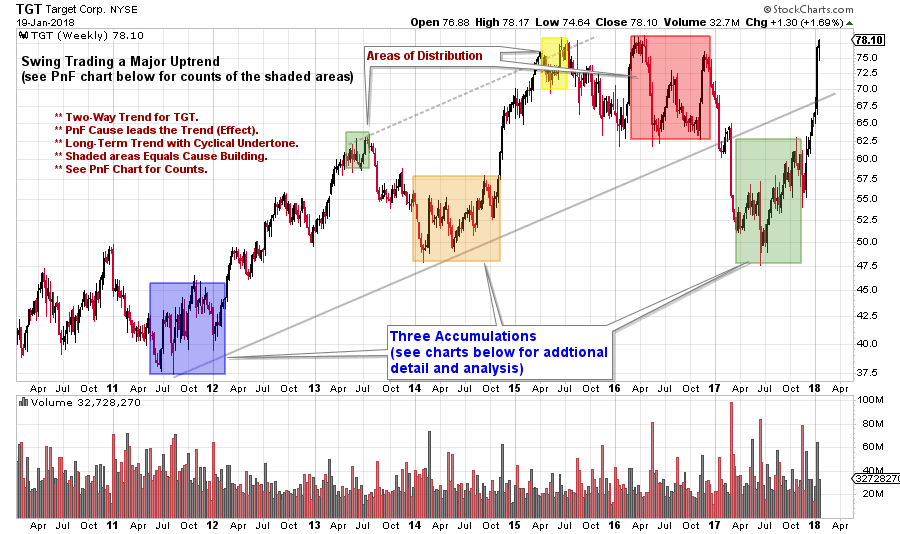
Most of the major trends have cyclical internals and take time to develop. The subject of our case study is Target Corp. (TGT), a stock that fits this description. According to Wyckoffians, significant trends are preceded by a period of cause-building or preparation.
The Composite Man (another name for the market) must accumulate their line of stock over time.
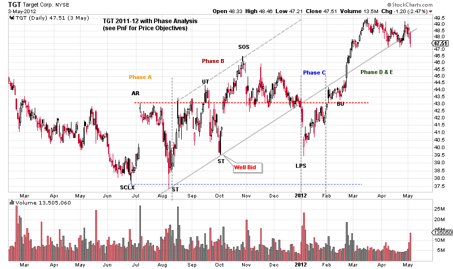
Here is an examination of the 2011–12 Accumulation with Phase. TGT follows a conventional markdown with a selling climax. The selling climax establishes the Support, while the rally establishes the level of Resistance.
TGT typically trades in this area, but the Accumulation tends to move higher. Take note of the TGT trend's rising scale in Phase B. This demonstrates the Composite Man's eagerness to amass shares.
This is probably because the overall trend is upward, and past absorption (before 2011) rendered TGT shares rare and challenging to acquire. A more significant slide towards the Last Point of Support follows the Sign of Strength.
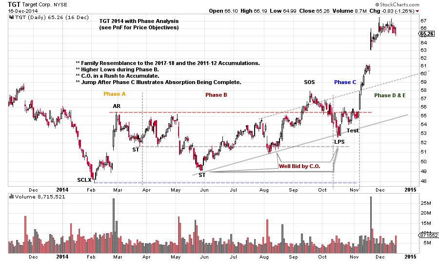
Following the preceding Accumulation, TGT saw a strong upswing, followed by a downturn. Early in 2014, this came to an end with a Selling Climax. For the majority of the year, a range-bound condition develops.
The selling climax is the low, and the price tilts upward. Phases B and C appear to be where the C.O. drives price increases. This lengthy cyclic halt is another one.
Remember the parallels to the previous Accumulation. TGT easily marks up the Last Point of Support, and the uptrend is well-established.
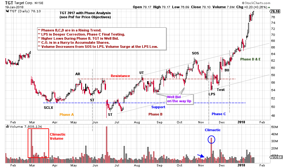
After a markdown and selling climax in 2017, TGT entered another cyclical period of accumulation. The accumulation phase caused the price to surge by making higher lows and breaking resistance.
Conclusion
To traverse the markets, traders can utilize a variety of price charts, and there are countless combinations of indicators and trading strategies available.
Find the perfect amount of information on the chart that will allow you to make an informed decision while avoiding having too much information that will just lead to indecision as you establish your chart preferences.
When there are too many indicators, "analysis paralysis" results, where no trading signal is ever offered, and there are too few indicators, false signals, and poor decisions might result.
When viewing stock charts, keep things straightforward. Every trader will have a different approach to finding the ideal combination, so it's crucial to start with the fundamentals and work your way up to using the indicators and patterns that make the most sense to you.


or Want to Sign up with your social account?